The Innocent Rebrand: Simplifying a Beloved Brand's Visual Story

Kwaku Amprako is a brand designer, speaker, and founder of Akrivi — Shaping the future of brand identity design. Get in touch→
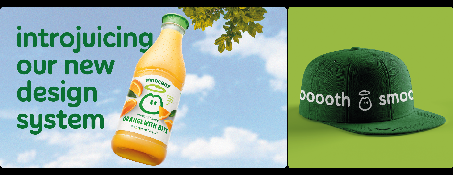
-4.png)


In the dynamic world of brand identity, nothing sparks a conversation quite like a rebrand. It’s a critical moment for any company to refine their narrative or adapt to a changing market. Today, we’re diving into the recent visual refresh of Innocent Drinks, a brand synonymous with healthy, delicious, and a touch of quirky goodness.
The Innocent rebrand, led by strategist Silas Amos and design agency Derek&Eric, aimed to simplify and rationalize a fragmented visual identity. This fragmentation had diluted its market-leading presence. The result is a more cohesive, confident, and impactful look. Let's unpack this "responsible brand refresh."
The Brand Challenge: Why Innocent Needed a Refresh
Innocent had grown significantly, expanding its offerings beyond smoothies to include juices, health shots, and coconut water. But with this growth came a common challenge: fragmentation.
Their brand architecture and design approach had grown "complicated and confused." Different product lines followed various design systems, leading to a loss of visual cohesion. This made it difficult for customers to "navigate" their extensive range, diminishing the "halo effect" and hindering Innocent's clear identity as a market leader.
The core problem was clear: the brand wasn't communicating its essence and breadth as effectively as it once did.
The Strategic Approach: Simplifying with Intent
Derek&Eric's objective was explicit: to "simplify and rationalise" the design system across all products. This was a strategic mandate, ensuring every design decision supported this core aim. The designers consistently adhered to this principle, even when tempted to deviate for specific product ranges.
This commitment to simplification led to what has been called a "responsible brand refresh" – a thoughtful evolution rather than a drastic revolution.
Deep Dive: What Changed?
The rebrand touched key visual assets to achieve this renewed clarity and cohesion:
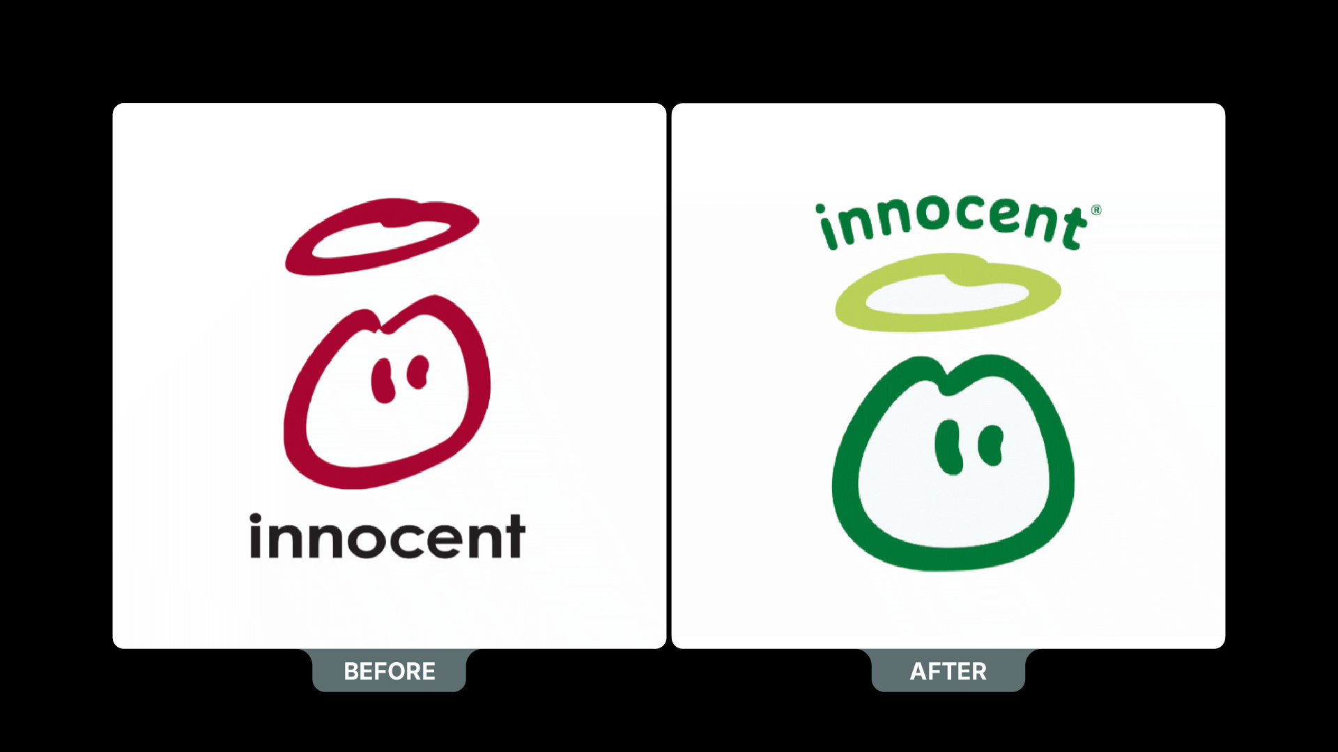
The Logo & Wordmark
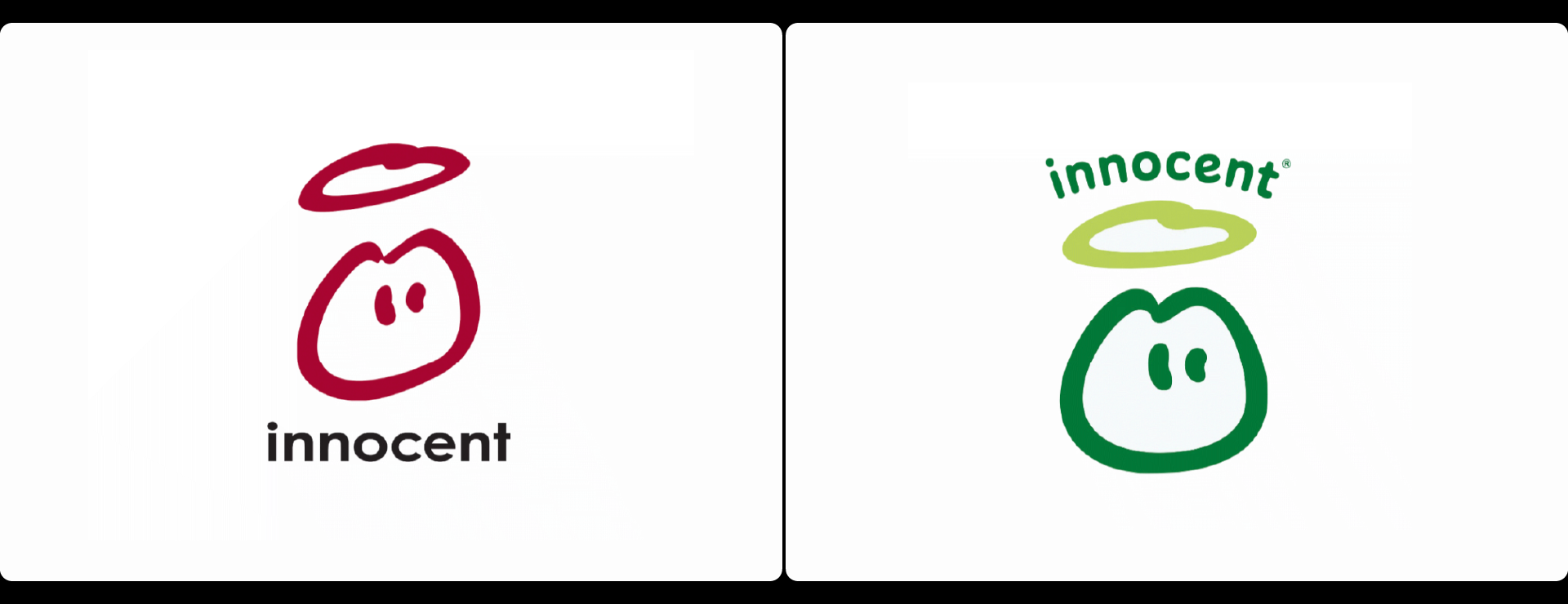
The rebrand refined key visual assets, including the logo and a new arched wordmark. The aim was a more "expressive" look without changing its core essence. The new wordmark needed a "plumpness that makes you want to pick it," like fruit.
- Before: Generally perceived as slightly more informal and less structured.
- After: The refreshed wordmark retains Innocent's approachable personality but gains a subtly more refined, "plumped up" feel. This enhances legibility and presence, especially on packaging, supporting the overall simplification.
Packaging Design
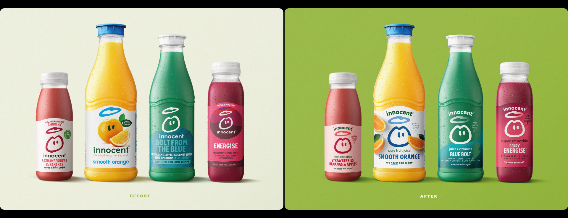
Packaging was a major focus, with a shift to "minimal assets on every pack" to tackle fragmentation and ensure consistency.
- Front of Pack: Features cleaner layouts, clearer product differentiation, and less visual clutter. The "plump" wordmark stands out more prominently.
- Back of Pack: A key challenge. Innocent's witty text needed to balance with nutritional information. The new design successfully integrates both, maintaining clarity and the brand's unique voice.
Overall Visual Cohesion
The collective impact of these changes is a brand that feels more unified and confident. By simplifying the design system and focusing on core assets, Innocent's diverse product portfolio now speaks with a single, clear voice. This enhanced cohesion allows the brand to look more like the market leader it is, making it easier for consumers to recognize and navigate its offerings.
My Expert Take: The Power of Thoughtful Simplification
From a brand design perspective, the Innocent rebrand by Derek&Eric is a prime example of how strategic simplification can revitalize a brand.
Here’s why I believe this approach is particularly effective:
- Clarity Boosts Recognition: In a crowded market, a fragmented visual identity is a handicap. Innocent's move to rationalize its design system means that regardless of the product, consumers instantly recognize it as part of the Innocent family. This clarity strengthens brand recall and reduces cognitive load for the customer.
- Consistency Builds Trust: When a brand's visual language is consistent across all touchpoints, it communicates reliability and professionalism. This "responsible brand refresh" demonstrates a mature understanding of their brand equity, evolving it thoughtfully rather than impulsively.
- Focus Amplifies Core Message: By aiming for "minimal assets on every pack," Derek&Eric forced the design to strip away anything non-essential, allowing Innocent's core message of natural, simple goodness to shine through more clearly. This is a crucial lesson for any brand struggling with visual noise.
- Personality Retained: Crucially, the rebrand didn't lose Innocent's distinct personality. The refined wordmark and the clever integration of their playful tone of voice on the back of packs show that simplification doesn't mean sacrificing character. This balance is a hallmark of truly great branding.
This rebrand underscores a fundamental truth in identity design: sometimes, the most powerful move isn't to add more, but to distill and refine what's already there. It's about ensuring every visual element serves a strategic purpose, allowing the brand's true essence to come through unimpeded.
Conclusion
The Innocent rebrand offers a compelling case study in strategic design. By simplifying its visual identity, Innocent has improved consumer navigability and injected renewed confidence into its brand presence. It’s a subtle yet impactful transformation, set to maintain their strong connection with consumers.
At Akrivi, we believe understanding these strategic shifts in branding is key to developing truly impactful identities. It’s about leveraging clarity and purpose to ensure your brand always stands out.

On a mission to simplify brand identity design, I build tools and workflows that help designers work faster, smarter, and with more precision—minus the friction.
Subscribe to the Akrivi Newsletter
for the latest insights & tools
Featured blogs

3 Ways to create Bento Grids in Adobe Illustrator
Bento Grids are everywhere these days – from slick web layouts to impressive presentation slides and captivating social media visuals. Their clean, organized aesthetic helps content shine, establishes clear hierarchy, and just looks incredibly professional.