The Role of Optical Balance in Logo Design and Why It Matters


Kwaku Amprako is a brand designer, speaker, and founder of Akrivi — Shaping the future of brand identity design. Get in touch→
-4.png)


Hey Designers!
As a logo design expert with nearly a decade of experience—and 18 Adobe Behance Awards for logo and identity design—I’ve worked with major brands like BET and seen firsthand how one key principle often separates good logos from great ones: optical balance.
So what is optical balance in logo design?
It’s the visual equilibrium of a logo — how the shapes and elements feel balanced to the human eye, even when they aren’t mathematically symmetrical. Unlike alignment or symmetry tools in Illustrator, optical balance relies on perception and designer instinct.
In this guide, you’ll learn:
- Why optical balance is essential in professional logo design
- The key difference between visual balance and grid alignment
- Famous logos that use optical balance effectively (like Nike and Airbnb)
- How tools like Akrivi Gridit™ support — but don’t replace — your judgment
- Practical ways to train your eye for better balance
Whether you’re building minimalist icons or complex brand marks, mastering optical balance helps your logos look polished, trustworthy, and visually strong across every format. Let’s dive in.
Why Optical Balance Matters in Logo Design
Here’s the truth: most viewers won’t be able to articulate why your logo feels off. But they will feel it.
Designers who ignore optical balance risk creating logos that:
- Appear off-center
- Feel awkwardly spaced
- Looks unprofessional when scaled down
- Fail to deliver confidence in the brand
On the other hand, logos that are optically balanced:
- Look good across all applications
- Make brand systems easier to build
- Communicate trust, professionalism, and polish
In a world where first impressions are formed in milliseconds, this principle gives your logo design a competitive edge.
Optical Balance ≠ Mathematical Symmetry
Designers using Adobe Illustrator often rely on guides, smart alignment tools, and grid systems to make decisions. But here’s the kicker:
What’s mathematically centered isn’t always visually balanced.
Examples:
- A logo with thin lettering might need to shift slightly off-center to look “right.”
- A symbol-heavy logo may need to nudge upwards to counteract visual weight.
- A tagline may appear too low even when aligned to a baseline grid.
This is where human judgment comes in—and why smart tools should support (not replace) a designer’s eye.
The Role of Grid Systems in Achieving Balance
gridDesigners using Adobe Illustrator often rely on guides, smart alignment tools, and grid systems to make decisions. But here’s the kicker:
If you’re thinking:
“So do I just eyeball everything?”
Not quite.
Logo grids exist to provide structure, consistency, and alignment. But when used correctly, they also guide your decisions about visual weight and space distribution.
To learn more about what logo grids are and why every designer should be using them, check out this blog I’ve written here.
I've developed several Adobe Illustrator plugins and scripts that help automate grid creation while keeping you in full creative control. This includes:
- Logo Lockup Grids Scripts (Horizontal, Vertical, Condensed)
- Base Grid Generator
- Logo Grid Generator Lite
These tools help you eliminate the guesswork while still allowing for optical adjustments based on what looks and feels balanced.
Check out this blog where I share and explain all of my free logo grid generator scripts — designed to help you create precise Adobe Illustrator grids with ease.
How Automation Helps (Without Making Your Design Robotic)

There’s a misconception that automation in design removes creativity. But in reality:
Automation removes the busywork, not your decision-making.
Using tools like Akrivi Gridit means:
- You spend less time setting up grids.
- You reduce alignment errors.
- You create reusable systems for future projects.
- You have more time to focus on the parts that truly matter—like visual storytelling and balance.
And most importantly, you maintain full control over your optical decisions.
Optical Adjustments Designers Commonly Make
To better understand how designers use optical balance, here are common “non-measured” tweaks made to logos:
These tweaks may look minor, but they’re what take a logo from "okay" to "premium."
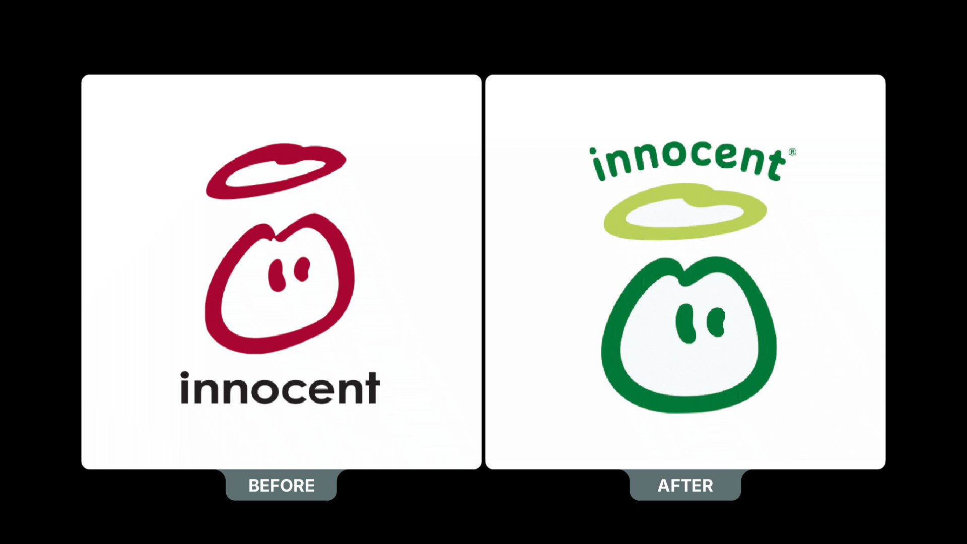
Examples: Famous Logos That Use Optical Balance
- Nike Swoosh
- Not mathematically centered under the “Nike” wordmark
- Adjusted to feel dynamic and forward-moving
- Airbnb “Bélo” Symbol
- The curves are carefully tuned to balance within a square space
- Not symmetrical, but feels stable and friendly
- Apple
- The bite and leaf create visual asymmetry
- Balanced with negative space and shape proportions
These examples prove that the most recognizable logos aren’t obsessed with perfect geometry—they’re focused on what feels right.
Akrivi Gridit: Helping You Balance with Precision

Designers using Akrivi Gridit inside Adobe Illustrator get access to tools that:
- Instantly generate lockup grids
- Provide repeatable frameworks
- Keep spacing consistent across identity elements
- Support optical balance adjustments, do not override them
You can start with our free scripts:
Or upgrade to the Akrivi Gridit Membership for:
- Full access to advanced grid generators
- Ongoing updates and tools for efficiency
- Workflow systems trusted by top identity designers
Free download available — Get it here
How to Train Your Eye for Optical Balance

Designers using Akrivi Gridit inside Adobe Illustrator get access to tools that:
Zoom Out
Look at your logo at multiple scales. Does it still feel centered?
Flip Horizontally
Seeing your logo in reverse often highlights an imbalance you didn’t notice.
Test on Multiple Backgrounds
Visual weight shifts depending on color contrast. Make sure your design holds up across light/dark applications.
Overlay It
Use a grid generator to compare your design with classic proportions—golden ratio, square, isometric—and see what feels more balanced.
Use Feedback
Sometimes other designers or clients will sense an issue but can’t name it. Train yourself to identify what “feels off” and why.
Bonus: A Free eBook on Mastering Logo Grids
To help you build logos that are both optically balanced and structurally sound, we’ve created a free eBook:
'The Ultimate Guide to Logo Grids'
Inside, you'll find:
- Grid theory breakdowns
- Step-by-step Illustrator tutorials
- Tips for achieving precision
- Common mistakes and how to avoid them

Final Thoughts: The Balance Between Structure & Intuition
After years of designing logos and identity systems, I’ve learned that great logos aren’t just built on grids — they’re shaped by instinct.
Optical balance is one of the most powerful tools in a designer’s toolkit, even though most people can’t put their finger on it.
From flipping your logo horizontally to testing it at different sizes and backgrounds — these small techniques can have a huge impact.
They help you go beyond what looks mathematically correct and create something that feels right.
So don’t ignore your eye. Use structure to guide your creativity — not replace it. And keep refining your process until your logos not only look good, but feel balanced, intentional, and built to last.

On a mission to simplify brand identity design, I build tools and workflows that help designers work faster, smarter, and with more precision—minus the friction.
Subscribe to the Akrivi Newsletter
for the latest insights & tools
Featured blogs
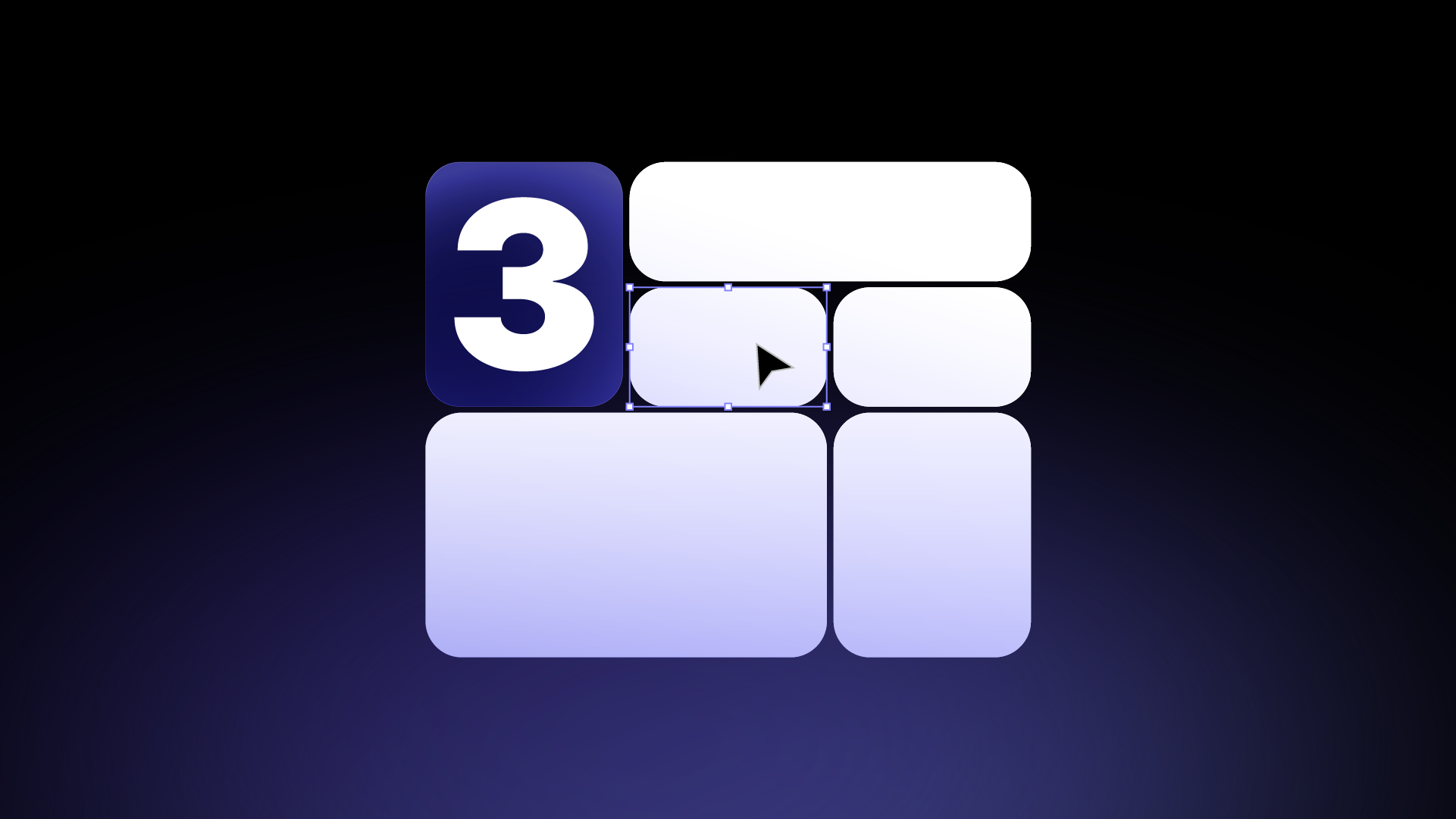
3 Ways to create Bento Grids in Adobe Illustrator
Bento Grids are everywhere these days – from slick web layouts to impressive presentation slides and captivating social media visuals. Their clean, organized aesthetic helps content shine, establishes clear hierarchy, and just looks incredibly professional.