Kwaku Amprako is a logo and brand identity designer, educator, and founder of Akrivi — pioneering BIDA (Brand Identity Design Automation) to empower designers to create with more speed, precision, and less stress.
The Ultimate Logo & Brand Identity Glossary: 57 Key Terms Explained
Master the language of logo and brand identity design with this easy-to-use glossary of essential terms.
In design, speaking the right language is half the battle. Whether you're talking with clients or collaborating with other designers, using the right terms builds confidence and ensures everyone is on the same page.
To help you master this language, I've put together a simple glossary of the most important terms in logo and brand identity design. Think of this as your go-to cheat sheet.
The Glossary
A
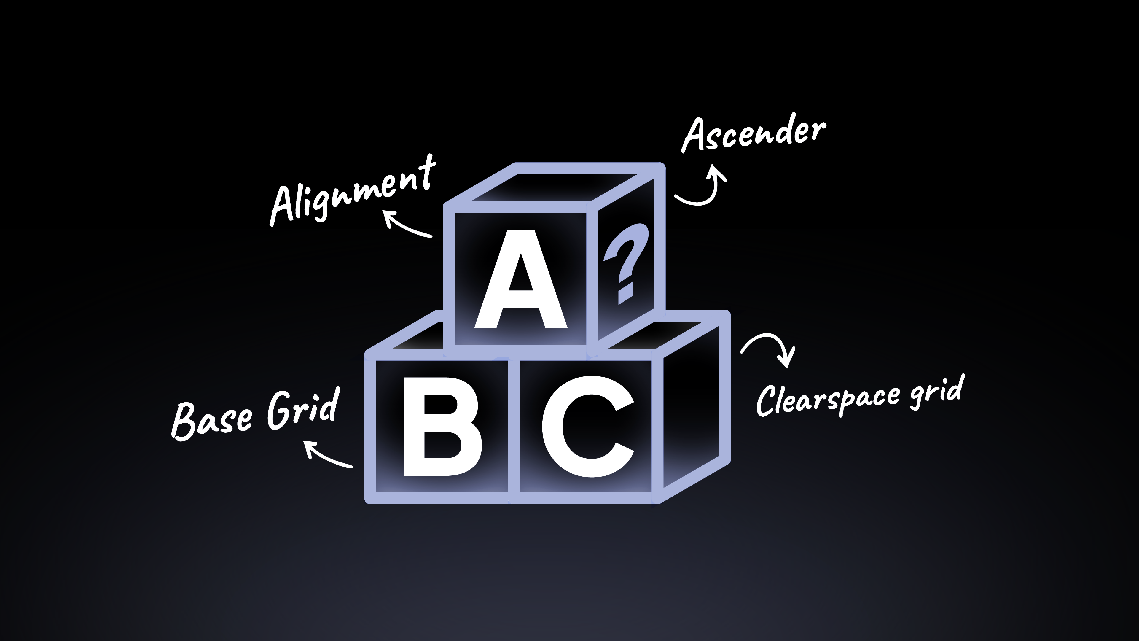
- Alignment: The arrangement of elements in a straight line or in a correct relative position. It’s a fundamental principle for creating clean, organized designs.
- Application: How a logo or brand identity is used in the real world, such as on a website, business card, or social media post.
- Ascender: The part of a lowercase letter that extends above the main body of the letter (the x-height), like in 'b' or 'h'.
B
- Balance: The distribution of visual weight in a design. A balanced logo feels stable and harmonious.
- Base Grid: A foundational grid (like a square or isometric grid) used at the very beginning of the logo design process to guide initial proportions and structure. Grid Generator can create base grids instantly.
- Baseline: The invisible line upon which a line of text rests.
- Bleed: The area of a design that extends beyond the trim edge of a printed page. This ensures no white edges appear after cutting.
- Body Copy: The main text of a document or publication.
- Brand: The overall perception and emotional connection a person has with a company, product, or service.
- Brand Guidelines (or Brand Book): A document that sets the rules for how a brand should be presented. It includes rules for the logo, color palette, typography, and more.
- Brand Identity: The collection of all visual elements that a company creates to portray its image to the public. It's how the brand looks.
- Branding: The process of creating and shaping a brand in the minds of consumers.
C
- Cap Height: The height of a capital letter above the baseline in a typeface.
- Clearspace Grid: A specific type of grid that defines the clear space, your logo's personal bodyguard! It's the minimum empty space you must keep around a logo, ensuring it always looks clean and professional. When clients understand this, they instantly see the value of a well-managed brand.
- CMYK: The color model used for print design, based on Cyan, Magenta, Yellow, and Key (Black).
- Co-branding: When two or more brands collaborate on a product or marketing campaign.
- Color Palette: The specific set of colors chosen to represent a brand's identity.
- Color Psychology: The study of how colors affect human emotions and perceptions. It’s a key part of choosing a brand's color palette.
- Combination Mark: One of the most common types of logos, where a logomark (symbol) and logotype (text) are combined into one design.
- Concept Statement: A short, written description that explains the core idea and strategy behind a logo design.
- Construction Grid: A detailed grid used after a logo is designed to refine its vector paths, curves, and anchor points for pixel-perfect precision. Logo Grid Generator can create construction grids instantly.
- Contrast: The difference between elements in a design that makes them stand out from each other.
- Corporate Assets: The various materials used to promote a company, such as business cards, letterheads, and brochures.
D
- Descender: The part of a lowercase letter that extends below the baseline, like in 'p' or 'g'.
- DPI (Dots Per Inch): A measure of resolution for printed images. Higher DPI generally means higher quality.
E
- Emblem: A type of logo where the company name is integrated into the symbol, like a badge or crest.
F
- Favicon: A small icon that represents a website in a browser tab.
- Font: A specific style within a typeface, such as "Helvetica Bold 12pt."
G
- GIF: An image file format that supports both static and animated images.
- Gradient: A gradual blend between two or more colors.
- Graphic Elements: The distinctive visual components of a brand identity beyond the logo, such as patterns, textures, or shapes.
- Greyscale: A version of an image or logo that only uses shades of grey.
H
- Hex Code: A six-digit code used to represent a specific color in digital design (e.g., #FFFFFF for white).
- Hierarchy: The arrangement of design elements to show their order of importance.
I
- Iconography: The set of custom icons used as part of a brand's visual language to represent actions or concepts.
- Ideation: The creative process of generating, developing, and communicating new ideas.
- Identity System: The complete collection of a brand's visual identity components, designed to work together as a cohesive system.
- Illustrations: Custom drawings or artwork that are part of a brand's visual identity.
- Infographics: Visual representations of information or data, often used in brand marketing.
J
- JPEG: A common image file format used for photographs. It is a raster file type.
K
- Kerning: My personal favorite! This is the process of adjusting the space between individual letters to create a visually harmonious result. Getting this right is a sign of a true pro.
L
- Layout System: A structured framework (like a grid) that governs how elements are arranged in a design, ensuring consistency.
- Leading: The vertical space between lines of text.
- Ligature: Two or more letters that are joined together as a single character (e.g., 'fi' or 'ae').
- Logo: A visual symbol that identifies a brand. This is one of the most confusing terms for designers and clients, but it's simple: the logo is the overall mark. It can be just a symbol, just text, or both.
- Logo Design: The process of creating a visual mark that represents a brand.
- Logo Drafts (or Vector Concepts): The early digital versions of a logo concept, created in a program like Adobe Illustrator.
- Logo Grids: The overall system of grids used to create balanced and precise logos. This includes base, construction, lockup, and clearspace grids.
- Lockup Grid: A grid used to define the specific arrangement and spacing of your logomark and logotype in a lockup.
- Logomark (or Brandmark): The icon or symbol part of a logo (e.g., the Apple, the Nike swoosh).
- Logotype (or Wordmark): The text-based part of a logo, where the brand name is designed in a specific style (e.g., the Google text, the Coca-Cola script).
- Lockups: The specific arrangements of your logomark and logotype.
M
- Margin: The empty space between the main content and the edge of a page or container.
- Merchandise: Products created for a brand to sell or give away, such as t-shirts, mugs, or pens.
- Mockup: A realistic visual representation of how a logo or design will look in a real-world context, such as on a sign, a phone screen, or a t-shirt.
- Monogram: A logo made from the initials of a brand name.
- Moodboard: A collection of images, colors, and textures used to define the overall look and feel of a brand's visual direction.
N
- Negative Space: The empty space around and between the elements of a design. It's just as important as the elements themselves!
O
- Orphan: A single word or short line left by itself at the bottom of a paragraph. It's generally considered bad typography.
P
- Pantone (PMS): A standardized color matching system used in printing to ensure color accuracy.
- PDF: A versatile file format that can contain both vector and raster graphics, commonly used for sending proofs to clients.
- Pixel: The smallest single point of color on a digital screen. Raster images are made of pixels.
- PNG: An image file format that supports transparent backgrounds. It is a raster file type.
R
- Raster: An image made of pixels (like a JPEG or PNG). It can lose quality when scaled up.
- Readability: How easily a reader can understand text based on its presentation.
- Resolution: The level of detail in a raster image, usually measured in DPI.
- RGB: The color model used for digital screens, based on Red, Green, and Blue light.
- Rule of Thirds: A design principle that divides a composition into nine equal parts, with important elements placed along these lines or their intersections.
S
- Sans-Serif: A typeface that does not have the small projecting lines (serifs) at the ends of its strokes.
- Saturation: The intensity or purity of a color.
- Scale: The relative size of objects in a design.
- Serif: A typeface with small projecting lines at the ends of its strokes.
- Sketches: The initial, rough hand-drawn ideas for a logo, usually done with pen and paper.
- Stylescape: A curated, in-depth version of a moodboard that shows a brand's visual direction in a more applied, real-world context.
- SVG: A vector file format commonly used for logos and icons on the web. It is scalable without losing quality.
- Symbol: A simple mark or icon that represents an idea or object. Often used interchangeably with Logomark.
T
- Tagline: A short, memorable phrase that accompanies a logo to communicate a brand's mission or value.
- Tracking: The adjustment of space between a group of letters or an entire block of text.
- Typeface: A family of related fonts (e.g., Helvetica Regular, Helvetica Bold, Helvetica Italic).
- Typography: The art and technique of arranging type to make written language legible, readable, and appealing.
V
- Vector: An image made of mathematical paths (like an AI or SVG file). It can be scaled to any size without losing quality.
- Visual Direction: The overall aesthetic and creative path for a brand's identity, often defined by a moodboard or stylescape.
W
- Watermark: A transparent logo or text placed over an image to mark it as proprietary.
- Weight: The thickness of the strokes in a typeface (e.g., Light, Regular, Bold).
- White Space: The unmarked space in a design. It's a key element for creating clean, uncluttered layouts.
- Widow: A single word or short line left by itself at the top of a new column or page. It's also considered bad typography.
X
- X-Height: The height of the lowercase letters in a typeface, not including ascenders or descenders.
Want to Keep Learning?
Mastering these terms is a huge step in becoming a more confident designer. If you want to keep learning and get more tips, tutorials, and insights like this, join my newsletter.
I share my best advice to help you elevate your design skills. So subscribe to my newsletters.
Conclusion
Knowing these terms will help you communicate with more confidence and precision. Bookmark this page and use it as your go-to guide.