The all-in-one automation suite for brand identity designers
Deliver flawless
Everything you need, in one poweful suite


7 Most Common Logo Mistakes
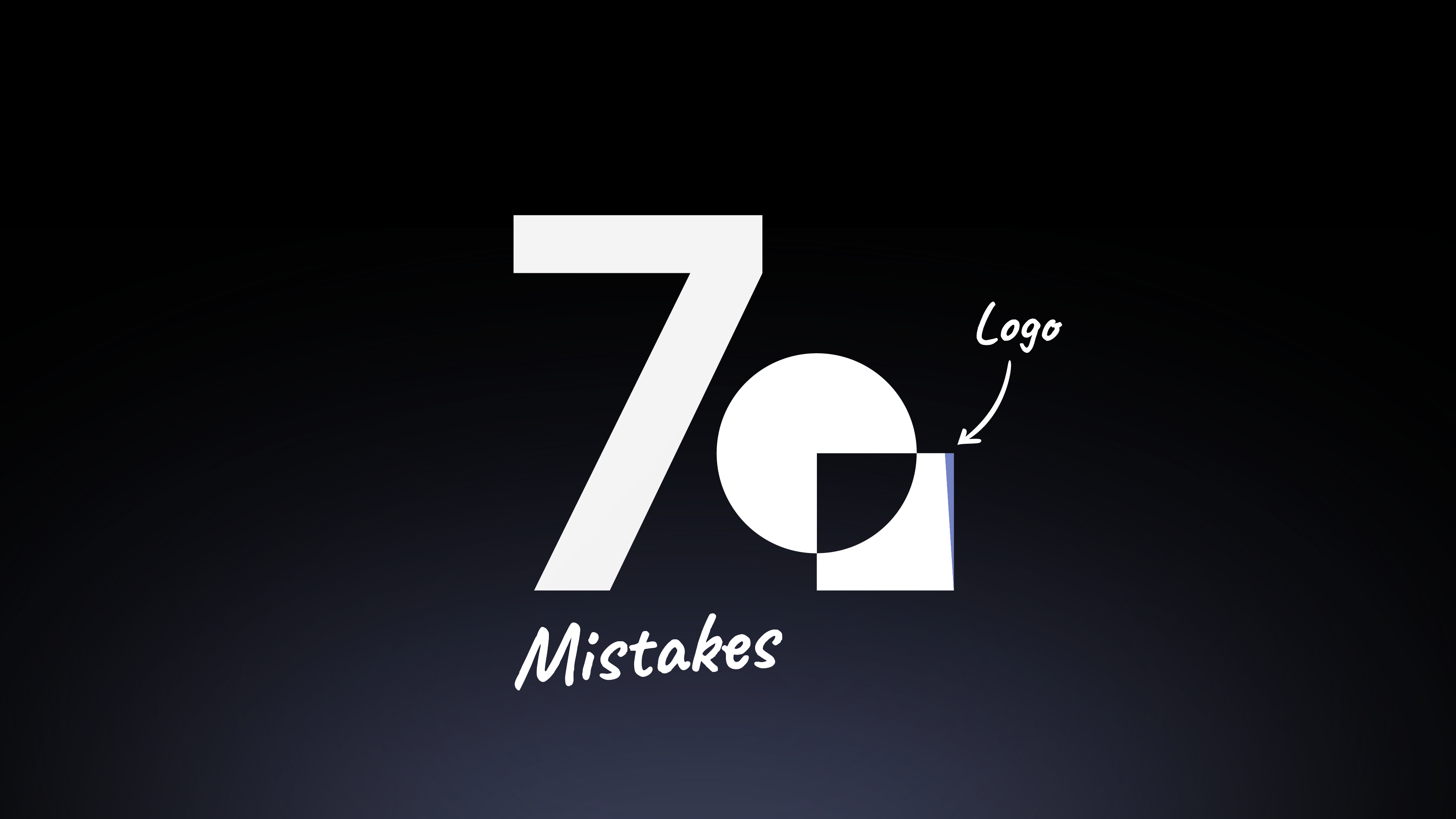
Think your logo’s ready to present? Here are 7 logo design mistakes to avoid before showing it to your client.
I've been designing logos for almost 10 years, and I've seen it all. We all make mistakes, especially early on. Your goal isn't to be perfect, but to learn from them.
I'm sharing the most common logo mistakes I see designers make. Avoiding these will save you from awkward client conversations and help you create truly professional work.
Think of this as your final checklist before you even think about showing your work.
The 7 Most Common Logo Mistakes
1. Skipping the Research Phase
I think this is the most painful mistake a designer can make. It leads to two nightmare scenarios for you and your client. First, you might create a logo that looks like an existing mark for another brand because you didn't do thorough research.
Even worse, you might not see that your design looks like something inappropriate. An unintended shape that resembles a sensitive object can destroy a brand's credibility.
Now, imagine presenting either of these things to your client. It's a disaster that proper research can easily prevent.
2. Overcomplicating Your Design
When I first started, I tried to merge too many elements into one mark. The result was often a cluttered and confusing logo. A great logo should be simple and memorable.
An overly complex design is hard for your audience to recognize and even harder to reproduce. If your logo has too many tiny details, it will lose its impact when scaled down.
Always ask yourself: "What can I remove from this design?"
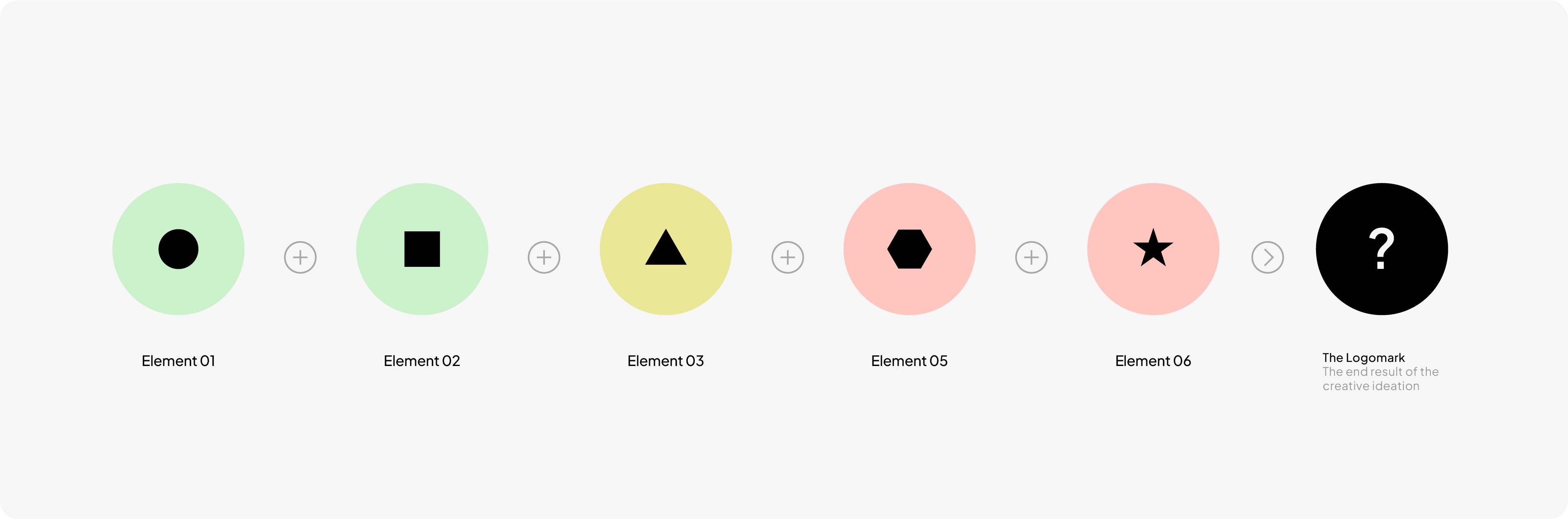
3. Not Using Grids

When I started designing, I wasn't using grids. Bad move. My work didn't look professional. It was full of tiny details that were impossible to reproduce accurately.
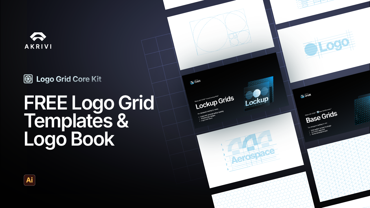
I see some people saying, “not all logos need grid systems,” but that’s not true. All your logos will benefit from a logo grid system. You just need to use the right type at the right time. Grids ensure your designs have consistency, balance, and scalability. Logo Grid Generator can create construction grids instantly.
To truly understand this, I’ve written a detailed article on what logo grids are.
4. Neglecting Your Kerning

This is a subtle mistake that seasoned pros will spot immediately. Kerning is the process of adjusting the space between individual letters to create a visually harmonious result. Bad kerning makes your logotype look awkward and unprofessional.
Take the time to manually adjust your kerning. Don't just rely on the default font settings. Perfecting this detail is a sign of a true pro and will elevate the quality of your work.
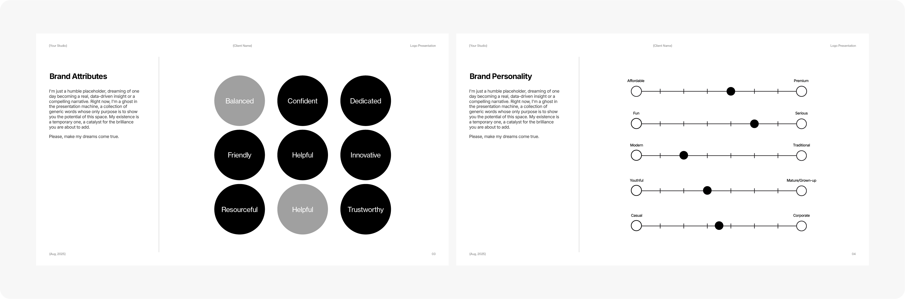
5. Ignoring Typography and Alignment
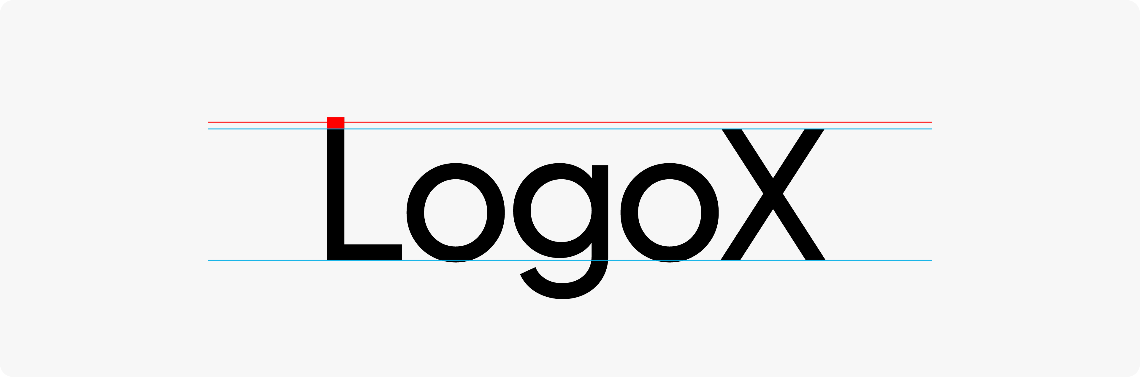
This is another subtle but crucial mistake, especially with custom-made wordmarks. Where your Uppercase letters do not have the same cap-height or lowercase shorten, but without a grid, they can be slightly off.
This shows a lack of professional polish. Using a construction grid is the best way to catch and fix these tiny alignment errors before you present to a client.
6. Creating Imperfect Geometry

This is closely related to not using a grid. If your logo is supposed to have a perfect circle or square, but it's slightly distorted, it looks unprofessional. This often happens when you eyeball it.
A lack of a grid can cause you to offset your shapes, making them imperfect. This is another one of those tiny errors that signals a lack of professional polish and care. Discover how Gridit can generate foundation grids instantly
7. Forgetting About Scalability

This ties back to overcomplicating your design. Your logo must work everywhere, from a tiny favicon to a massive billboard. If your design relies on thin lines, small text, or intricate details, it will turn into an illegible smudge at small sizes.
Always test your logo at various sizes during the design process. Zoom way out. Is it still readable? If not, you need to simplify your design.
Build Logos the Right Way
Now that you know the pitfalls to avoid, you can build your logos with more confidence. One of the best ways to start is by mastering your grids, which is why I've put together a FREE logo grid template for you.
It's part of our Logo Grid Core Kit and has everything you need to build with a strong foundation. Discover other automation tools that Gridit offers. For even more tips and tutorials like this, you can also join my newsletter.
Conclusion
Avoiding these common logo mistakes is what separates amateur work from professional design. Every designer makes mistakes, but the great ones learn from them. Keep practicing, stay mindful of these pitfalls, and your work will show it.