The all-in-one automation suite for brand identity designers
Deliver flawless
Everything you need, in one poweful suite


How Do You Know What Logo Grid to Use Before Designing a Logo
Learn how to choose the right grid for your logo before you even start designing.
You’re staring at a blank artboard, ready to start a new logo. You know you should use a grid, but which one?
While grids are the strong foundation of every great logo process, they can also become a creative trap if chosen without intention. The question of what logo grid to use is a strategic one. It's not about what looks cool; it's about what best serves the brand's goals.
When I start a project, my first thought isn't about technicals. It's about, "What kind of feeling do I want this logo to have for the target audience?" This question guides everything, including your grid choice.
I'll walk you through how I choose the right grid to set the perfect foundation for my logo designs.
Before the Grid: Start with the Brand's Personality
Your grid choice should directly reflect the brand's personality and values. Are they modern and techy, or classic and elegant? Are they playful and organic, or structured and serious?
The "feeling" you want to create dictates the "form" your logo will take. A grid is the first step in defining that form.
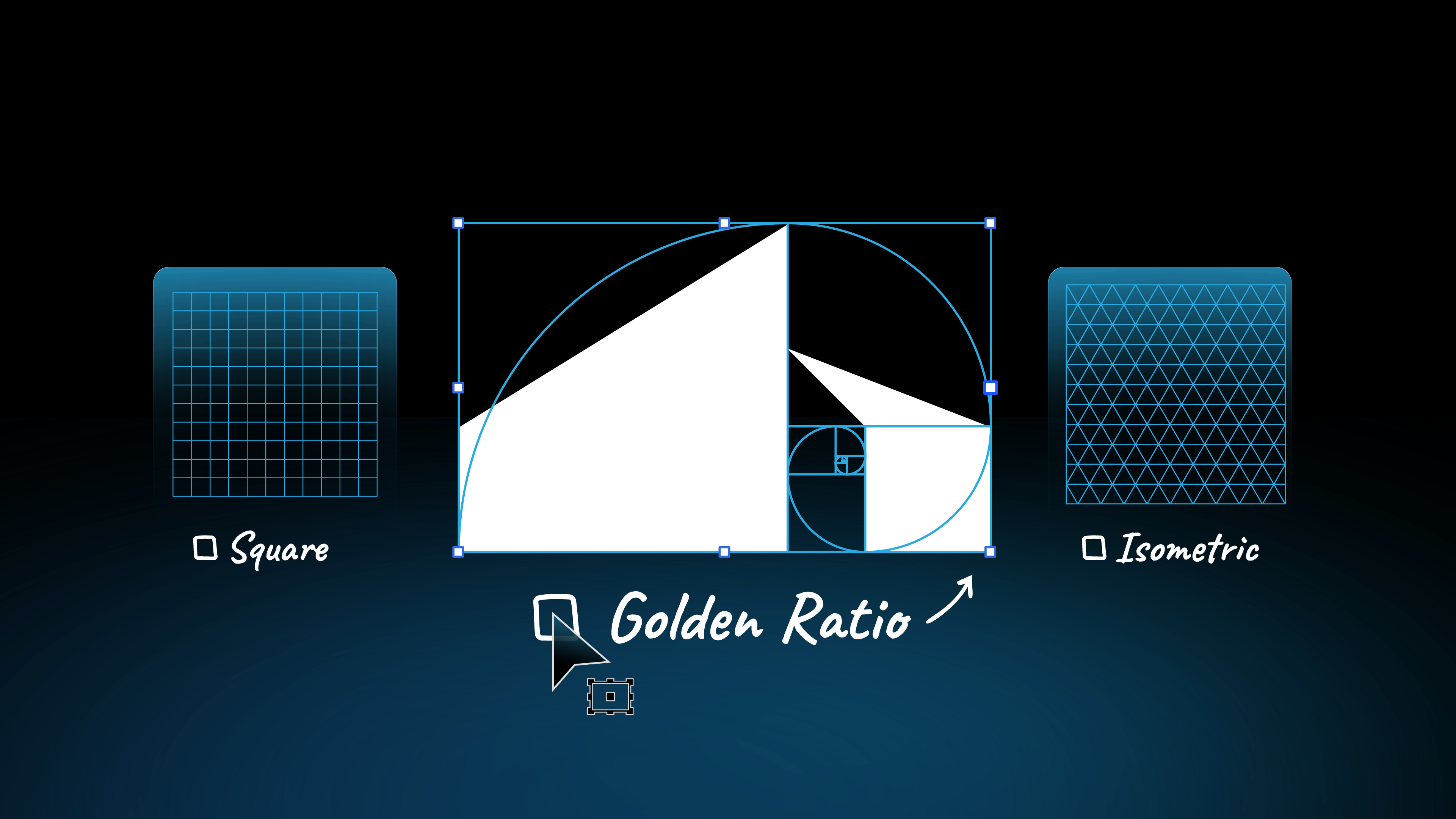
To understand the different types of grids we'll be discussing, you can read my guide on the four main types of logo grids.
The "Golden Ratio Trap" (A Common Mistake)
I see many designers, especially when they're starting out, who feel married to the idea of using the golden ratio grid for everything. The reality is, the golden ratio is a powerful tool, but it's not a magic bullet for every logo.
Forcing a design into a grid that doesn't fit its personality can actually harm the final result. The best grid is the one that supports your creative vision, not the one that's the most complex or trendy. Don't let the grid become a cage.
Discover how you can automate your logo grids.
Choosing Your Grid: A Guide to Different Foundations
Here’s how I match a grid to a brand’s personality:
The Square Grid: For Stability and Modernism
- When I use it: When a brand needs to feel stable, reliable, and modern.
- Brand Personality: Tech companies, financial institutions, construction brands.
- Why it works: Its clean, predictable structure communicates order and trustworthiness.
The Isometric Grid: For Tech, Dimension, and Innovation
- When I use it: For brands that are forward-thinking, innovative, and want to show a sense of dimension.
- Brand Personality: SaaS companies, gaming studios, modern architecture firms.
- Why it works: It creates a 3D-like effect, perfect for conveying concepts of structure, technology, or modularity.

The Golden Ratio Grid: For Elegance and Natural Harmony
- When I use it: When a brand wants to convey elegance, natural beauty, or a timeless quality.
- Brand Personality: Luxury brands, high-end beauty products, art institutions.
- Why it works: Its proportions are naturally pleasing to the human eye, creating a sense of organic perfection.

The Hex Grid: For Modularity and Connection
- When I use it: When a brand needs to communicate modularity, connection, or a futuristic, tech-savvy feel.
- Brand Personality: Tech startups, blockchain companies, science or engineering firms, and innovative brands.
- Why it works: Its repeating geometric pattern creates a sense of rhythm, connection, and high-tech precision. It's a visually dynamic way to build complex, modular marks.

No Grid at All: For Organic and Expressive Brands
- When I use it: Sometimes, the best grid is no grid! For logos that are highly illustrative, hand-drawn, or need to feel completely organic and free-flowing.
- Brand Personality: Artisanal food brands, artists, children's brands.
- Why it works: It allows for a level of expression and personality that a rigid grid might constrain.
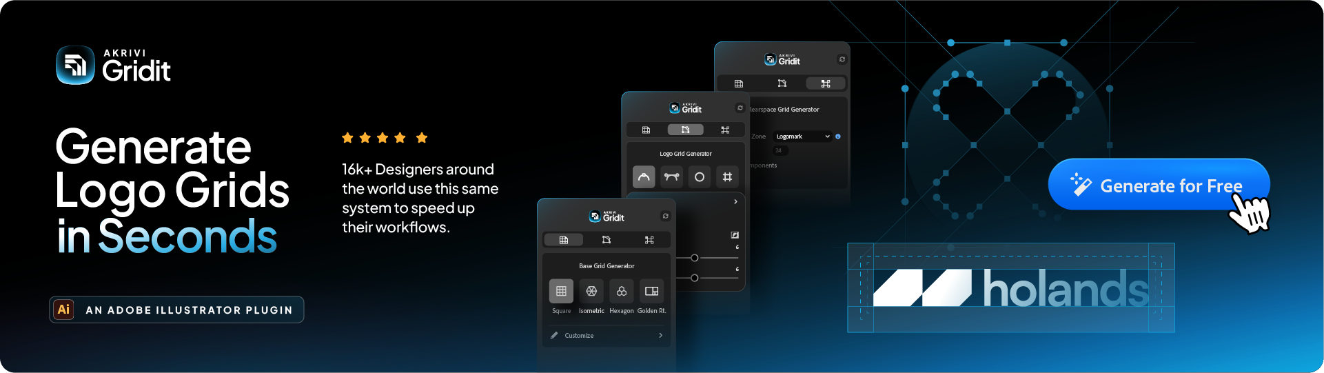
Generate Base Grids in Illustrator
Once you've decided on the "feeling" for your logo, you can quickly bring it to life.
Base Grid Generator™, an Adobe Illustrator plugin, instantly creates these different foundational grids for you. It saves you the manual setup time, so you can focus on the creative part: the actual design.
Ready to Start with the Right Foundation?
Now that you know how to choose the right grid for your project, you can put it into practice. To help you build with a strong foundation, I've put together a FREE logo grid template.
Conclusion
Choosing what logo grid to use is a strategic decision. It's driven by the brand's personality and the feeling you want to convey. Start with the "why" and the "feeling," and the right grid will follow. Trust your intuition, and use grids as a tool to support your vision, not to trap it.