The all-in-one automation suite for brand identity designers
Works with Adobe Illustrator 2021 - 2026
Deliver flawless
Everything you need, in one poweful suite

Try Akrivi Studio, includes automated templates that generates layouts for you
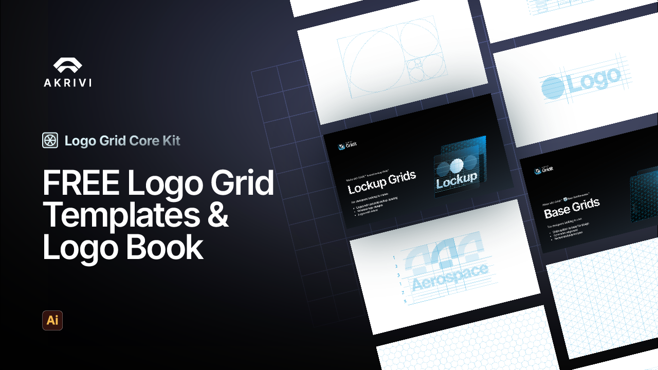
The 4 Types of Logo Grid Systems


Did you know there are 4 types of logo grid systems? Base, Construction, Lockup and Clearspace. Here’s how and when to use them.
After almost a decade of designing logos, there’s one thing I've learned - NEVER SKIP GRIDS.
I use them before, during and after I design. They’re like the unsung heroes behind every professional logo.
But here’s the strange part: no one talks about the different types of logo grids. It’s all “use a grid”, like that explains everything. I started wondering, why doesn’t anyone name these things? So, I did.
I recently answered ‘what is a logo grid?’ and WHY designers should use them.
But in this post, I’ll explain the 4 different types of logo grids and WHEN to use them.
Along with the tools that can help you create them 10x faster, and with serious precision.
1. Base Logo Grid
Use it before you design.
Purpose: structure, consistency, geometric peace of mind.
A Base Grid is your starting point, like stretching before a marathon, but for logos. It gives your design structure and makes it look well crafted.
You’ll usually see:
- Square grids (your basic bestie)
- Isometric grids (for when you’re feeling edgy)
- Hex grids (for that futuristic vibe)
- Golden ratio grids (if you want to impress clients and mathematicians alike)
These grids help with:
- Keeping your logo balanced and repeatable
- Minimizing wonky shapes and eyeball guesstimates
- Making you look like you had a plan from the start
Tools:
- Gridit Base Grid Generator can create multiple different base grids on your artboards (Adobe Illustrator Extension)
- Instant Isometric Grid can create isometric base grids (Adobe Illustrator Script)
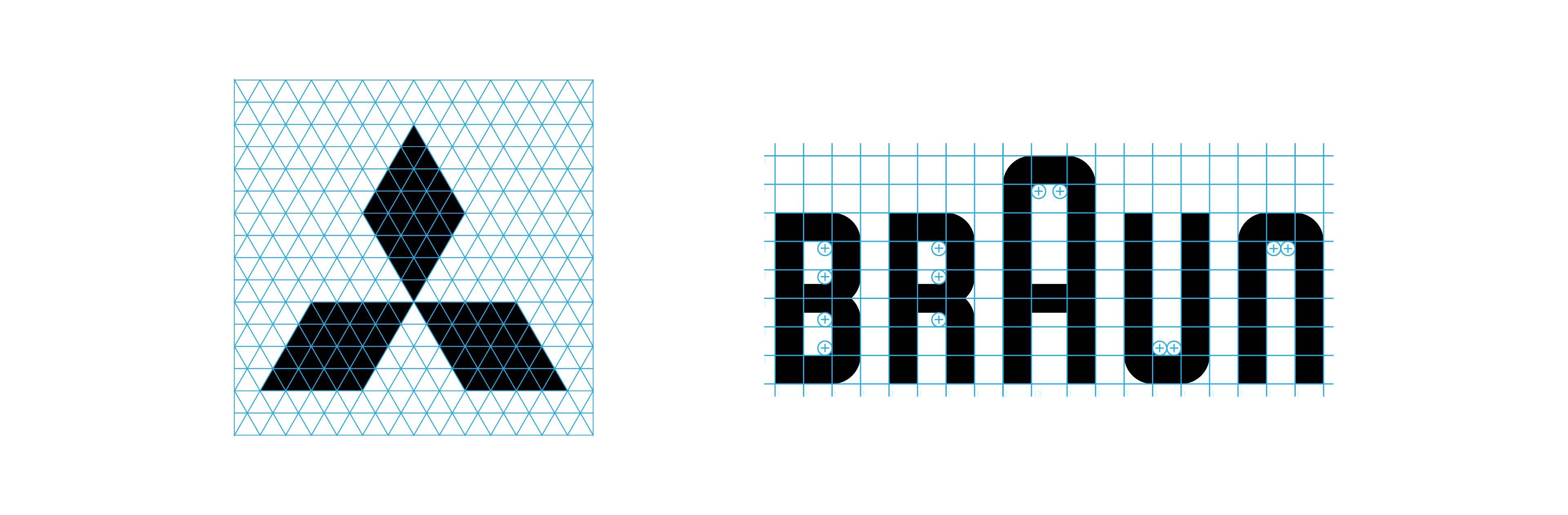
2. Construction Logo Grid
Use it after you design.
Purpose: pixel-perfect polish and “how is this so perfect?” energy.
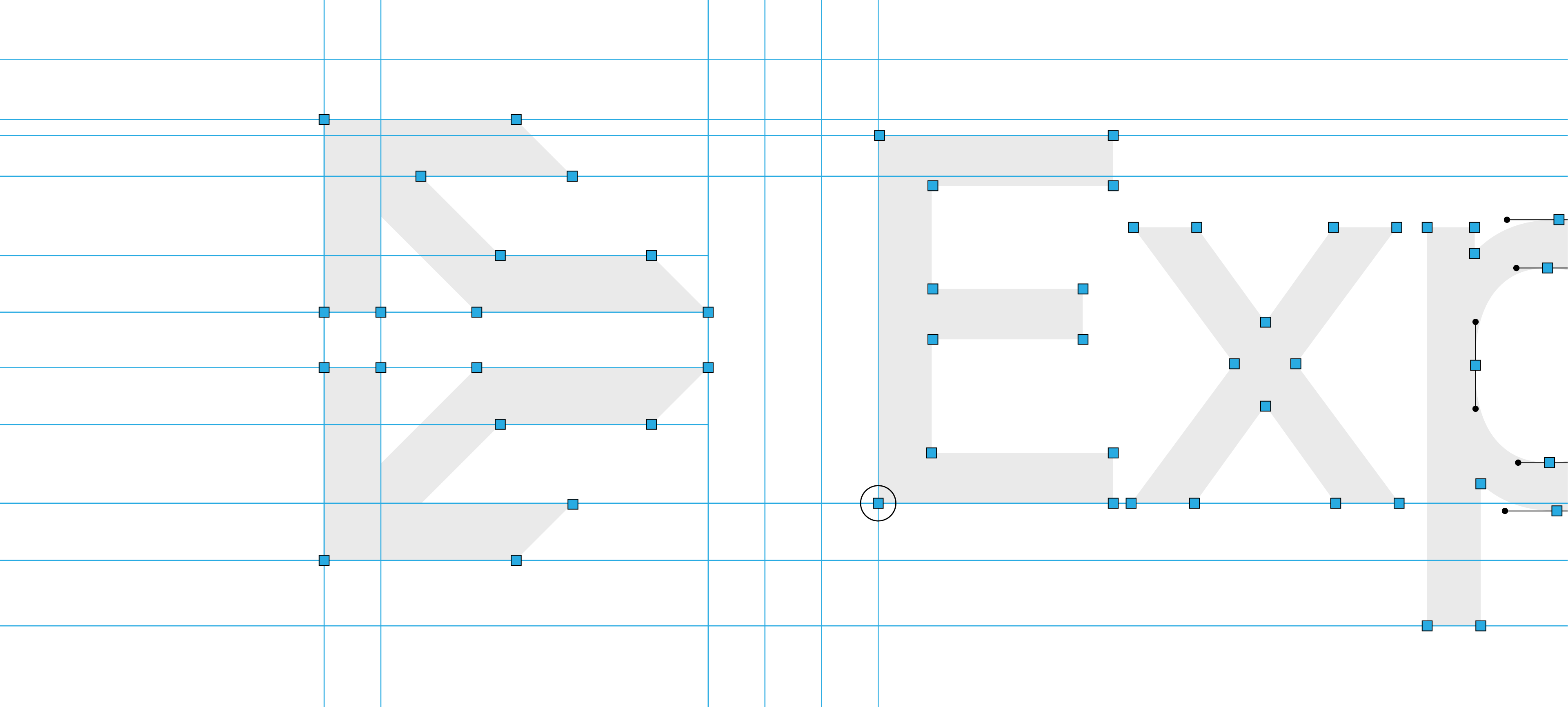
This one’s your secret weapon before presenting the logo to a client. A Construction Grid helps you spot any mistakes like uneven lines or things that don’t line up.
Think of it like your logo going through final inspection.
A construction grid reveals the anchors, handles, outlines, and gridlines in your logo to help you check for mistakes.
The issue with this type of grid is that it can take 30–60 minutes per logo (yes, really).
Or you could use Logo Grid Generator™ and get it done before your coffee gets cold.
Use this grid for:
- Vector blueprint clarity – Spot structural mistakes before your client does and refine with confidence
- Detailed gridlines – Ensure shapes, angles, and elements are perfectly aligned and balanced
- Visual spacing guide – Check spacing between elements to maintain optical consistency
- Refinement layer – Use it at the end of your process to clean up curves, edges, and proportions
- Presentation-ready polish – Add a professional layer of structure to impress clients and justify design decisions
- Error-proofing – Helps avoid feedback like “can we tweak the spacing?” by showing you’ve already addressed it
Tools:
- Gridit Logo Grid Generator can instantly create construction grids, revealing anchors, handles, outlines and gridlines for your logos (Adobe Illustrator Extension)
- Logo Grid Generator Lite can also do the same, although it gives you limited customisation options.
3. Lockup Logo Grid
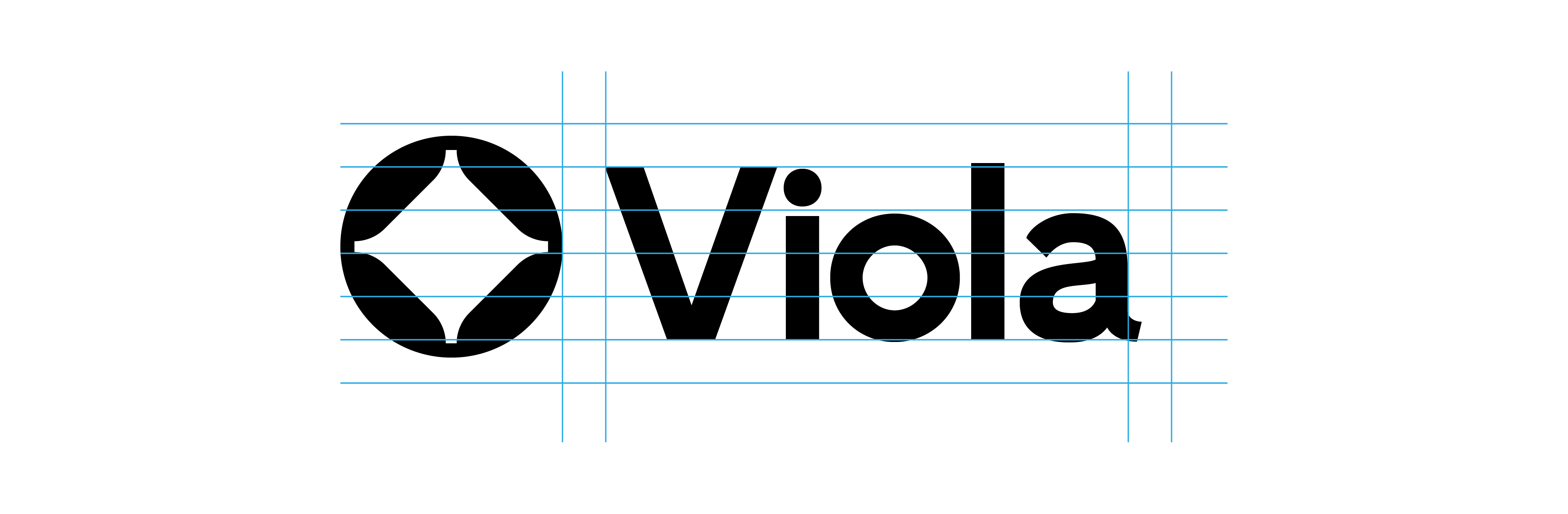
Use it to pair logomarks and logotypes like a pro.
Purpose: harmony and hierarchy.
You’ve got your logo mark. You’ve got your logotype. But how do you stack, align, or pair them without eyeballing it and hoping for the best?
Thats why Lockup Grids are a lifesaver.
Lockup grids help your logo and text line up, no matter the layout.
These grids use techniques like the rule of thirds to:
- Keep spacing consistent between mark and type
- Make your layouts feel intentional, not improvised
- Avoid the “Oops, that looks of-center” email from clients
Tools:
- Lockup Grids Script Pack gives you the ability to generate lockup grid systems, to help you balace your horizontal and vertical logos (Adobe Illustrator Script)
- Gridit Lockup Grid Generator will be coming soon and added inside Akrivi Studio
4. Clearspace Logo Grid
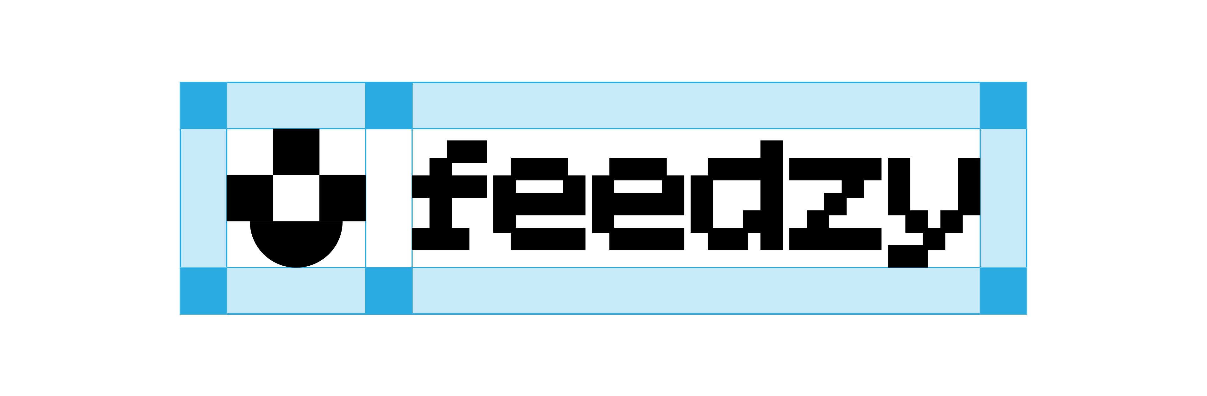
Use it when the logo’s final.
Purpose: protect your logo’s personal space like a bodyguard.
Ever seen a great logo cramped in the corner of a poster, smushed next to some other design element like it owes rent? Yeah, don’t be that designer.
A Clearspace Grid defines how much breathing room your logo needs. It’s the buffer zone that keeps it legible across all platforms.
The clearspace around the logo marked with numbers or the letter X, is the ‘exclusion zone’. This is where no elements should be inside.
Usually shown in logo presentations and brand guidelines, it tells clients:
- “Hey, don’t put text right here.”
- “Yes, the logo does need this much space.”
- “Trust me, it looks better this way.”
Tools:
- Clearspace Grid Generator enables you to instantly generate clearspace grids for your logomarks, logotypes and wordmarks (Adobe Illustrator Extension)
Conclusion
Most designers talk about a logo grid like it’s a one-size-fits-all solution. It’s not.
It’s more like a toolbox, and you need to know which tool to pull out at each stage of the logo design process.
Let’s recap:
- Base Grid – Used at the start of the logo design process to create geometric structure and balance.
- Construction Grid – Applied after designing the logo to refine curves, alignment, and spacing.
- Lockup Grid – Helps align the logomark and logotype with optical balance and consistent spacing.
- Clearspace Grid – Defines the padding and safe space around the logo for legibility and practical use.
Creating logo grids manually takes time. To help, Akrivi offers a few different options depending on what you need:
- Akrivi Studio – Best for professional designers who want the full workflow for creating logo grids, brand guidelines, and presentations faster.
- Logo Grid Generator Lite and Scripts – Best for designers who want a focused one-off tool for specific projects without a subscription.
- Logo Grid Templates – Best for designers who want a free starting point and are happy to build manually.