for your clients 10x faster

Automate your entire logo & brand identity workflow with Akrivi Studio.
5 Best Brand Guidelines Examples in 2026

A curated collection of the best brand guidelines examples across different industries and styles in 2026
Brand identity design doesn't start after creating a logo.
Preparing a brand book/ brand guidelines is one of the most important steps for your clients to use the brand correctly
I believe one of the best ways to learn is by looking at what the pros are doing. This list isn't just for looks. It's to help you learn about effective layouts, what sections to include, and see how top brands maintain consistency.
Let's look at some of the best brand guideline examples setting the standard in 2026.
1. Bolt: The Power of a Quick Guide

Bolt's 2025 refresh is a great example of a simple but effective change. What I love is how they present their identity in a concise, accessible guide for partners. It’s built for speed and clarity, and the bento grid at the end is a perfect way to summarize everything.
Key Takeaway for You: Your brand guide doesn't need to be 100 pages. A clear, direct guide for partners that gets straight to the point can be incredibly effective.
Akrivi Guideit's Tech template is heavily inspired by this brand guidelines example.
2. Tripadvisor: Interactive and Vibrant Branding

Tripadvisor's guide is a masterclass in bringing a brand's personality to life. While it's a PDF, it feels interactive and dynamic. The use of vibrant colors and a playful tone is perfectly on-brand, making what could be a dry document an engaging experience.
Key Takeaway for You: Your brand guide should always reflect the brand's personality. If the brand you're designing for is fun and energetic, infuse that feeling into the guide itself. Don't just state the brand's tone of voice, show it in your layout.
A similar corporate brand guidelines style is available to download for free
3. Snapchat: Direct and Easy to Follow

Similar to Bolt, Snapchat's guide is built for partners and is incredibly direct. There's no fluff, just clear rules on the logo suite, color, and typography. It gets straight to the point.
Key Takeaway for You: Clarity is king. When creating guides for external use, your "do's and don'ts" must be impossible to misunderstand.
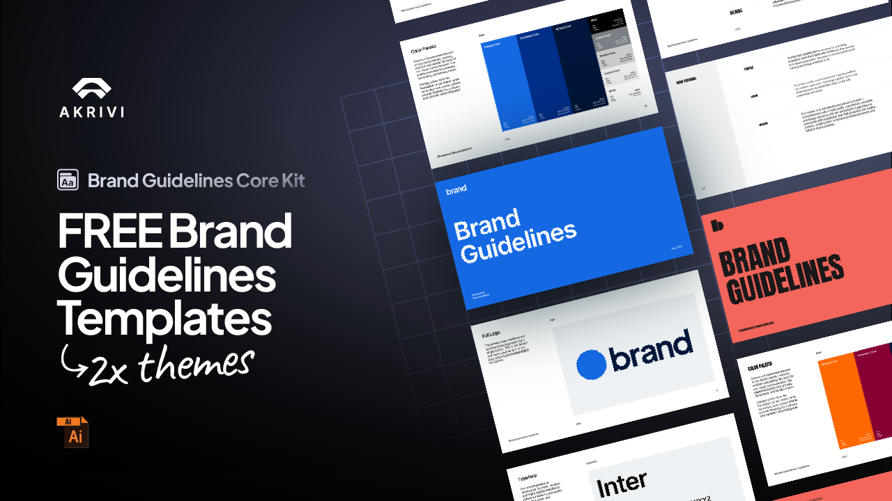
You can also use this brand guidelines example inside this free brand guidelines template kit for Adobe Illustrator.
4. 3MON: Mastering Logo Variations

3MON is a fantastic example of how to handle a brand with many logo lockups. They clearly show the primary badge, symbol alternatives, and exactly how each version should be used, which is crucial for consistency.
Key Takeaway for You: If the brand you're working on has multiple logo variations, you must dedicate a clear section to show how each one works. As you know, this is so important that I've even written a guide on how to balance your logos and their lockups.
5. John Knox Christian School (JKCS): Clean and Focused

The JKCS brand guide is beautifully clean and minimal. The layout gives the brand elements plenty of room to breathe. This provides a really good, clear view of the brand identity.
Key Takeaway for You: Don't be afraid of whitespace. A minimal layout can make a brand feel more confident, premium, and easy to understand.
Generate Brand Guidelines in Seconds
Ready to save hours on your next project? You don't need to build layouts manually.
Create professional brand guidelines in seconds, not hours, with Guideit. It handles the structure, colors, and typography automatically inside Adobe Illustrator.

Conclusion
As you can see, there's no single "right" way to make a brand guide. The best ones are clear, reflect the brand's personality, and make it easy for anyone to maintain consistency.
Use these brand guideline examples as inspiration for your next project, and visit Guideit to learn more on how this process will change forever.


