The all-in-one automation suite for brand identity designers
Works with Adobe Illustrator 2021 - 2026
Deliver flawless
Everything you need, in one poweful suite

Try Akrivi Studio, includes automated templates that generates layouts for you
Using Grid-systems in Logo Design


How I use Grid Systems in My Logo Design Projects
When I was starting out, no one told me about using grids for logo design. My work felt inconsistent and lacked the structure I saw in professional logos. I quickly learned that grids are the key to achieving that next level of precision.
Many designers see grids as restrictive, but that's not true. A grid isn't a cage; it's a foundation. It’s the tool that helps you create balanced, scalable, and professional work with speed.
In this guide, I’m going to walk you through my process using real examples, to show you how these principles work in practice.
Case Study: Qubeon
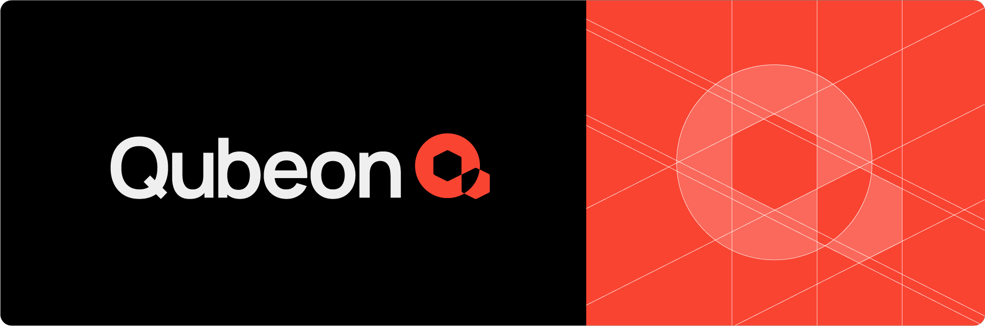
Every great logo starts with a solid foundation. For me, that foundation is almost always a base grid. This is the blueprint I use to build my logos.
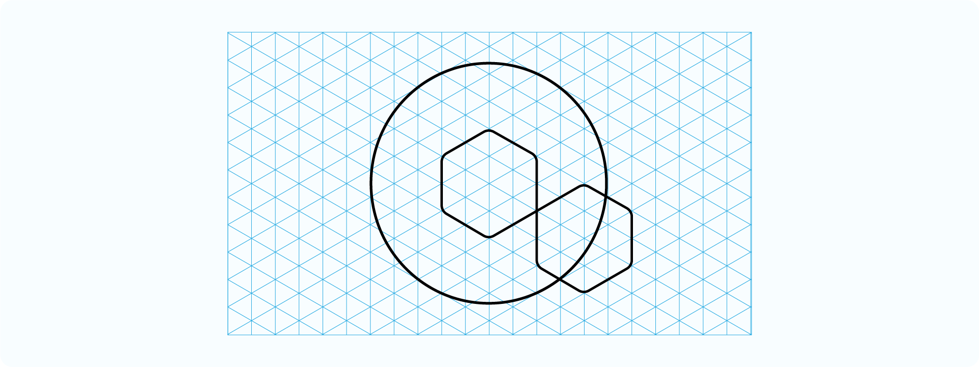
For the Qubeon logo, the concept was about structure, dimension, and connectivity, so an isometric grid was the only choice. It allowed me to build the "Q" form with a sense of three-dimensional space, ensuring every line and angle felt intentional and geometrically perfect. The grid wasn't something I applied after; it was the canvas I built upon.
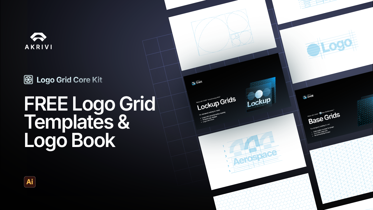
Base Grid Generator can create these foundation grids instantly.
I explain each of these grids in more detail in my article on the 4 types of logo grids every designer should know.
Case Study: Interswitch
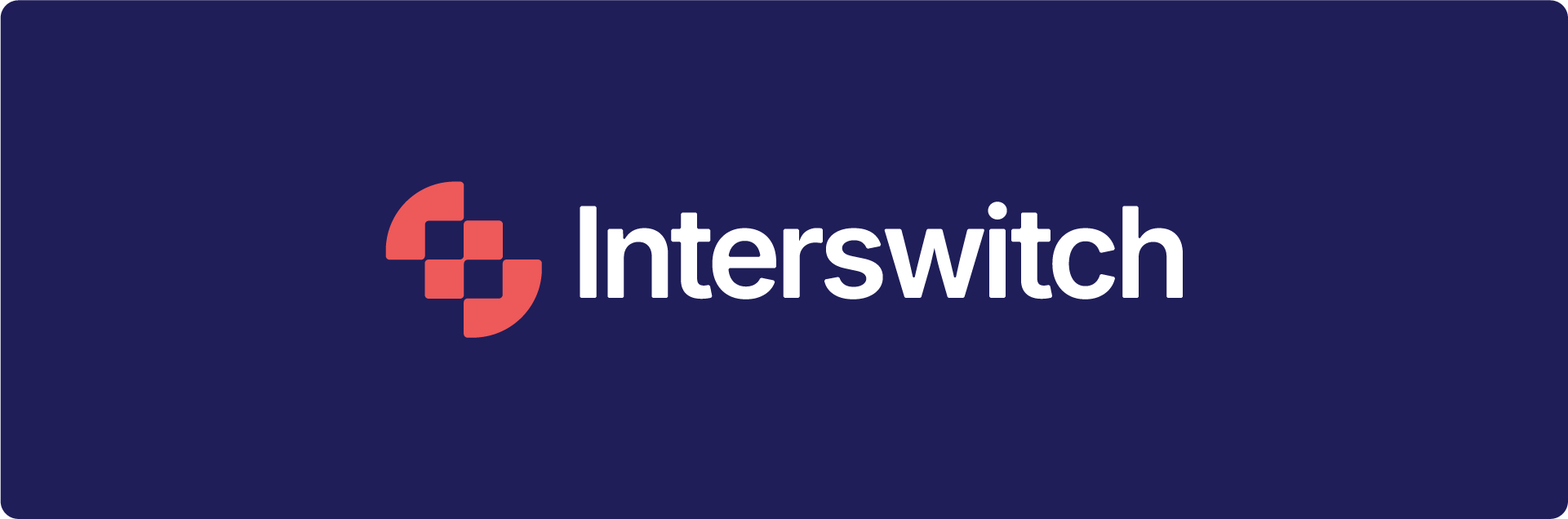
Not every logo needs a complex 3D grid. Sometimes, the goal is about flow and balance. For these projects, I often turn to a simple square grid.
When I redesign my take on the Interswitch logo, the goal was to create a mark that represented a seamless, interlocking connection. I used a simple square grid to build the entire "S" shape. Each curve and line is derived from the proportions of the grid, creating a final form that is perfectly balanced and modular.
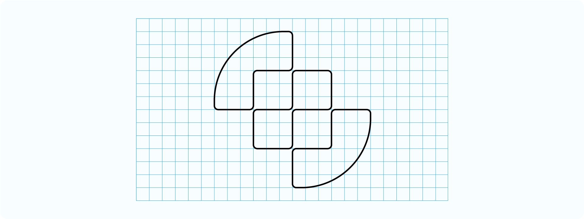
Case Study: Cubeit
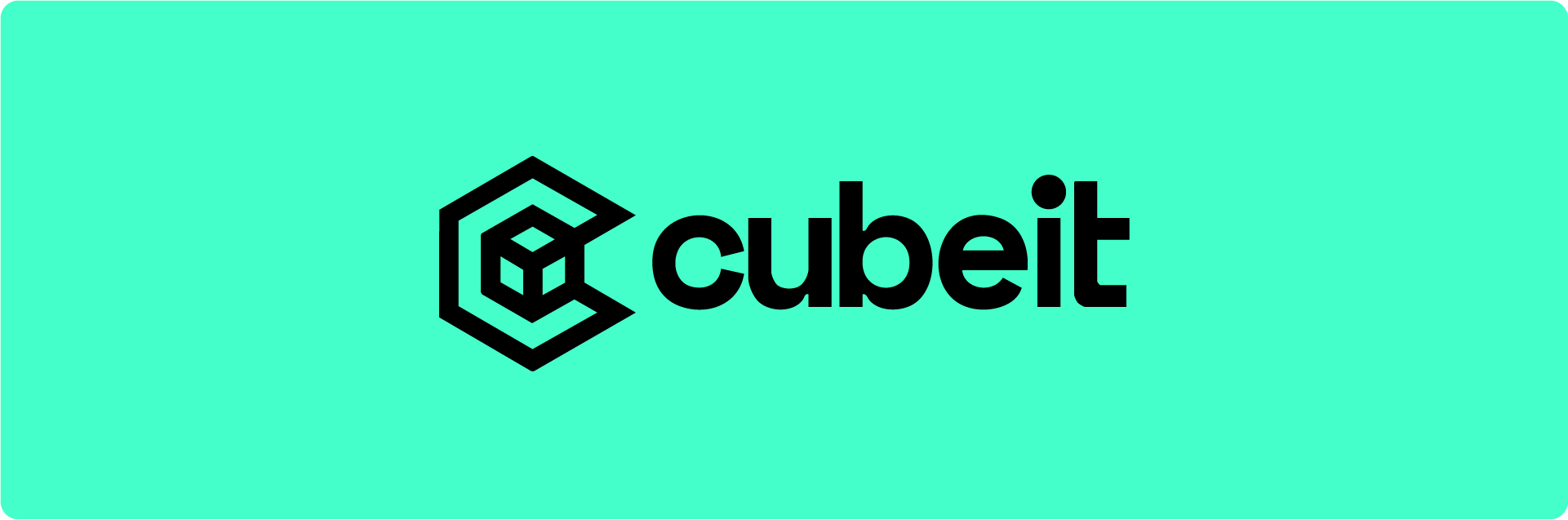
After the initial logomark is built on a base grid, the job isn't done. You still need to complete the system. For the Cubeit logo, which I designed on a livestream, the next steps were all about creating a complete and professional lockup.
The Construction Grid

After the main logo form is built, I move on to the refinement stage. A construction grid is used to check the execution and perfect the vectors. It ensures every curve is smooth and every angle is mathematically sound.
Manually building these grids is exactly the kind of tedious work I built my tools to eliminate. I use Logo Grid Generator to automate this entire step, which is y using Gridlines in this case.
The Lockup Grid
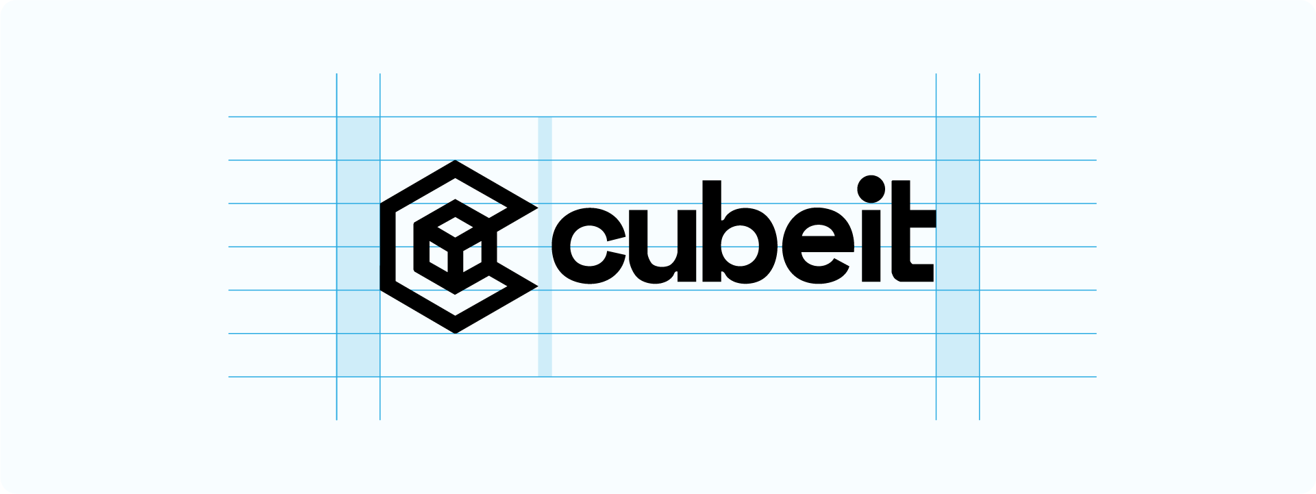
After the mark was designed, the next step was to pair it with the logotype. A lockup grid is essential for this, as it defines the exact spacing and scale relationship between the two elements. This ensures they always feel perfectly balanced and cohesive.
The Clearspace Grid

The final step was to define the "breathing room" or safe zone around the completed logo. A clearspace grid ensures no other elements on a page can crowd the logo and reduce its impact. This is a non-negotiable step for a professional identity system.
Discover how Gridit can automate your logo design.
Watch the Full Process
Reading about it is one thing, but seeing it in action can make all the difference. I've embedded a few videos from my channel that show this process in detail.
Ready to Build Your Own Grids?
Now that you understand the process, you can start applying these techniques to your own work. To help you get started, I’ve put together a free pack of essential logo grid templates.
Conclusion
A grid system isn’t about limiting creativity; it’s about providing a framework for precision. By using the right grid at the right time, whether it's an isometric grid for structure or a square grid for balance, you can ensure your work is professional and built to last.
It's a foundational skill that will elevate the quality of every logo you design.