The all-in-one automation suite for brand identity designers
Deliver flawless
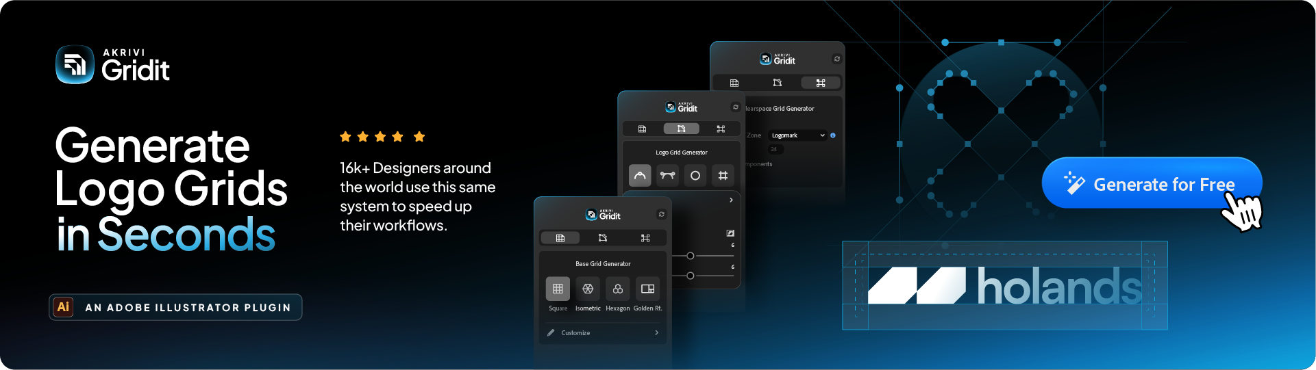
Everything you need, in one poweful suite


How to use Golden Ratio Grid in Logo Design
Learn how to apply the golden ratio grid to create balanced, professional logo designs with perfect proportions.
Have you ever wondered why a seashell spiral or a sunflower looks so naturally pleasing? Often, the answer is a hidden mathematical principle: the Golden Ratio. In design, we can use this same principle to create logos that feel instantly harmonious and balanced.
Let me be clear: the Golden Ratio Grid isn't a magic formula that automatically makes a logo great. Think of it as an incredibly powerful tool, and like any good guide, it’s not meant to be rigid.
When used correctly, the golden ratio in logo design can help you create logos with a natural harmony that feels intentional and professional.
I’ll show you two practical ways I use it to bring balance to my work.

What is the Golden Ratio? (A Simple Explanation)
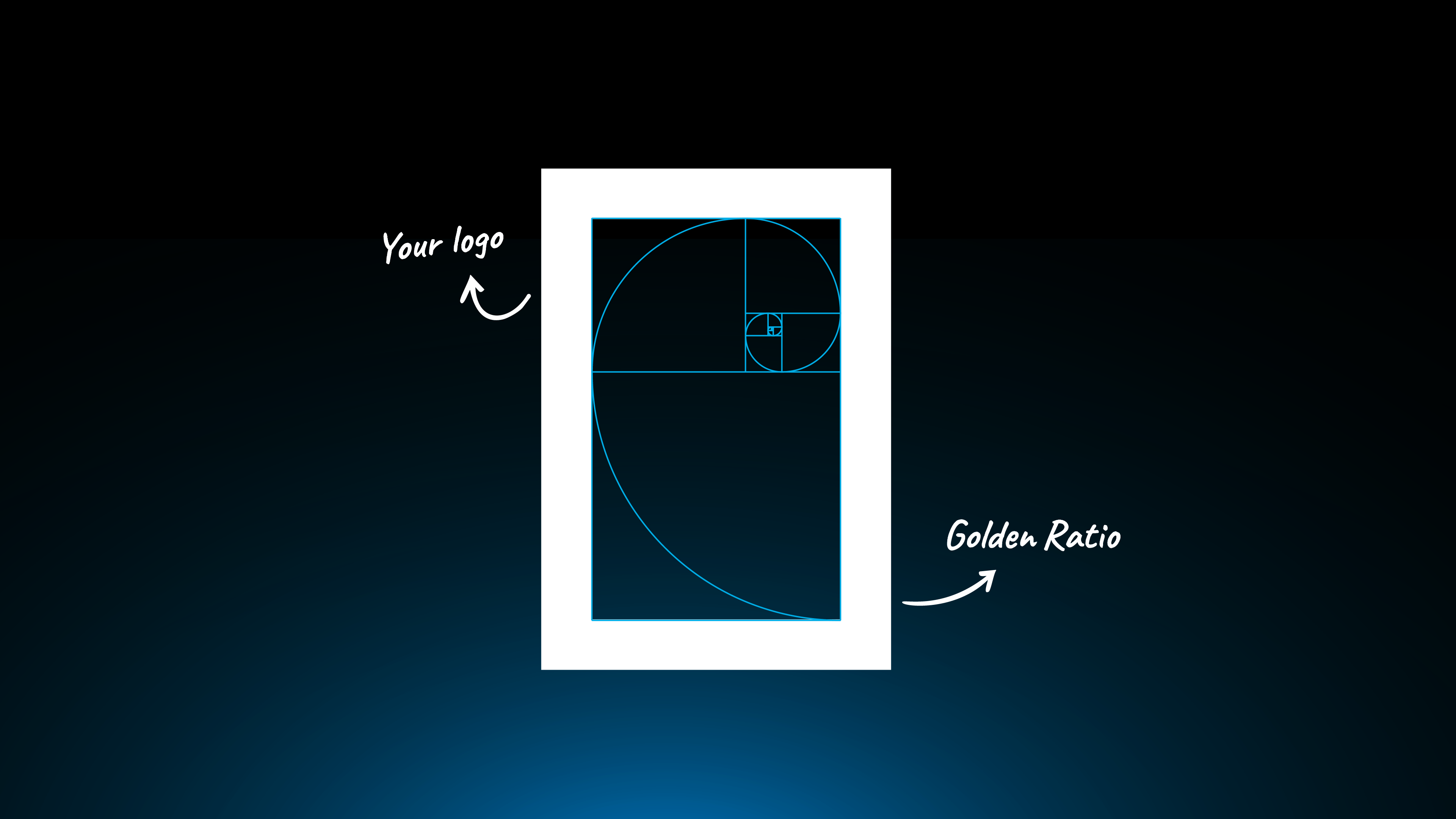
The Golden Ratio is a special number, approximately 1.618. Imagine you have a line segment. You divide it into two smaller segments, one long and one short. The Golden Ratio is found when the long segment divided by the short segment is equal to the entire line divided by the long segment.
It’s closely related to the Fibonacci Sequence, and together they create visually satisfying proportions. In design, we use this ratio to create a grid of rectangles and circles that are all in perfect proportion to each other.
Why Use It? To End the Guesswork
One of the most common challenges in geometric logo design is making multiple shapes, like circles, that feel like they belong together. How big should the second circle be in relation to the first? Guessing often leads to a design that feels 'off'.
This is where the Golden Ratio Grid truly shines. It solves the problem of what I call 'repetitive incrementation'.
Instead of you randomly choosing different sizes, the grid gives you a set of circles that are already in natural, harmonious proportion to each other. It provides a perfect set of building blocks for your design.
How to Make a Golden Ratio Grid
Making a Golden Ratio Grid in Adobe Illustrator is a great exercise. While this is a quick overview, I’ve also put together a more detailed, in-depth tutorial on how to create the Golden Ratio Grid from scratch if you really want to get into the details. Base Grid Generator will place an accurate Golden Ratio Grid on your artboard instantly
Here’s the simple way to do it:


- Draw a Perfect Square: Start by drawing a perfect square. Use the Rectangle Tool (M) and hold Shift. Then, use a line segment to divide it perfectly in half.
- Create Your Guide Line: Draw a diagonal line segment across the right-hand section of the square.
- Find the Next Square's Size: Rotate this diagonal line 180 degrees until it is straight and horizontal. This line now defines the width for the next part of your grid.
- Repeat the Process: Draw your next, smaller square based on this new point. Keep repeating this process of dividing and drawing squares. You'll create a spiral of squares that get smaller and smaller.
- Add the First Circle: Use the Ellipse Tool (L) to draw a circle that fits perfectly within the largest square you've created.
- Add All Circles: Continue drawing circles within each of the squares in your grid.
While you can make these grids by hand, Base Grid Generator™, an Adobe Illustrator plugin, has a one-click Golden Ratio Grid feature that saves a lot of time.
How to Apply the Golden Ratio Grid (Two Practical Methods)
Now that you have your grid, here’s how to actually use it.

Method 1: Building with Golden Ratio Circles
This method is famously used for creating minimal animal logos, like the work you see in George Bokhua's book. While that's a great use, my personal obsession is using these circles to build unique abstract shapes.
You use the pre-proportioned circles from your grid to define the main curves and arcs of your design. Then, you can combine, subtract, and trim these shapes using the Pathfinder or Shape Builder tool to create your final form.

Method 2: Sizing with the Golden Ratio Rectangle
This method is less about building with curves and more about defining the overall proportions of your logomark or logotype.
You can place the golden ratio rectangle on your art-board. Then, you can use its proportions to guide the height and width of your logomark or your logotype. This ensures that your key brand elements have a naturally pleasing and harmonious proportion from the start.
Final Tip: Trust Your Eye
Remember, the Golden Ratio Grid is a guide, not a rigid rule. Use it to build a strong foundation, but always make final adjustments based on what looks best to your designer's eye. The best designers know when to follow the rules and when to break them.
Build More Harmonious Logos
Now that you know how to apply the golden ratio, try using it in your next design project. To help you get started with a solid foundation, I've put together a FREE logo grid template.
It's part of our Logo Grid Core Kit and includes a variety of base grids to kickstart your creative process.
Conclusion
The golden ratio in logo design is a powerful tool for achieving natural balance and harmony. Whether you're building with circles or sizing with the rectangle, it’s a fantastic way to bring a sense of organic perfection to your work. Give it a go! or Use Gridit to automate the process.