Kwaku Amprako is a brand identity designer and founder of Akrivi — pioneering BIDA (Brand Identity Design Automation) to empower designers to create with more speed, precision, and less stress.
for your clients 10x faster

Automate your entire logo & brand identity workflow with Akrivi Studio.
How to Make Clearspace for a Logo (and Use It Professionally)
Step-by-step guide to creating Clearspace grid systems for your logos and applying it professionally.
You've designed a great logo, but your work isn't done yet.
Now, it's time to protect it. I'll show you how to make Clearspace for your logo. This is a crucial step that creates a "safe zone," ensuring your logo always looks professional and never gets crowded.
Think of it like a personal space for your logo.
This guide will teach you two simple methods for creating this essential logo safe zone.
I'll also show you how to use it professionally in your brand guidelines.
Watch the Video Tutorial
I put together a quick video that explains what Clearspace is in logo design and how to create it properly.
If you’re still unsure about the concept, I also covered it in more detail in a previous blog post.
Feel free to check that out if you need a refresher. You can visit Gridit to see automation tools I made.
The Basics of Clearspace in Logo Design
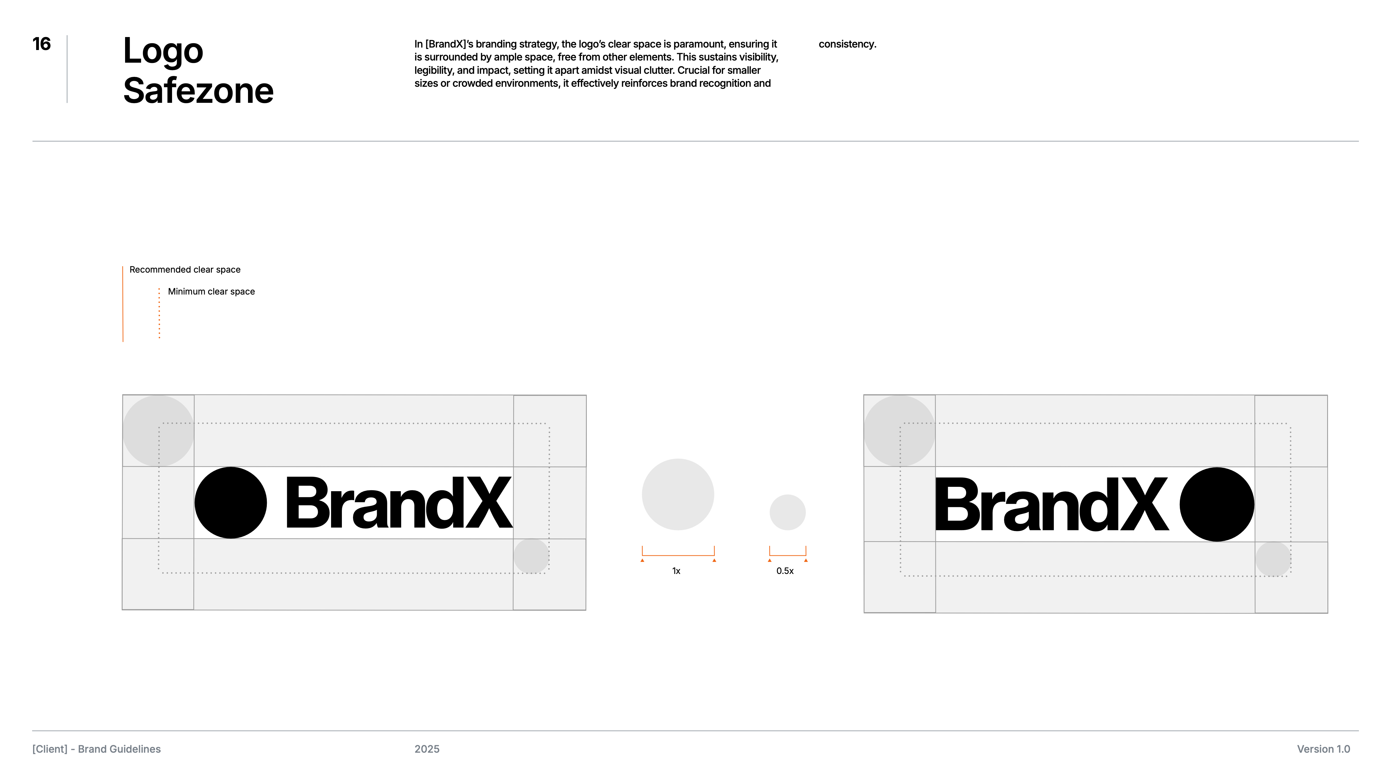
The most important thing to remember is that Clearspace should be proportional.
There isn't a single universal pixel number for it. Your logo's exclusion zone is usually created from a component already used within your logo.
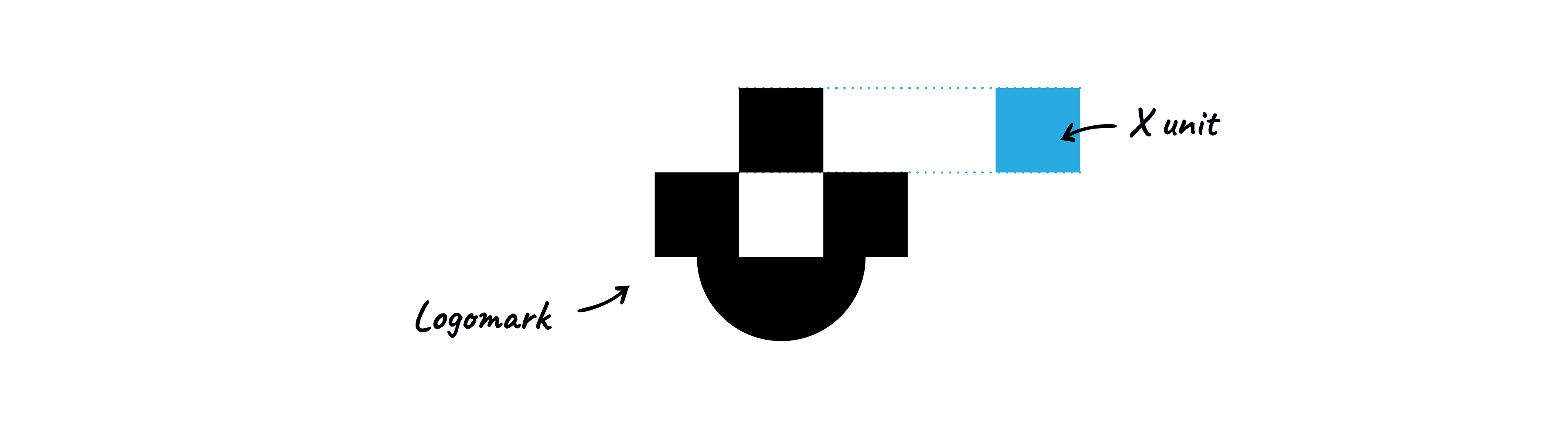
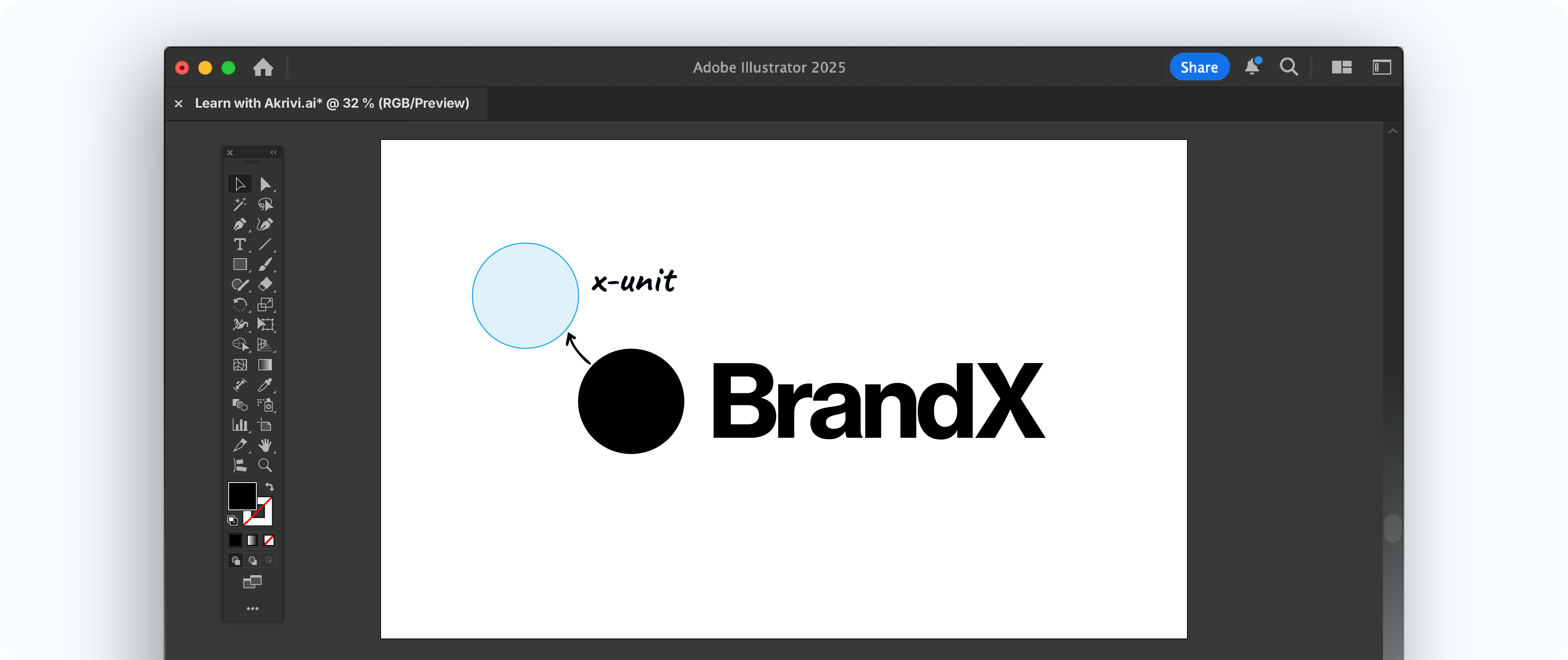
This is known as the Exclusion Component, and marked as "X".
X is usually taken from the logo's own dimensions, like half its height & width (0.5x) or a small piece of the logo (Like image shown below)
Method 1: Using an Element from the Logo (My Go-To)
This is a classic method which I used in the video tutorial above, and is also my personal favourite.
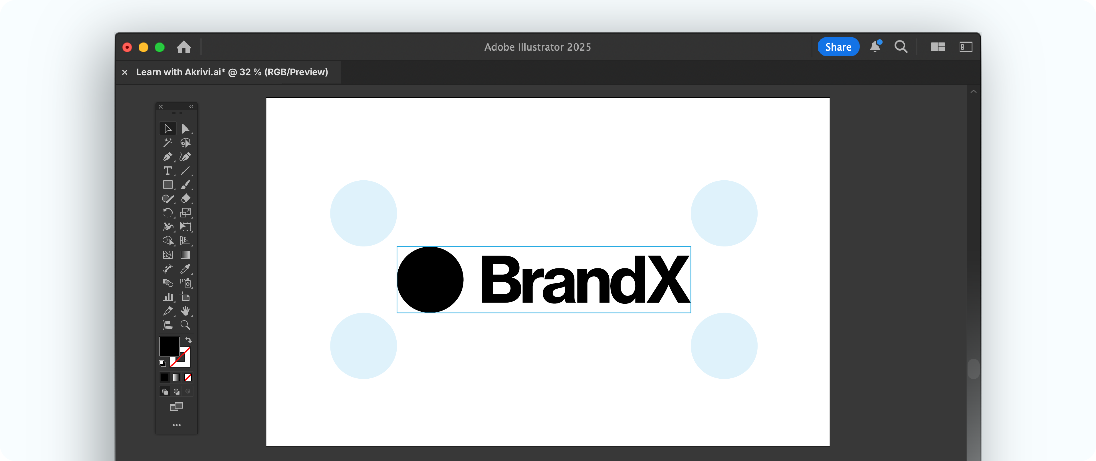
You take a prominent part of the logo itself to define your "X" unit. This could be a repeated width, a small logomark that matches the type height (like in the Slack logo), or another distinct element.

This method is great for creating a harmonious relationship between the logo and its safe zone.
- Identify Your Element: Find a clear, repeatable element (e.g., a symbol, a specific letter).
- Define Your "X" Unit: Use that element's width or height as your "X" unit.
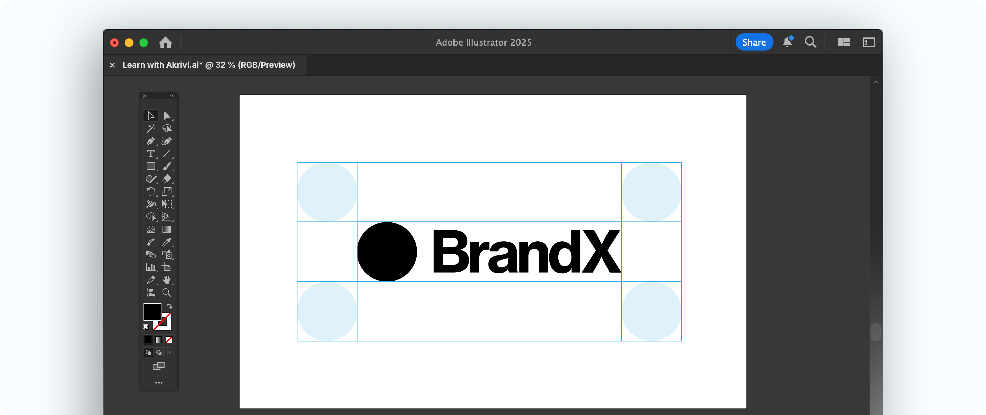
- Place the Unit: Place this unit around your logo to define the boundary.
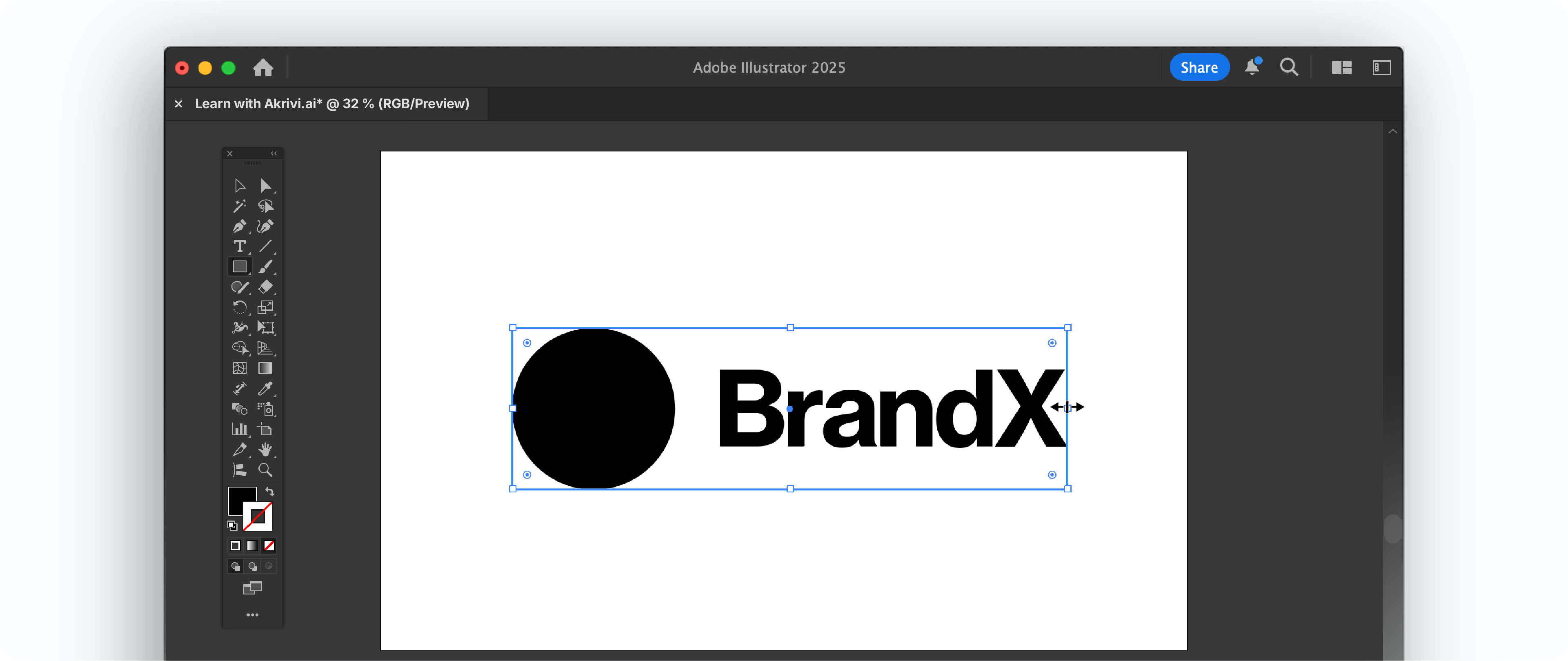
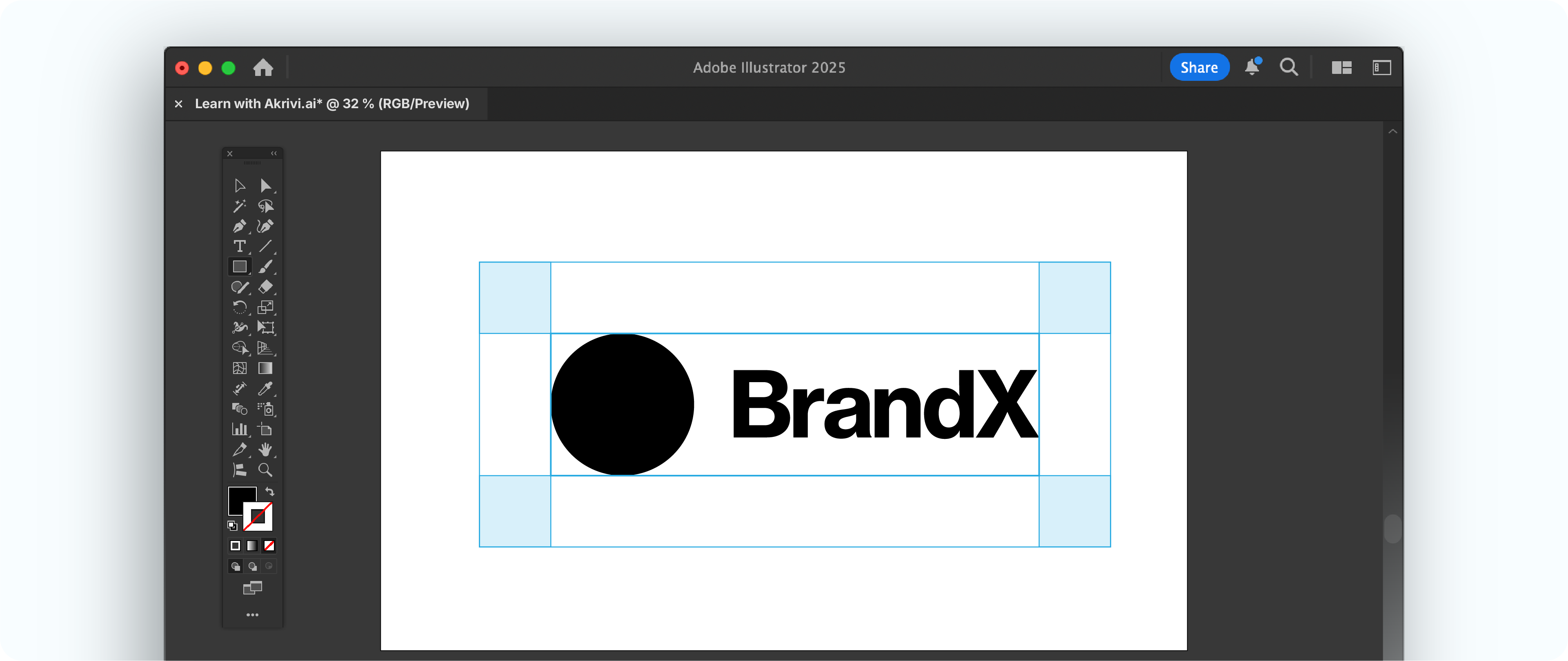
- Bounding Box: Use the Rectangle tool (M) to draw a bounding box snapping to the edges of your logo.
- Make Your Guide: Use the Rectangle tool (M) to draw your Clearspace zone with the width and height of your element.
However, it's not for every logo. If your logo has very thin strokes or a complex lockup, a simple measurement might be a better choice.
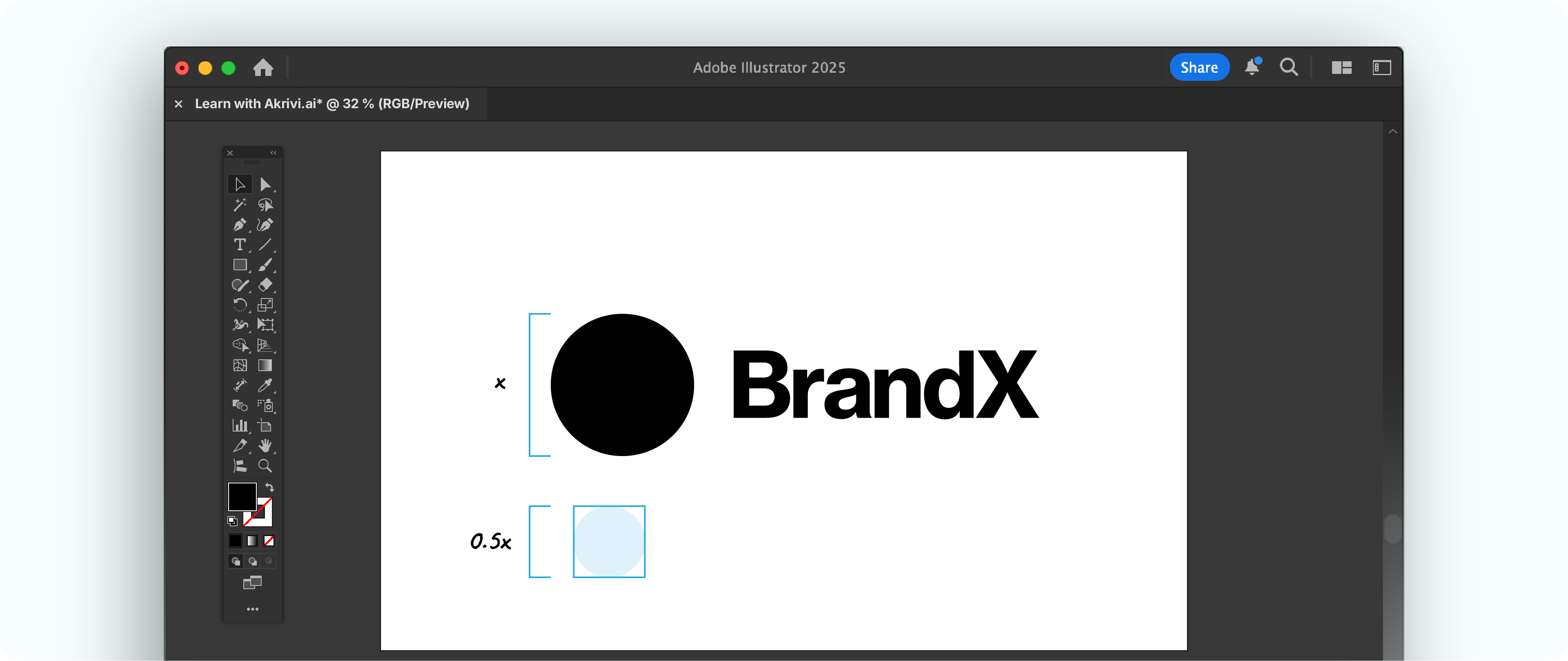
Method 2: Using a Proportional Measurement
This method is universally applicable and a great alternative. Instead of a specific element, you use a fraction of the logo's overall dimensions.
A common practice is to use half the height of the logo (0.5x) or one-fourth of the height. This scales perfectly. This method guarantees a consistent, balanced buffer that always feels right, no matter how complex your logo is. It’s similar to how the PBS logo defines its clear space.

- Measure Your Logo: In Adobe Illustrator, measure the total height or width of your logo.
- Calculate Your "X" Unit: Decide on a fraction (e.g., half the height). This is your "X" unit.
- Create Your Bounding Box: Select the Rectangle tool (M) to draw a bounding box around the logo, intersecting the logo paths.
- Make Your Guide: Select the Rectangle tool, use your "X" unit measurement to draw a boundary around the unit.
How to Use Clear Space Professionally
Once you've defined your clear space, you need to show it clearly in your brand guidelines.
This ensures clients and other designers use your logo correctly.
Build Every Logo with Precision.
Applying Clearspace is how you add that final layer of precision.
This same attention to detail should start from the very beginning of your design process.
To help you build with precision from step one, I've put together a FREE logo grid template. It includes the base and lockup grids from our Logo Grid Core Kit.

Conclusion
Learning how to make Clearspace is crucial for the functionality of your logo.
Whether you use an element from the logo or a proportional measurement, the goal is to ensure your logo is being used correctly with its correct spacing requirements.
By defining and using a Clearspace, you protect your logo's integrity and ensure it always looks professional and is used correctly when handing it off.
Give it a go in your next project, and checkout my automation tools in Gridit.