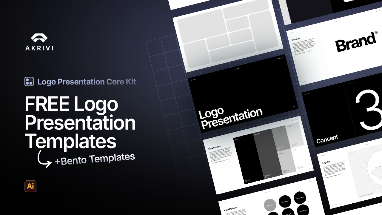
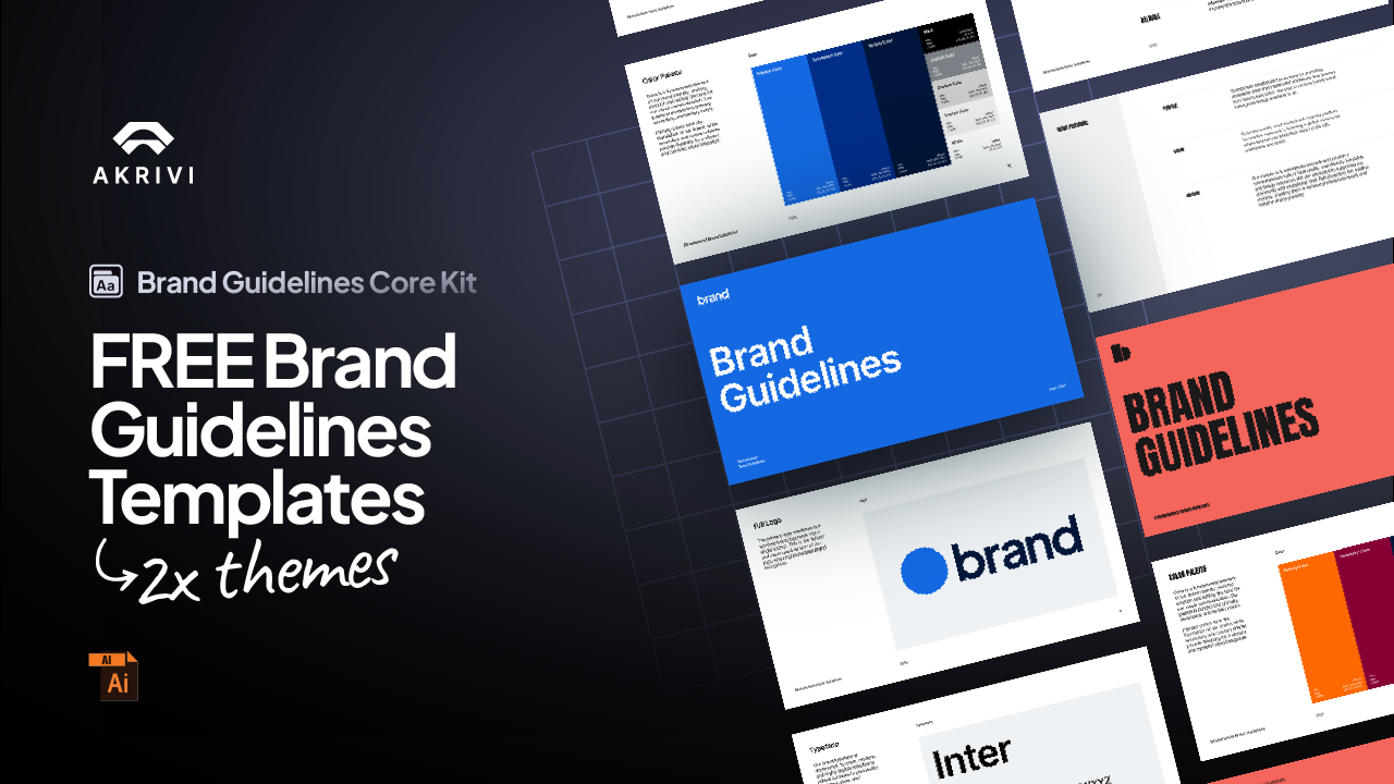
The all-in-one automation suite for brand identity designers
Deliver flawless
Everything you need, in one poweful suite


Top 5 Famous Brand Logos Built Using Grid Systems

What I Learned from Designing Logos for a Global Brand
As a logo specialist, who created several logos for the BET, I’ve experienced firsthand how essential logo grids are at the highest level of brand identity.
I helped develop and align logo systems for channels like BET Jams, BET Soul, and BET Her — each one requiring precise structure to ensure consistency across platforms, sizes, and styles.
When you’re designing for a family of brands or scaling a system across touchpoints, grids aren’t optional — they’re essential.
And this isn’t just true for BET.
Some of the most iconic logos in the world — from McDonald’s to Apple — are grounded in grid systems that create balance, structure, and longevity.
In this post, we’ll look at five global brands that used grid systems to build logos that are simple, scalable, and impossible to forget.
What Is a Logo Grid?
A logo grid is a framework, used to craft, refine and strengthen logos ensuring balance proportions, consistency and visual harmony.
There are 4 different type of logo grid systems:
- Base Grids
- Construction Grids
- Lockup Grids
- Clearspace Grids
👉 Want to learn more? Check out this blog i've written explaining what a logo grid is in depth - What Is a Logo Grid?
5 Famous Brand Logos Built on Grids
1. McDonald’s – The Golden Arches

McDonald’s iconic “M” — better known as the Golden Arches — might seem simple, but it’s built on a system of smooth, mirrored curves and geometric alignment.
The grid system ensures:
- Consistent arch width and curvature
- Visual balance on packaging, signs, and digital formats
- Scalability without distortion
💡Design takeaway: Use repeated lines to build a grid that ensures consistent shape widths throughout your logo — creating balance and a more cohesive visual system.
2. Nike – The Swoosh

The Nike Swoosh is one of the most recognizable and dynamic logos on the planet. And while it appears fluid and organic, it was crafted with geometric precision using a circular grid system.
This grid helped Nike achieve:
- Perfect balance between curve and tilt
- An implied sense of motion and momentum
- A clean silhouette that scales seamlessly
💡Design takeaway: Use the golden ratio to guide curves and spacing in dynamic logos.
3. Apple – The Bite and the Balance

Apple’s iconic logo is a masterclass in visual minimalism and structural precision.
Built using intersecting circles and principles of the golden ratio, the Apple logo achieves a balance that feels both organic and mathematical.
The grid creates:
- A perfectly curved bite radius
- A balanced silhouette with no visual tension
- A timeless shape that holds up across every product and screen
💡Design takeaway: Use the golden ratio to construct circular forms with natural balance and harmony.
4. Google – Geometry with Personality

Google’s “G” icon and its full wordmark are deeply rooted in grid-based modular design. The circular “G” is a classic example of how precision and playfulness can coexist.
The grid ensures:
- Clean spacing between color segments
- Consistent stroke weights and inner curve radii
- Immediate clarity even at small sizes
💡Design takeaway: Use the a Square grid to construct simple logos which may consist of rectangles, squares and circles
5. Netflix – Sharp, Structured Simplicity

Netflix’s “N” might look minimal, but it’s engineered with a diagonal grid system that controls the tension, depth, and alignment of its folded shape.
The structure gives:
- Visual consistency across responsive platforms
- Balanced spacing between strokes and shadows
- A dimensional effect that holds up on-screen and in print
💡Design takeaway: Create a custom grid when designing wordmarks. Use gridlines to ensure consistent shapes, spacing, and alignment across each letter — helping your logo feel balanced, refined, and professionally constructed.
Final Thoughts
Logo grids aren’t just for textbooks — they’re behind the most recognizable logos in the world.
Whether you’re building a global brand system like I did with BET, or designing your next freelance project, using grids will help you:
- Design with more confidence
- Present with more clarity
- And create logos that truly stand the test of time
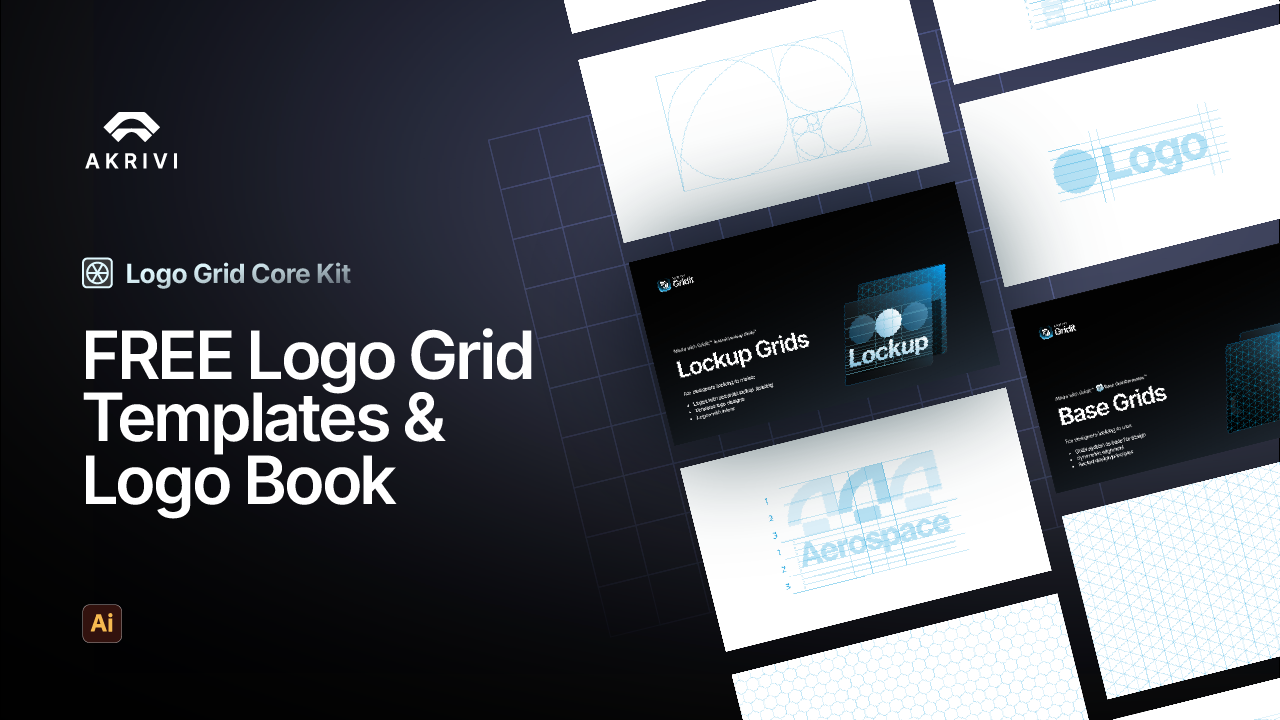
If you want to speed up your workflow and build grid systems in seconds, check out Gridit™ — my Adobe Illustrator extension, made to help you align your logos, and present the perfection behind your logo designs