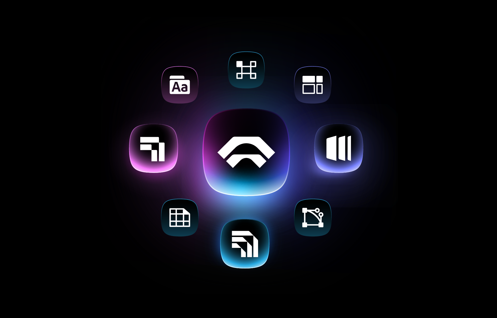
The all-in-one automation suite for brand identity designers
Works with Adobe Illustrator 2021 - 2026
Deliver flawless
Everything you need, in one poweful suite

Try Akrivi Studio, includes automated templates that generates layouts for you
What is a Bento Grid?

Wondering why you’re seeing so many Bento Grids? Learn what they are and why designers use them.
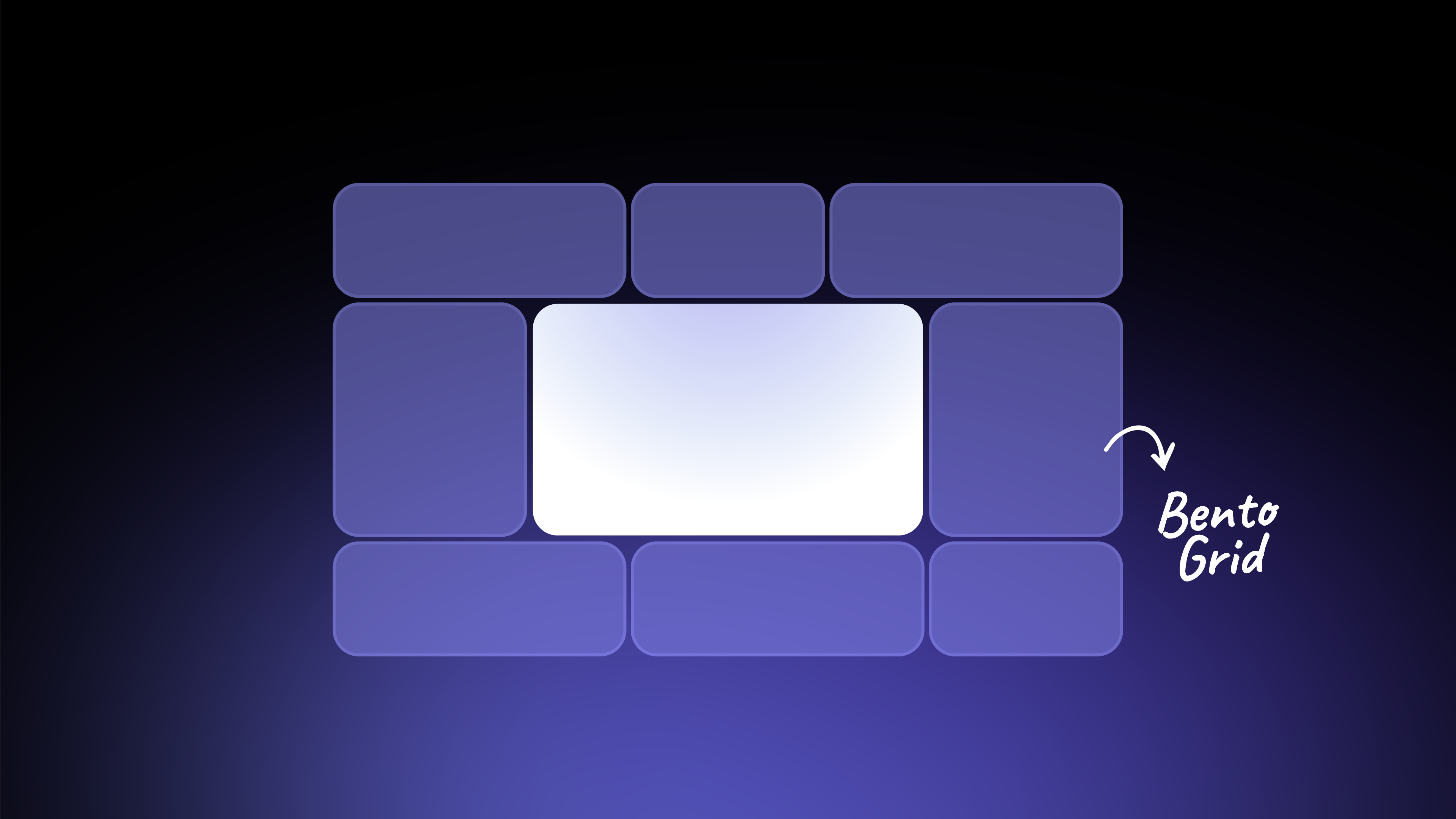
You’ve seen them everywhere lately: those clean, modular layouts that neatly showcase multiple items at once. They're called bento grids.
A bento grid is more than just a layout trend; it's a design philosophy that respects the viewer's attention. It presents a whole system, a product and its features, a brand and its facets, as a collection of distinct, digestible parts that can be understood all at once.
In this simple guide, I'll explain what a bento grid is, its core benefits, and show you a few powerful examples of how designers use them.
What Exactly is a Bento Grid?
The easiest way to understand a bento grid is to think of a Japanese lunchbox. You have different compartments for your main meal, a side, and a sauce. They're all separate, but together they create one complete, organized meal.
A bento grid layout does the same for design. It divides a space into different sections, or "boxes," that hold individual pieces of content. They are separated, but you can access them all at once, allowing the different parts to work together.
3 Benefits of Using Bento Grids
- A Digestible Overview: A bento grid is perfect for highlighting multiple powerful features in a digestible and intuitive way. It takes complex information and makes it simple to understand at a glance.
- Visual Cohesion and Hierarchy: The varied box sizes allow you to create a clear visual hierarchy. Your most important content can go in a larger box, naturally drawing the viewer's eye first, while smaller boxes support it.
- A Modern and Consistent Look: The clean lines and organized structure of a bento grid system give your designs a fresh, modern, and professional feel.
3 Examples of Bento Grids in Action
1. Logo and Brand Identity Presentations

In a logo presentation, I often use a bento grid to showcase the "best buddies" of a brand identity, the logomark, logotype, color palette, and a key mockup, all on one summary slide. This gives the client a cohesive overview. My Bento Generator automates this process with a click of a button.
2. UX/UI Design
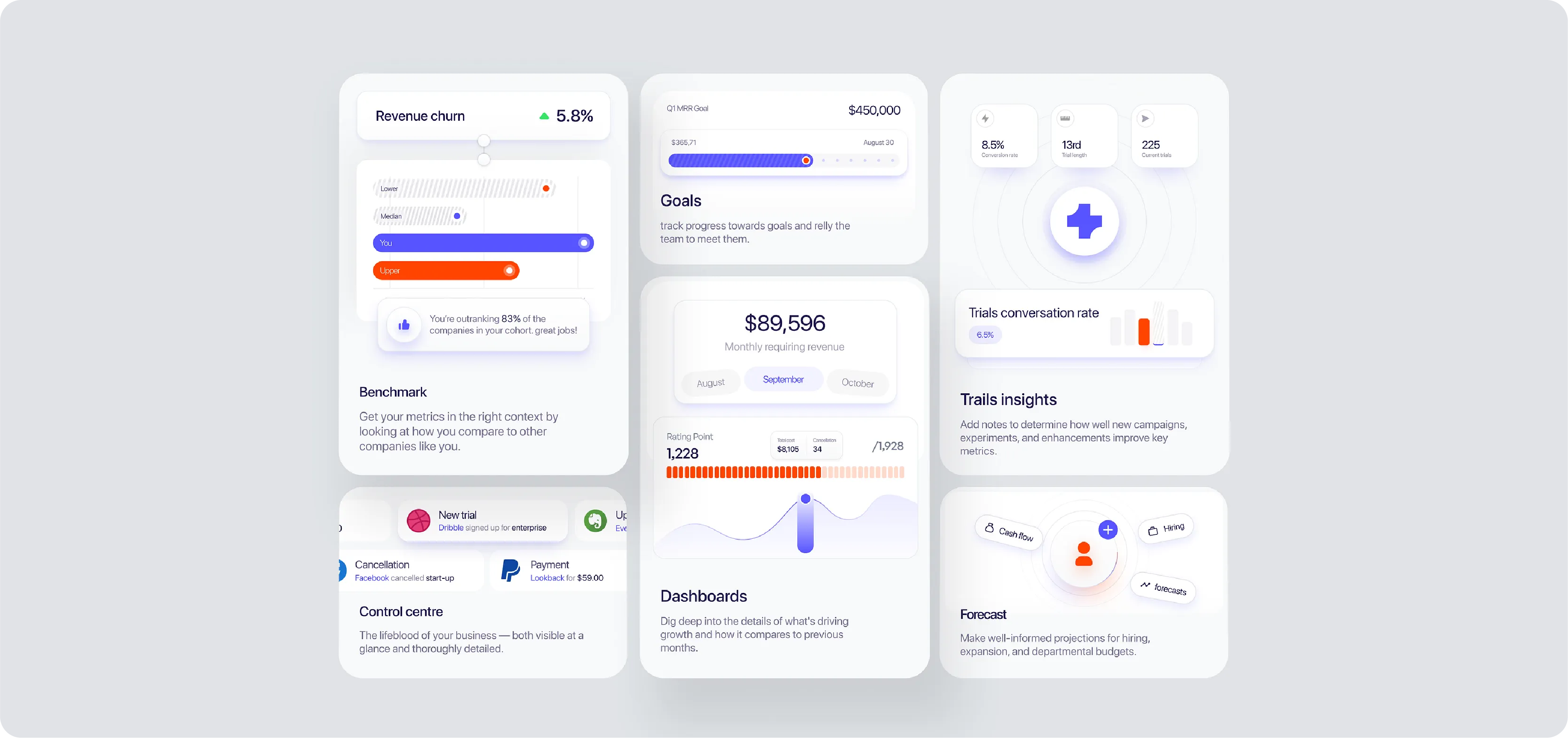
UX/UI designers use bento grids for dashboards, app home screens, and website feature sections. Each box can represent a different function or piece of information, creating an interface that feels both organized and easy to navigate.
3. Product Summaries (The Apple Method)
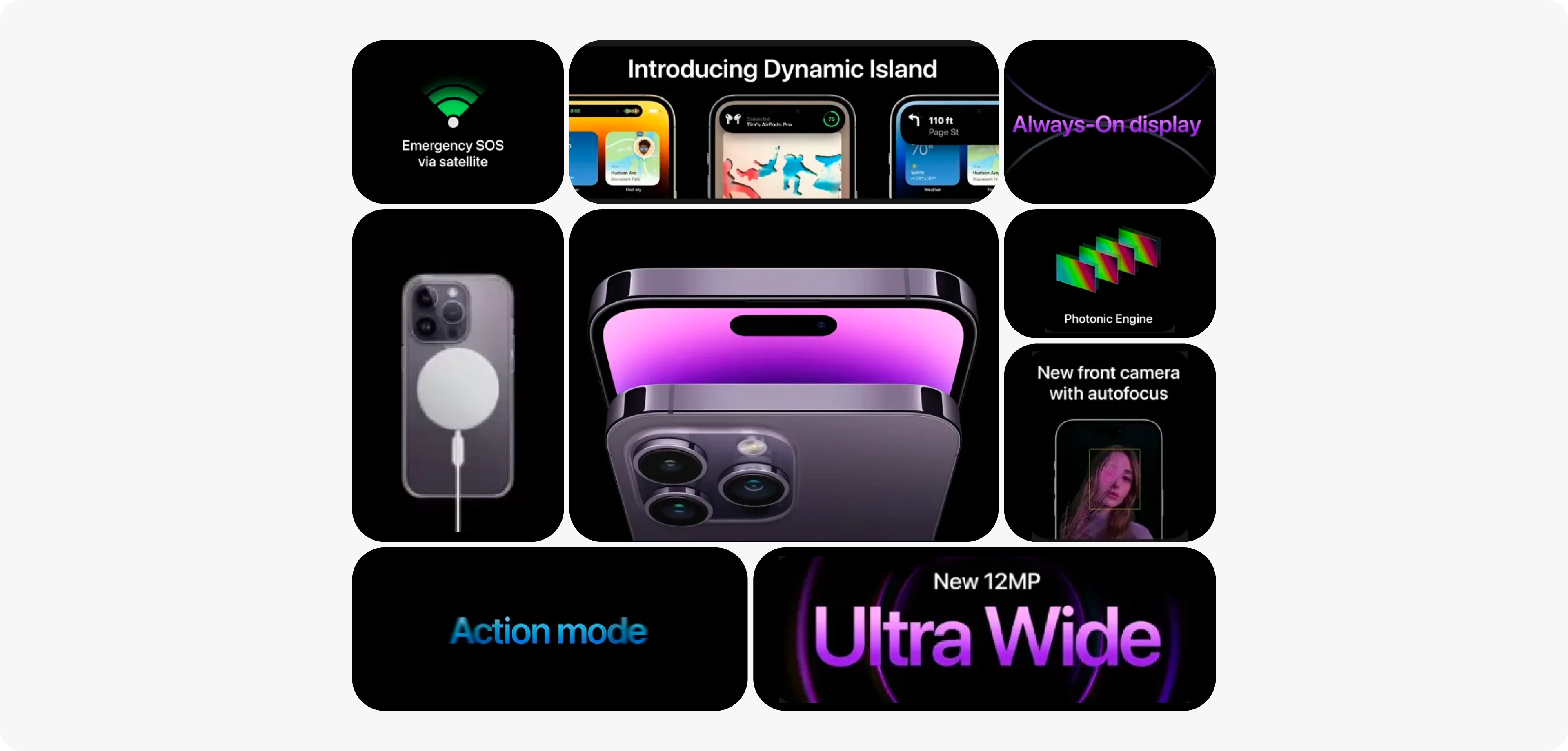
Apple does this brilliantly. I call their approach a 'Centered' bento. They often place the main product, like a new iPhone, in a large, central box. The smaller boxes around it are then used to showcase its key features.
Your eye is drawn to the product first, and then you're invited to explore the details. It's a masterful way to control the narrative.
Build Your Own Bento Grids
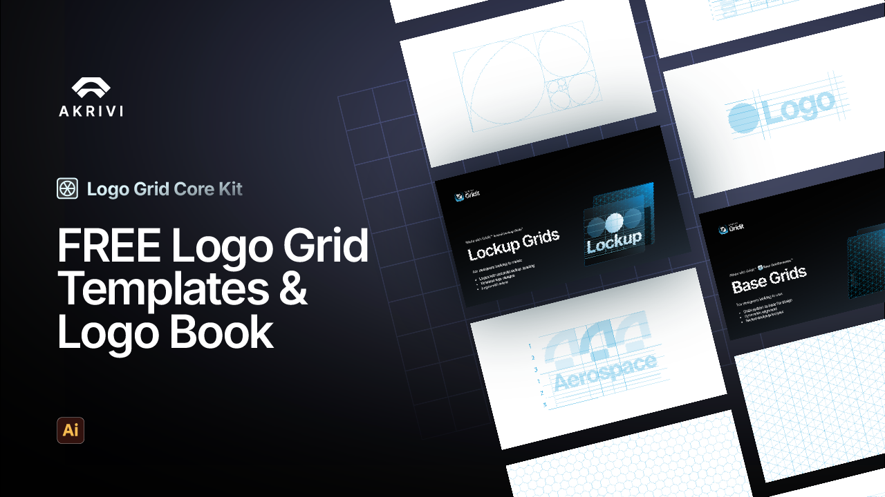
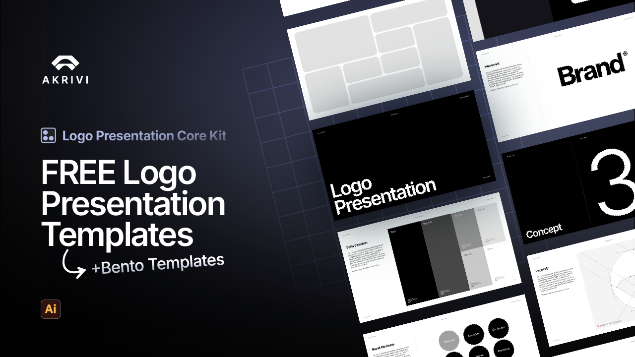
Now that you know what a bento grid is, you're ready to start using them. To help you build your own professional layouts, I've put together a FREE Logo Presentation template.
It's part of our Logo Presentation Core Kit and includes a bento grid summary page, perfect for getting started quickly in Adobe Illustrator.
Discover how Presenta automates the bento process for you.
Conclusion
Understanding what a bento grid is opens up new design possibilities. It's a powerful way to organize content and create a modern, professional look. If you're wondering how to build these layouts yourself, I explain the process in my guide on how to create bento grids. Give it a go!