The all-in-one automation suite for brand identity designers
Deliver flawless
Everything you need, in one poweful suite


How to Create a Construction Grid for a Wordmark Using Gridit
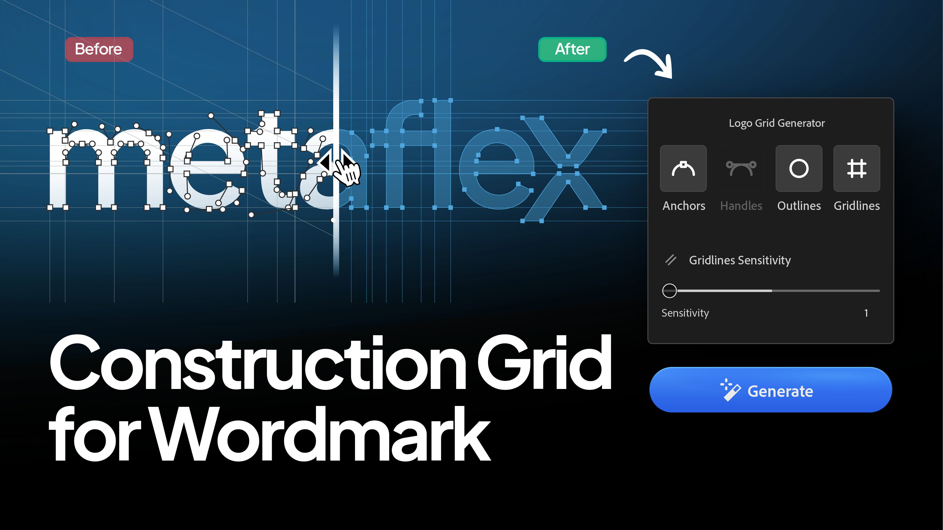
Learn why wordmarks require different grid settings than logomarks to look professional.
When you create a construction grid for a geometric symbol, showing every circle and curve adds to the beauty. It looks like engineering.
But if you apply those same settings to a wordmark, it often looks like a mess.
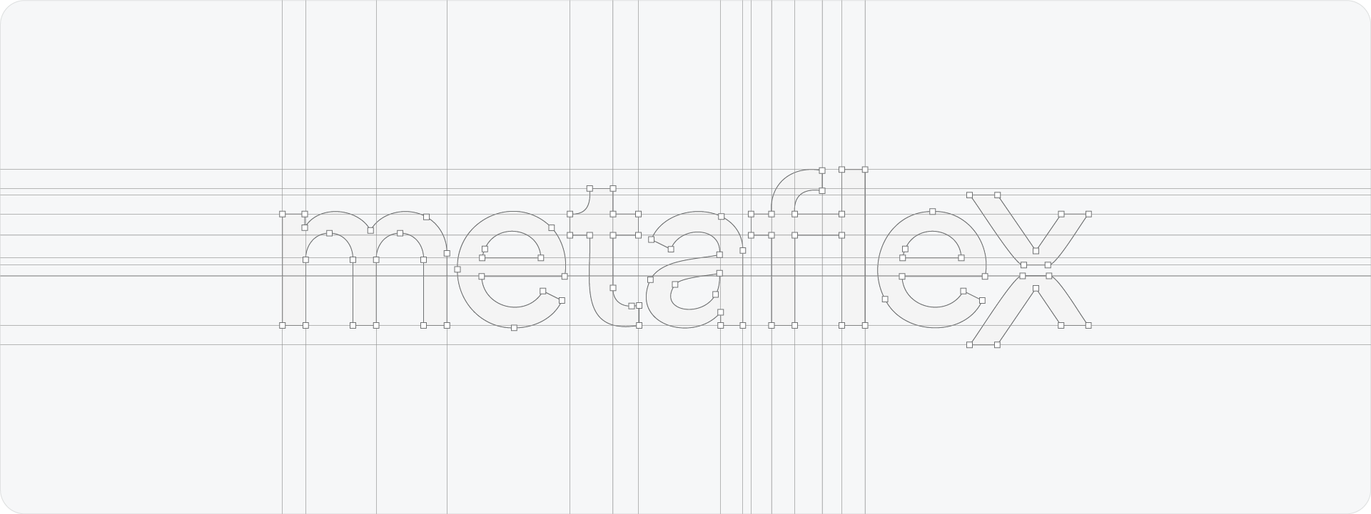
Typography is complex. Even a simple serif font has hundreds of anchor points and tiny, subtle curves. If you try to map every single one of them with a circular trajectory or a handle, your beautiful lettering gets buried under a "spiderweb" of lines.
In this guide, I’ll show you the specific Gridit settings I use to create clean, professional grids for typography.
The Problem with Handles on Text
In a standard logomark, curves are usually large and deliberate. In typography, curves are often microscopic, think of the tiny bracket of a serif or the subtle turn of an 'S'.
If you enable Handles or Circular Trajectories for a wordmark, Gridit will try to generate a circle for every one of these tiny curves.
The result? The circles are so small and numerous that they create visual noise rather than explaining the design. You lose the impact of the word itself.
The Best Settings for Wordmarks
To get a result that looks professional and intentional, you need to simplify. Here is my "Clean Text" recipe:
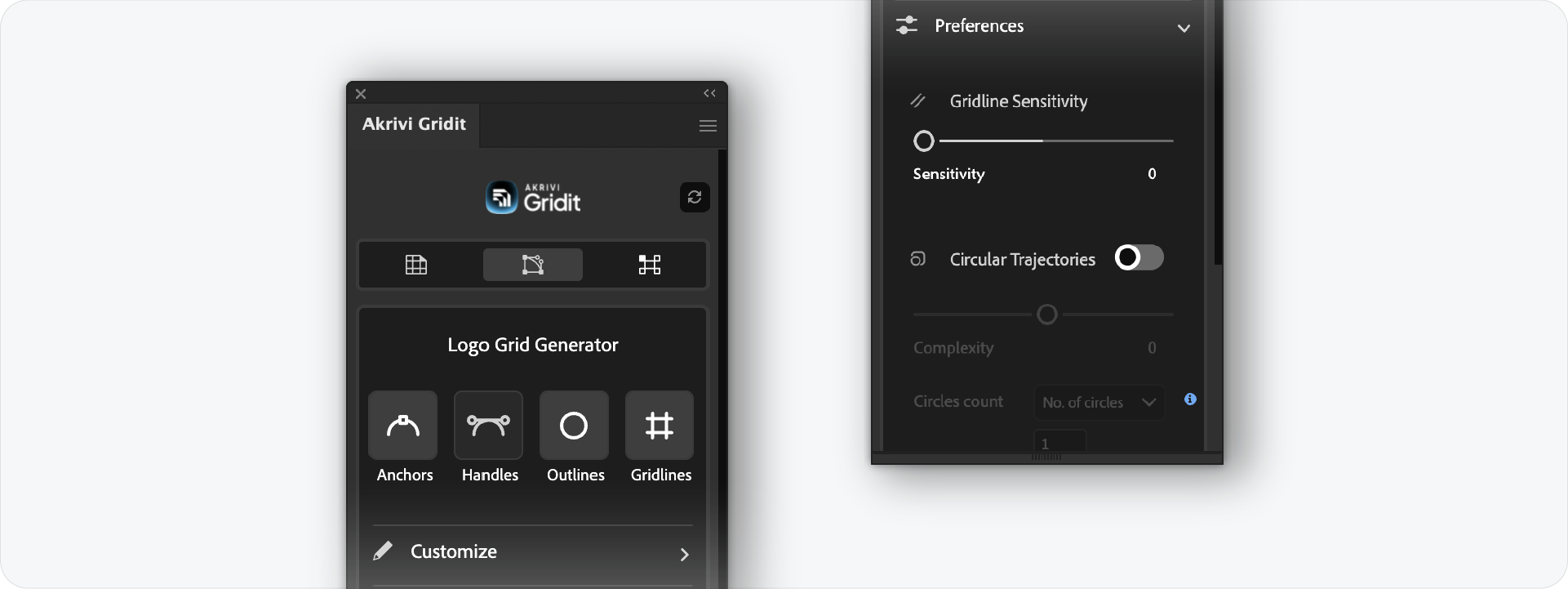
1. Turn OFF Handles (Circular Trajectories)
This is the most important step. Hide the bezier handles. You don't need to show the math behind every tiny curve in a letterform unless it is a custom geometric font.
2. Turn ON Gridlines
Gridlines are essential for text. They demonstrate alignment—showing that your ascenders, descenders, x-height, and kerning are mathematically consistent.
3. Turn ON Outlines
This keeps the shape of the letters clear and distinct from the grid background.
4. Anchors: Use with Caution
Anchors are okay to leave on, as they show the nodes of your vector paths. However, because text has so many points, I recommend using the Scale Slider in Gridit to make them very small, or toggling them off entirely if the text is long.
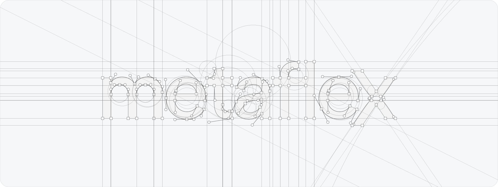
The Exception: Geometric & Short Wordmarks
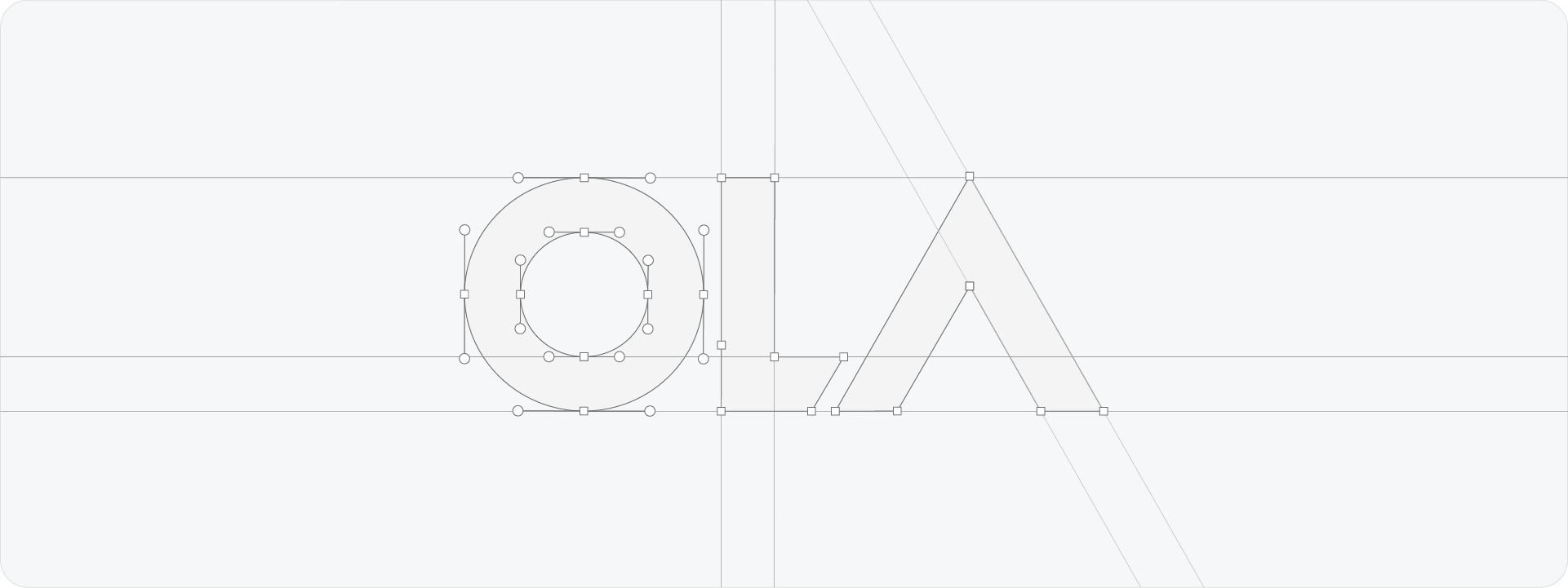
There is one exception to this rule.
If you have a very short brand name (like "OLA" or "UBER") or a wordmark constructed from pure geometric shapes, you can use handles.
In these cases, the curves are large and structural. Showing the circular trajectories here proves that the letters were built using perfect geometry, which adds value. But for 90% of standard typefaces, keep it simple.
Ready to Clean Up Your Typography Grids?
A construction grid should clarify your design, not complicate it. By turning off the handles and focusing on alignment, you can present wordmarks that look precise, legible, and professional.
Generate for Free with Akrivi Studio
Conclusion
Presenting a wordmark requires a different approach than an icon. By understanding the difference between "geometric" and "typographic" detail, you can use Gridit to highlight the strengths of your lettering without overwhelming the client.