The all-in-one automation suite for brand identity designers
Deliver flawless
Everything you need, in one poweful suite


How to Get the Best Construction Grid Results Using Gridit Logo Grid Generator Preferences
Learn the best preferences to use in the logo grid generator based on your logomark, logotype, or wordmark.
The Generate All button in Gridit is magic, but it’s not a one-size-fits-all solution. A strictly geometric icon requires a different grid approach than a flowing, organic hand-drawn mark.
If you just hit generate and the result looks too messy or too simple, you don't need to fix it manually. You just need to tell the algorithm what kind of logo it's looking at.
In this guide, I’ll show you how to tweak the Preferences in the Logo Grid Generator to get the perfect result for your specific design type.
Scenario 1: The Geometric Logo
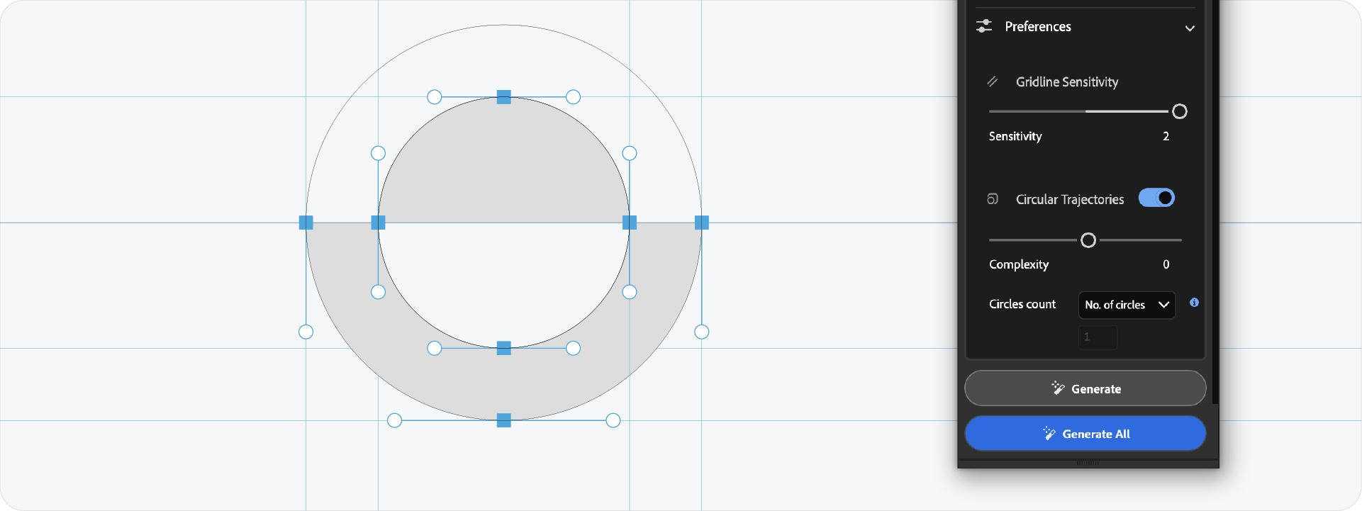
This is the ideal scenario for construction grids. If your logo was built using the shape builder tool, perfect circles, and straight lines, you want to show that off.
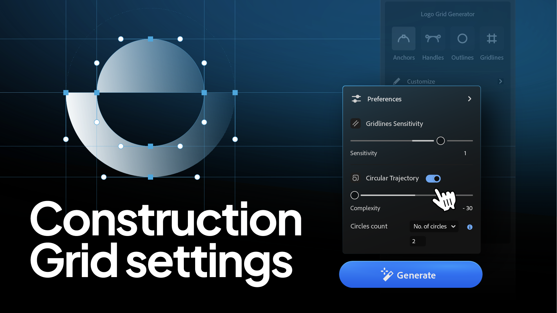
The Settings:
- Gridline Sensitivity: High.
- Circular Trajectories: ON.
Why?
For geometric marks, the circles are the design. Enabling circular trajectories reveals the "invisible geometry" that defines your curves. It proves the logo is mathematically sound.
Scenario 2: The Organic or Hand-Drawn Logo
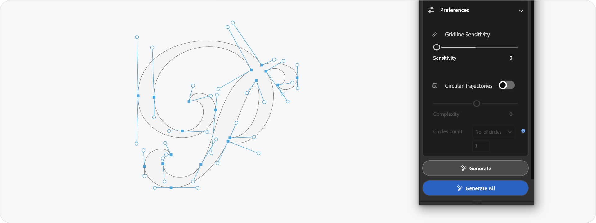
If your logo is organic or has complex curves (like a mascot or a loose shape), the default settings might create a "spiderweb" effect. The tool might try to find a perfect circle for every tiny varied curve, resulting in a cluttered mess.
The Settings:
- Gridline Sensitivity: Low.
- Circular Trajectories: OFF (or set to very low complexity).
Why?
For organic shapes, you want to show the general bounding structure, not every single radius. Turning off circular trajectories cleans up the noise and lets the logo breathe.
Scenario 3: The Wordmark
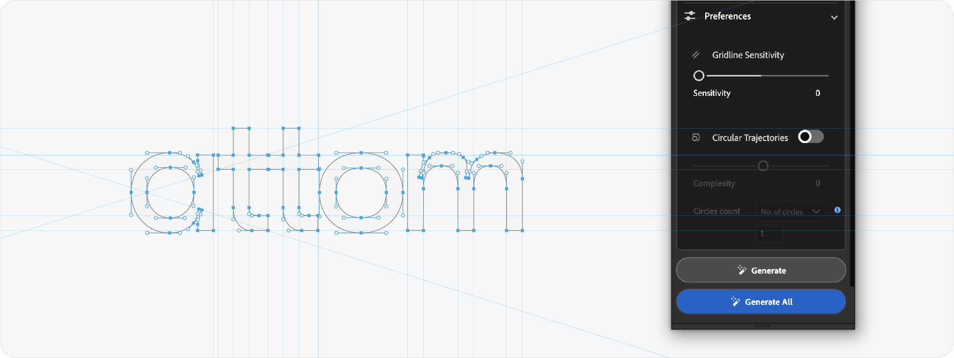
Wordmarks are tricky because they have so many anchor points. A standard grid can look overwhelming if it tries to map every serif and bowl.
The Settings:
- Gridline Sensitivity: Medium to Low.
Why?
With text, you mainly want to show alignment (cap height, x-height, baseline) and consistent spacing. You don't need a grid line for every single letterform detail. Lowering the sensitivity focuses the grid on the major alignment points.
Pro-Tip: The -30 Complexity Rule

If you want to keep Circular Trajectories on but find them too distracting, use the Complexity Slider.
I find that dialing the complexity down (around -30 or lower on the slider) gives the best balance. It keeps the major, important circles that define the main shape but filters out the tiny, insignificant ones that just add visual noise.
Ready to Refine Your Grids?
Knowing which buttons to toggle transforms Gridit from a simple generator into a precision instrument. By matching the preferences to your logo style, you ensure your presentation looks engineered, not cluttered.
Generate for Free with Akrivi Studio.
Conclusion
A construction grid should clarify your design, not complicate it. By taking a moment to adjust your sensitivity and complexity settings, you can produce a grid that perfectly matches the "logic" of your specific logo.