The all-in-one automation suite for brand identity designers
Deliver flawless
Everything you need, in one poweful suite


5 Best Brand Guidelines Examples in 2026

A curated collection of the best brand guidelines examples across different industries and styles in 2026
Studying how other brands document their identity is one of the fastest ways to improve your own brand guidelines work. These examples cover a range of industries, styles, and document approaches, from minimal one-pagers to comprehensive multi-section documents.
Use them as reference for layout, structure, section order, and how strong brands communicate their visual systems.
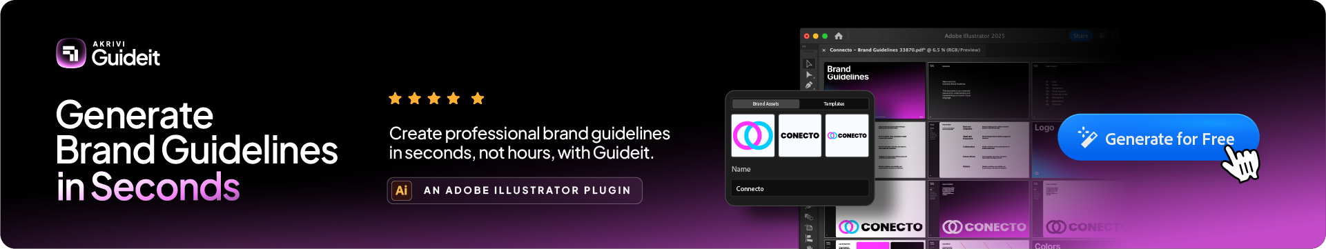
Related Reading: If you want to create your own brand guidelines document, Guideit generates one inside Adobe Illustrator in seconds using Automated Templates.
Minimal Brand Guidelines Examples
Clean, stripped-back documents that focus on the essentials: logo, colour, and typography with minimal copy and strong visual hierarchy.
1. Environex
The Environex guidelines show how to use white space effectively. The document uses a small color palette and clean typography to present the brand.
2. Icelandic

Icelandic uses a very direct layout for their visual identity. Their guidelines focus on the relationship between the logo and brand imagery.
3. Brandwerk Leipzig

Brandwerk Leipzig is a good example of grid-based design. These guidelines use a strict structure to keep every element aligned.
4. McDonald’s (2019)
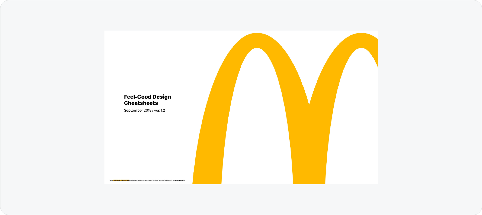
McDonald’s updated their guidelines in 2019 to be more minimal. They removed many details and focused on bold, simple rules for their assets.
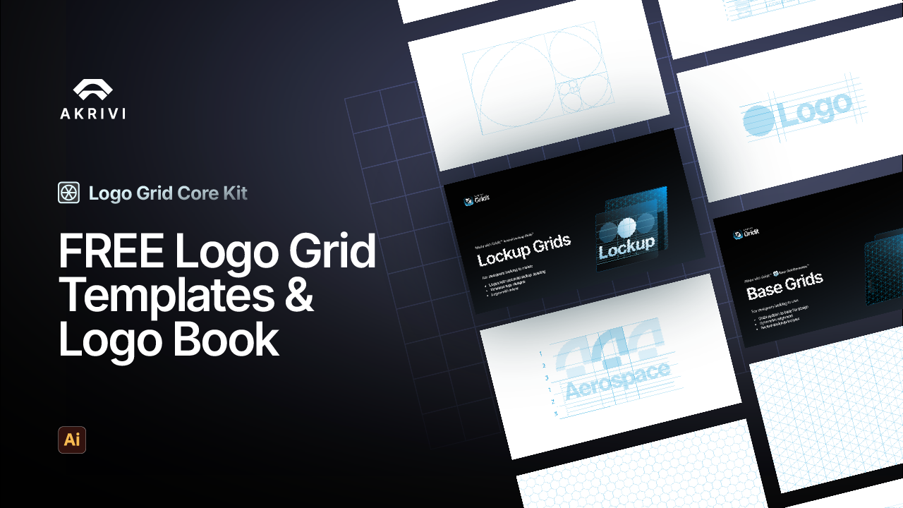
5. Akrivi Free Contemporary Template
I designed the Contemporary Template to help you create a clean, modern look. It uses wide margins and a simple hierarchy to present your design work clearly.
6. Urban Automated Style (Guideit)
I also included the "Urban" style inside Akrivi Guideit. This style uses bold typography and a minimal structure for technical pages.
Related Reading: Looking for minimal brand guidelines templates to start from? Browse the collection at brandbooks.shop.
Tech Brand Guidelines Examples
Brand guidelines from technology companies and digital-first brands. Typically strong on colour systems, UI components, and digital application rules.
1. IBM
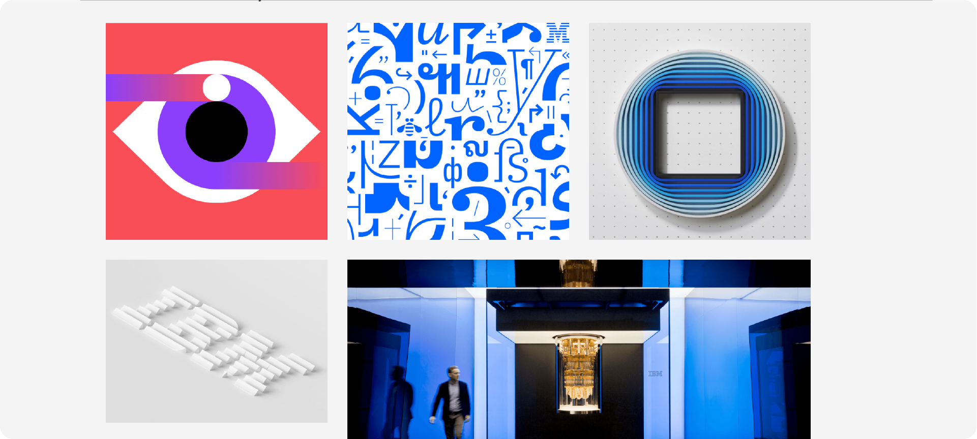
IBM's Design Language is a masterclass in building a comprehensive, living system for a global brand. It’s more than a document; it’s a full resource hub.
2. DevRev
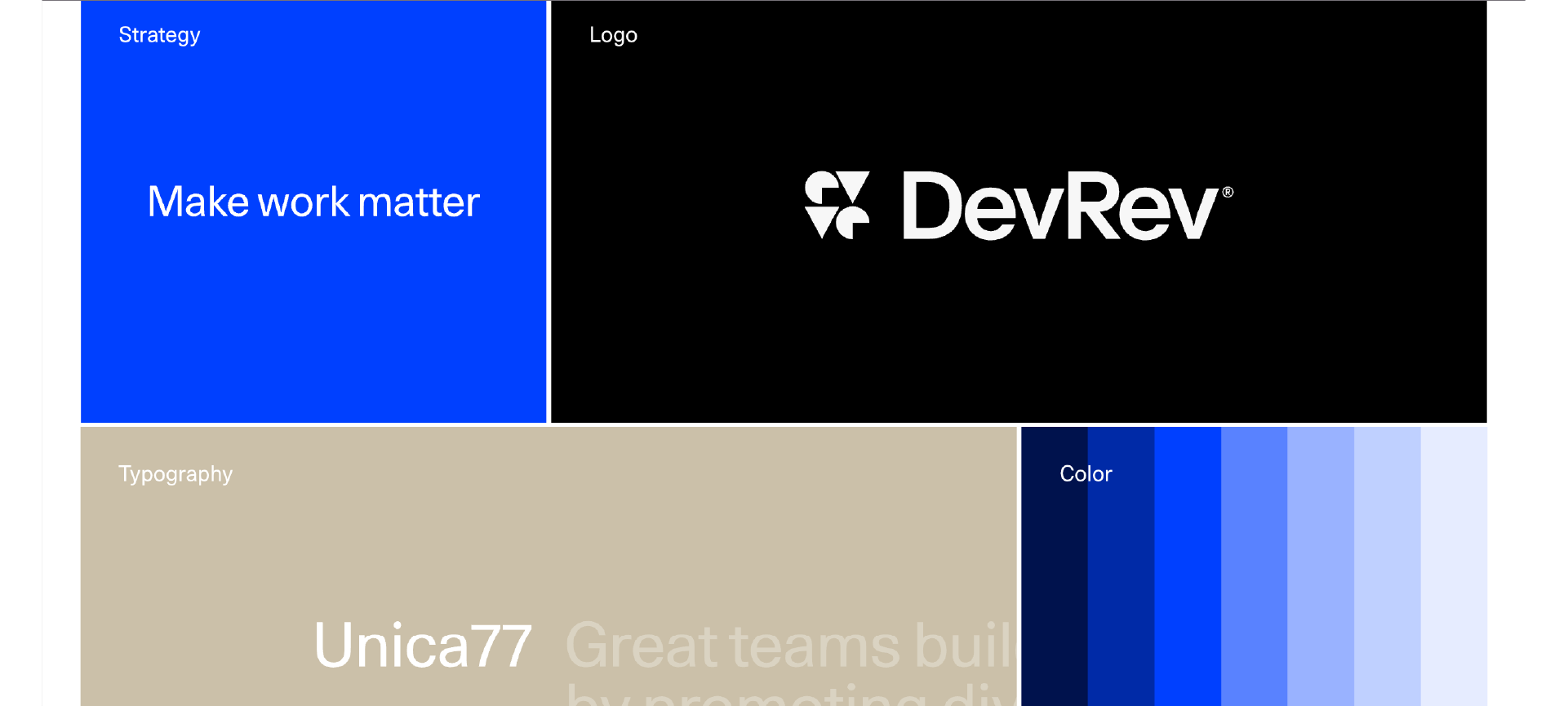
DevRev's brand guidelines are a perfect example of a modern, digital-first approach. It's clean, concise, and incredibly easy to navigate.
3. Bang & Olufsen

As a premium tech brand, B&O's guidelines perfectly reflect their commitment to quality and sophisticated design. It feels exclusive and well-crafted.
4. Klarna
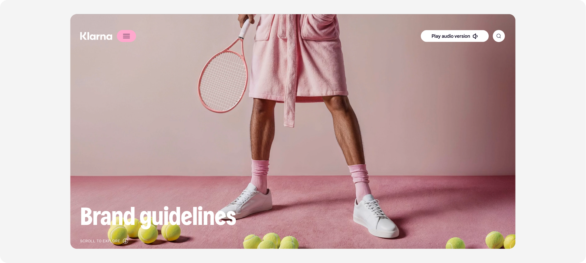
Klarna's guidelines are a brilliant example of how to manage a brand that needs to be used correctly by thousands of external partners.
5. Beyond Gravity
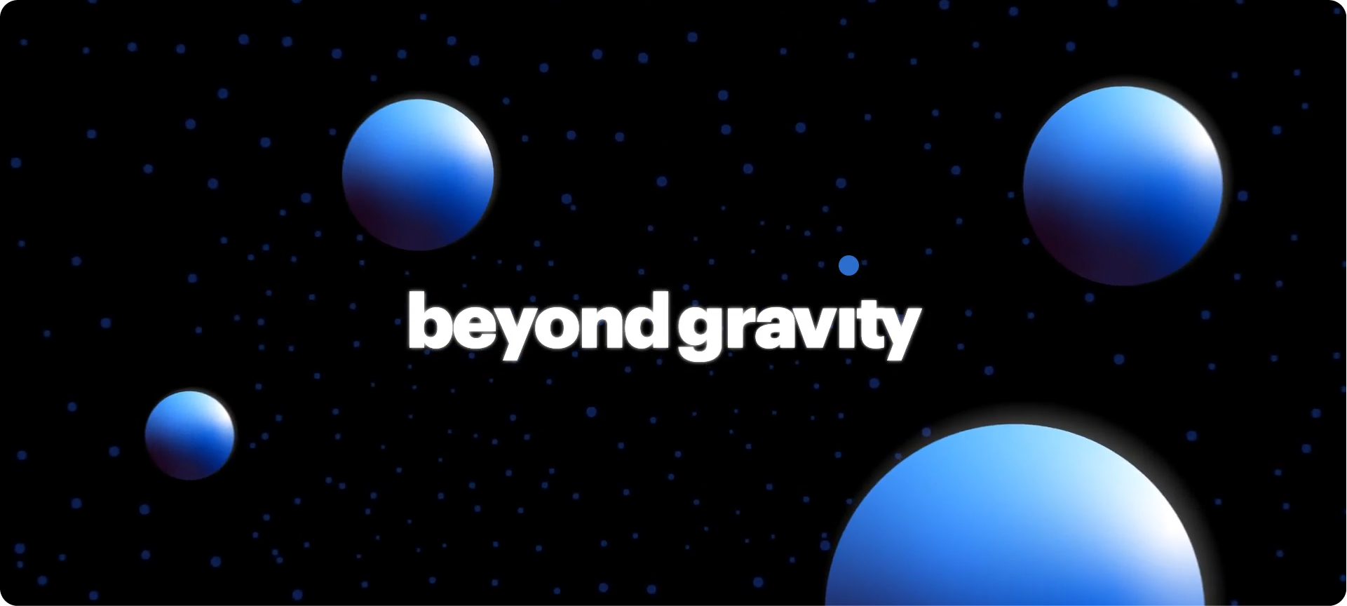
This is a fantastic example of a brand guideline for a highly technical and futuristic company. The design of the guidelines themselves feels innovative.
6. Netflix

The Netflix brand site is clean, iconic, and straight to the point. It’s built for speed and clarity, just like their product.
7. Dropbox
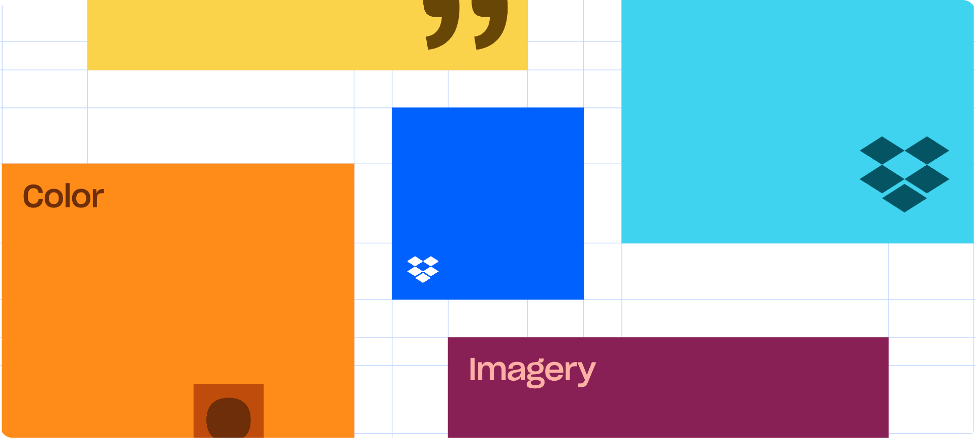
Dropbox's brand guidelines are a great example of a flexible, creative, and modern tech brand. It’s less about rigid rules and more about a creative system.
8. Trustpilot
Trustpilot’s guidelines are a masterclass in practicality. They are focused on one primary goal: ensuring other businesses use their trust marks correctly.
9. Sinch
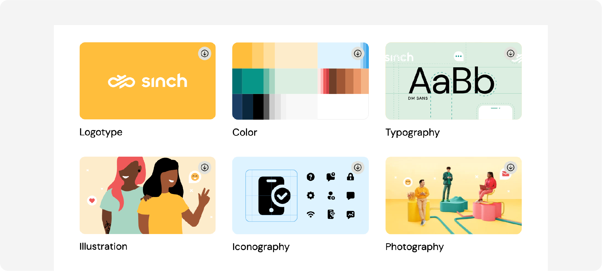
Sinch provides a clean, comprehensive, and well-structured set of guidelines that are a perfect example of a modern B2B tech brand.
10. Firefox
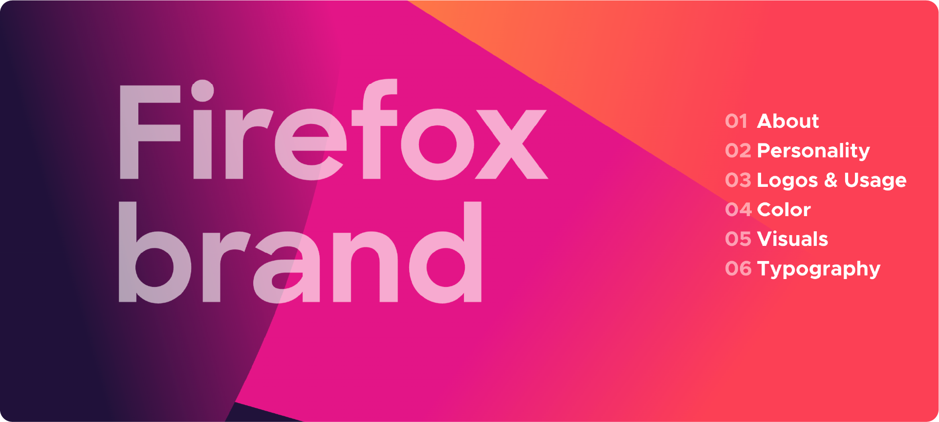
The Firefox brand guidelines are part of the larger Mozilla Design System, making them a fantastic example of how a brand identity fits into a product design ecosystem.
Related Reading: For more tech brand guidelines inspiration, visit brandbooks.shop.
Luxury Brand Guidelines Examples
Brand guidelines from high-end and premium brands. Typically restrained in colour, precise in typography, and focused on tone of voice and application consistency.
1. Harrods
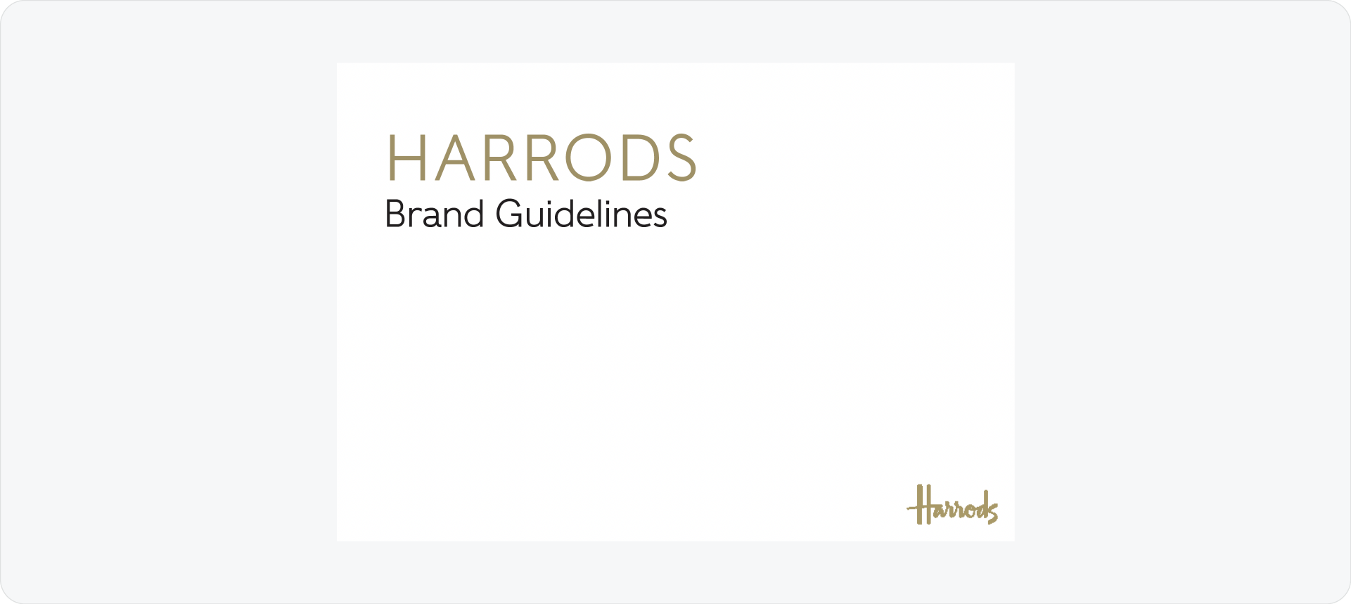
Harrods is one of the most famous luxury names in the world. Their guidelines focus on a classic, timeless look.
2. Ivory & Deene
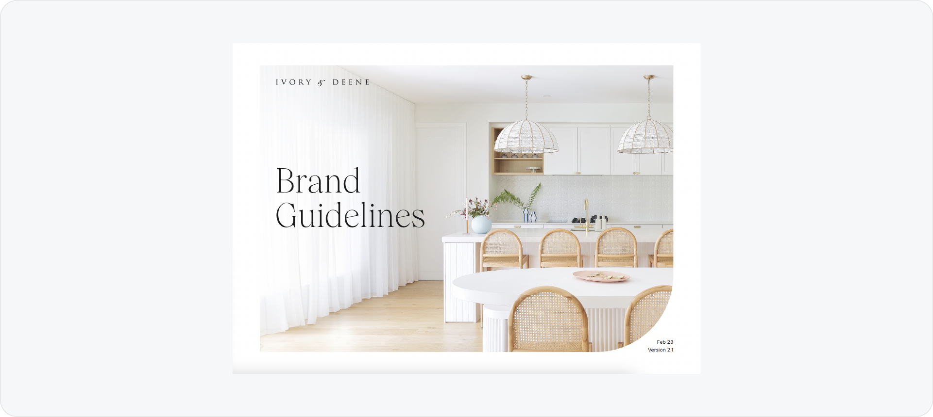
Ivory & Deene is a home decor brand that focuses on amazing spaces. Their guidelines use beautiful lifestyle photography to set the mood.
3. Linvisibile
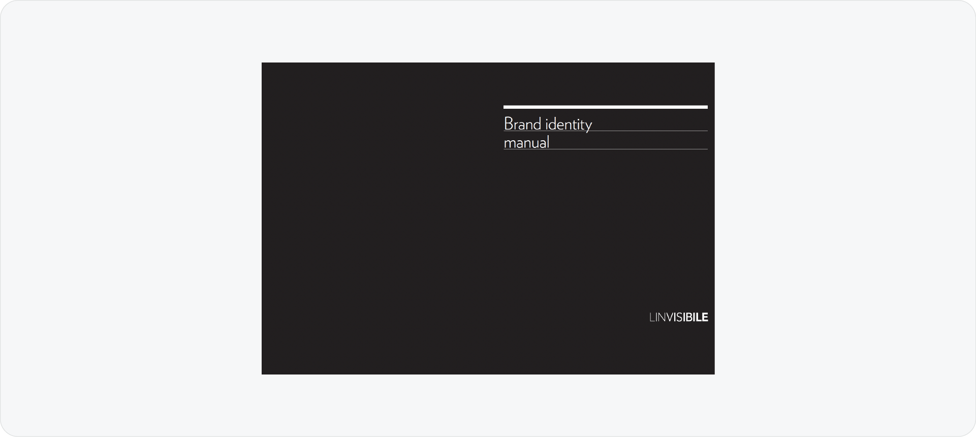
Linvisibile creates premium architectural products. Their brand identity manual is very minimalist and technical.
4. Swanq
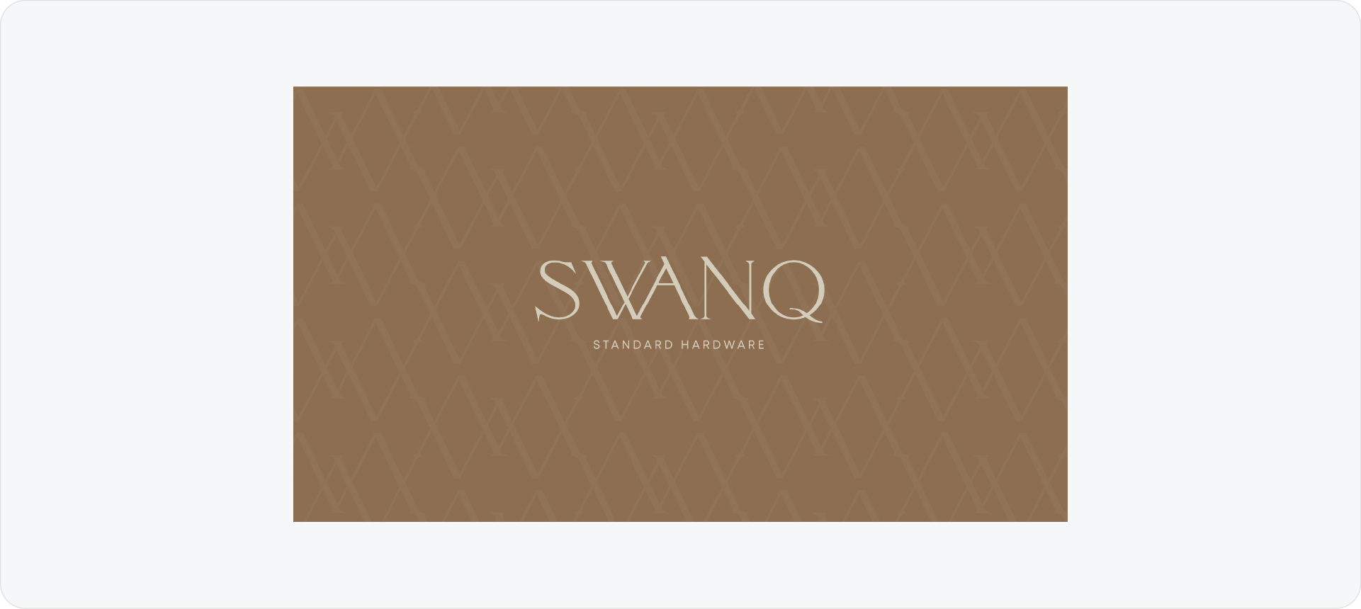
Swanq is a hardware brand that uses luxury materials. Their guidelines use earthy tones like brown and gold to reflect their products.
5. HCMA
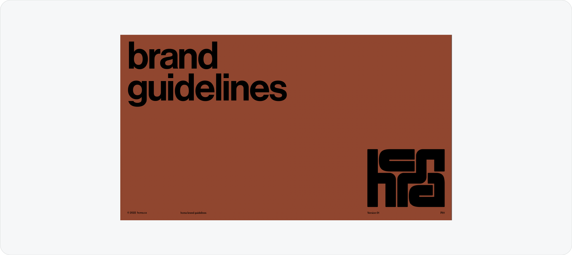
HCMA uses a bold and creative approach to luxury. Their guidelines focus on high-contrast layouts and very large, confident typography.
Related Reading: Browse luxury brand guidelines references and templates at brandbooks.shop.
Comprehensive Brand Guidelines Examples
Full multi-section documents covering logo, colour, typography, imagery, tone of voice, and applications. These are the most complete examples of what a thorough brand guidelines document looks like.
1. Rolls-Royce SMR
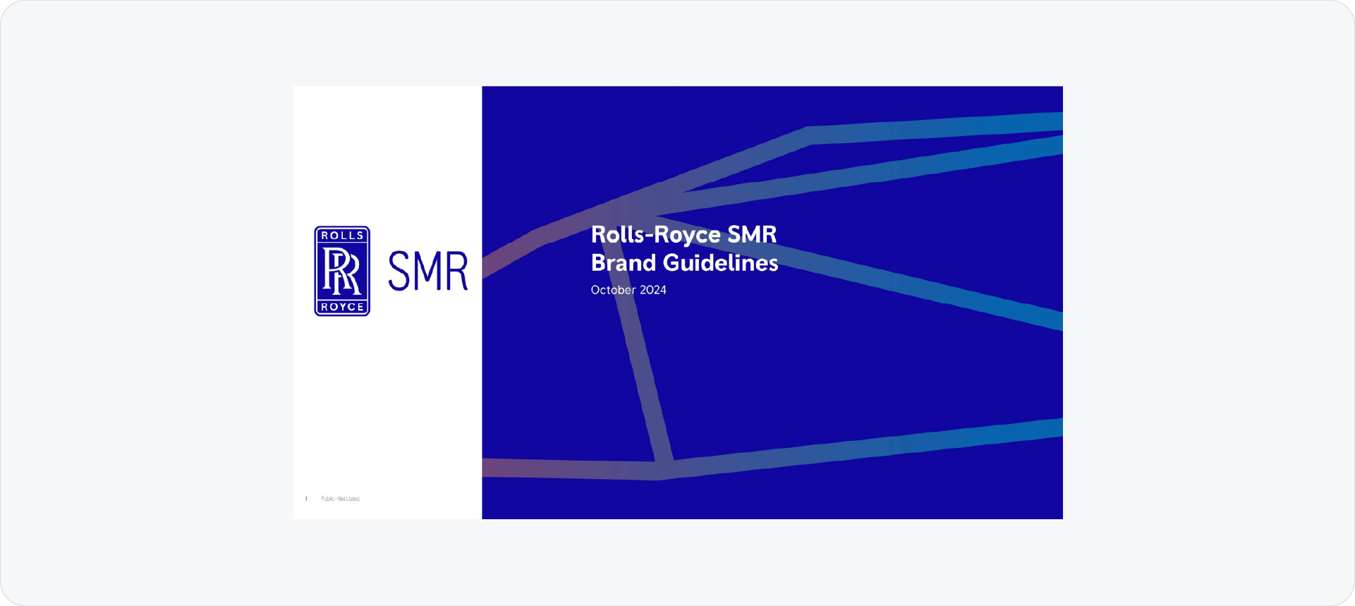
The Rolls-Royce SMR guidelines are a good reference for industrial branding. The document provides a lot of detail on how the logo lives next to engineering data and technical imagery. It is a very structured example that focuses on authority and clarity.
2. OneHousing

OneHousing uses a detailed documentation style to manage its visual presence. Their guidelines focus on accessibility and clear layout rules. It shows how a brand book can manage a large amount of information while staying organized.
3. Sea-EU
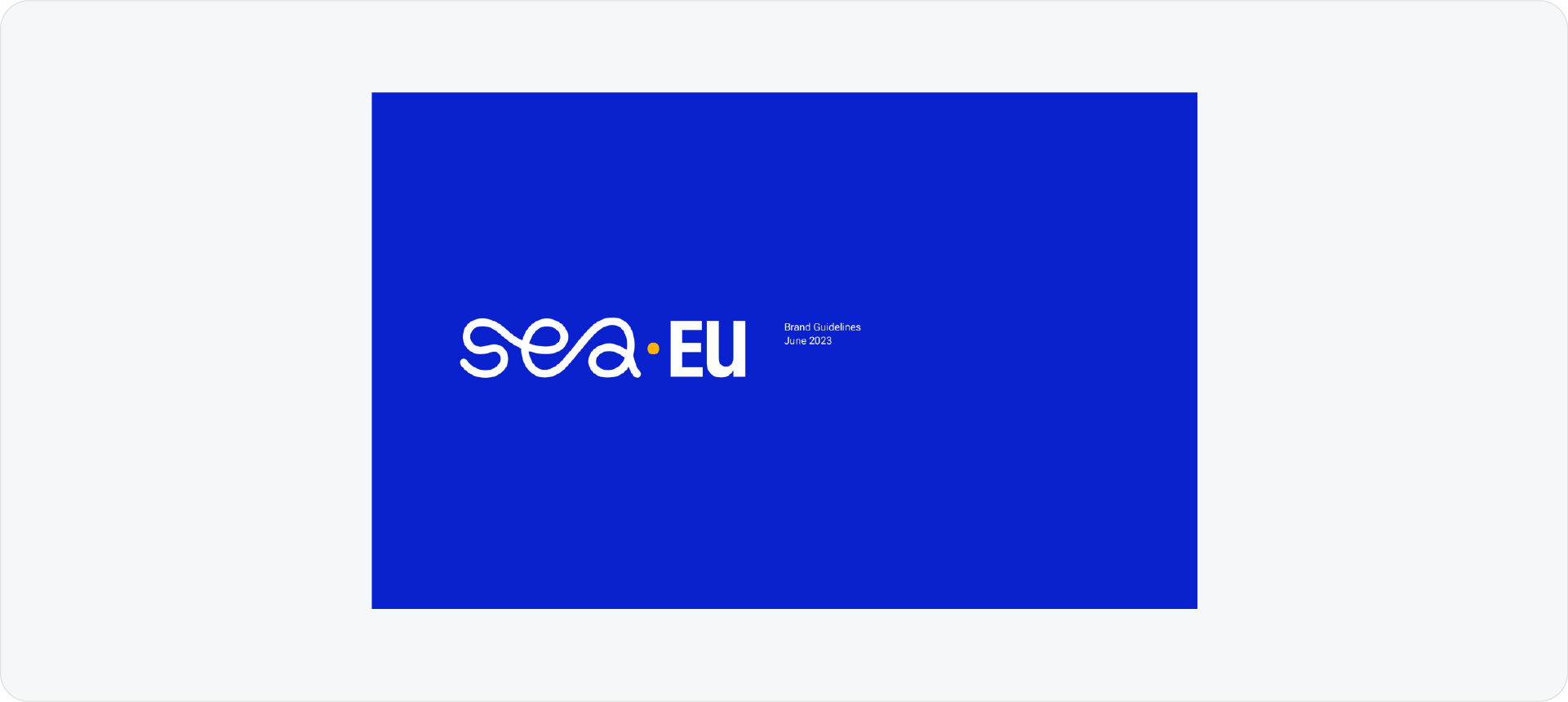
The Sea-EU visual identity is a great example for institutional branding. These guidelines document a complex symbol and a broad color palette used across several European locations. The focus is on maintaining a unified voice across many different applications.
4. Effie
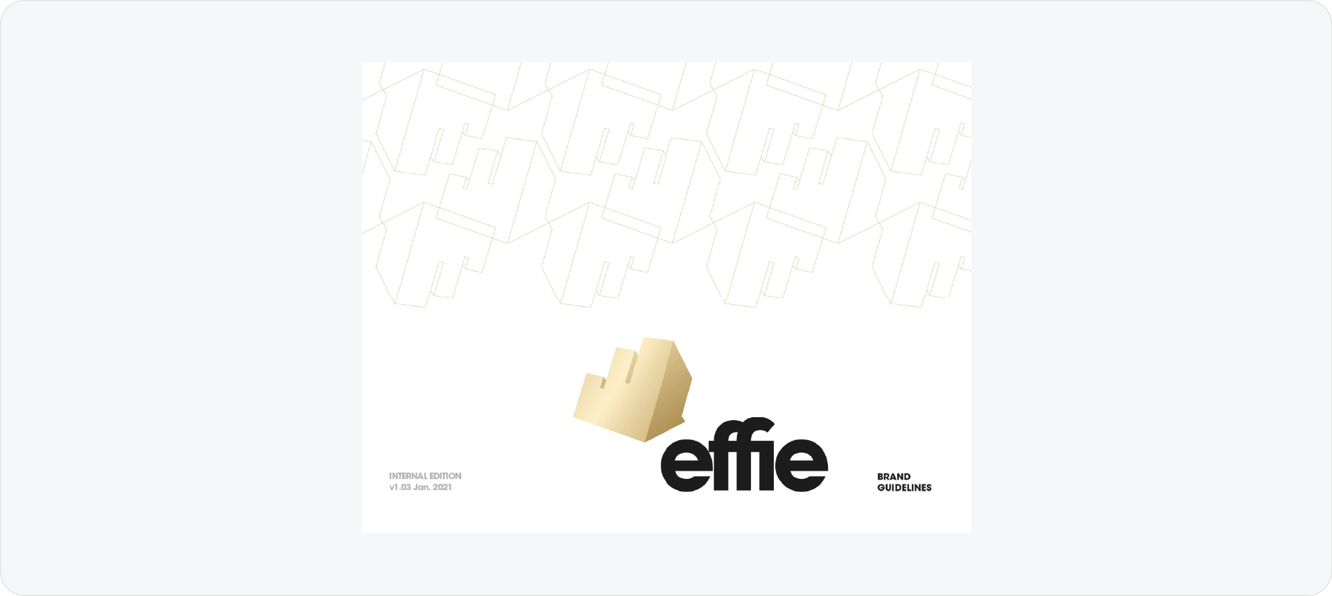
Effie’s brand guidelines show how to document an identity for the global marketing industry. The document uses high-contrast layouts and provides clear rules for photography and typography. It is a professional reference for building a brand that needs to feel established.
5. Rakuten
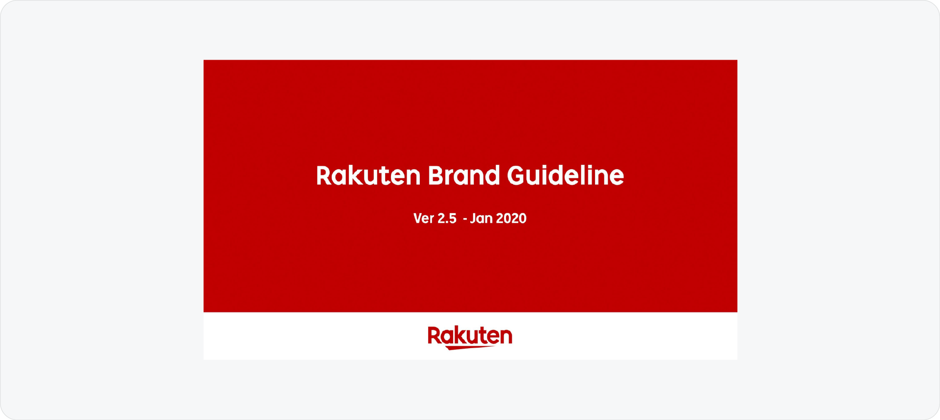
Rakuten is a massive global e-commerce brand, and its guidelines reflect that scale. The document covers everything from app icons to global sponsorship rules. This is one of the best brand guidelines examples for understanding how one identity works across many business units.
6. Akrivi Automated Tech Template
If you are working on a large project, I designed a specialized 100-page tech template inside Akrivi Guideit. I was inspired by the technical depth of the Bolt brand guidelines when I built this.
Related Reading: If you want to see how a brand book differs from brand guidelines, read Brand Book vs Brand Guidelines.
Famous Brand Guidelines Examples
Publicly available brand guidelines documents from well-known global brands. Useful for studying how large organisations handle logo usage, colour systems, typography, and layout across a full guidelines document.
7. Bolt: The Power of a Quick Guide

Bolt's 2025 refresh is a great example of a simple but effective change. What I love is how they present their identity in a concise, accessible guide for partners. It’s built for speed and clarity, and the bento grid at the end is a perfect way to summarize everything.
Akrivi Guideit's Tech template is heavily inspired by this brand guidelines example.
8. Tripadvisor: Interactive and Vibrant Branding
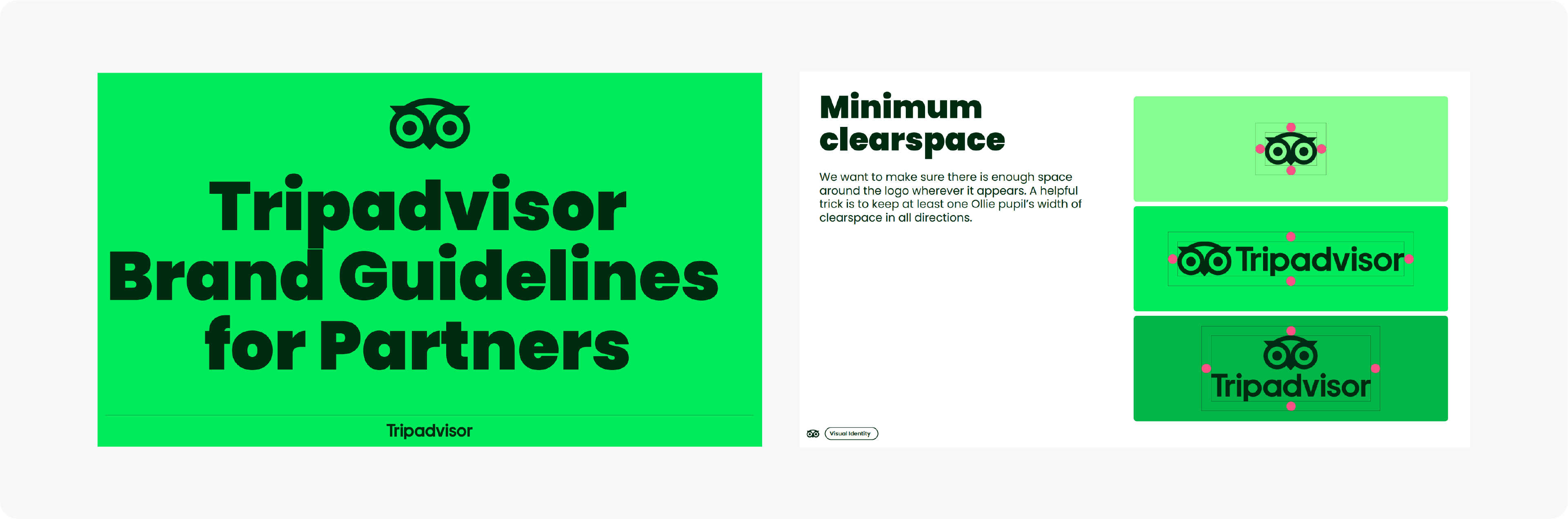
Tripadvisor's guide is a masterclass in bringing a brand's personality to life. While it's a PDF, it feels interactive and dynamic. The use of vibrant colors and a playful tone is perfectly on-brand, making what could be a dry document an engaging experience.
A similar corporate brand guidelines style is available to download for free
9. Snapchat: Direct and Easy to Follow
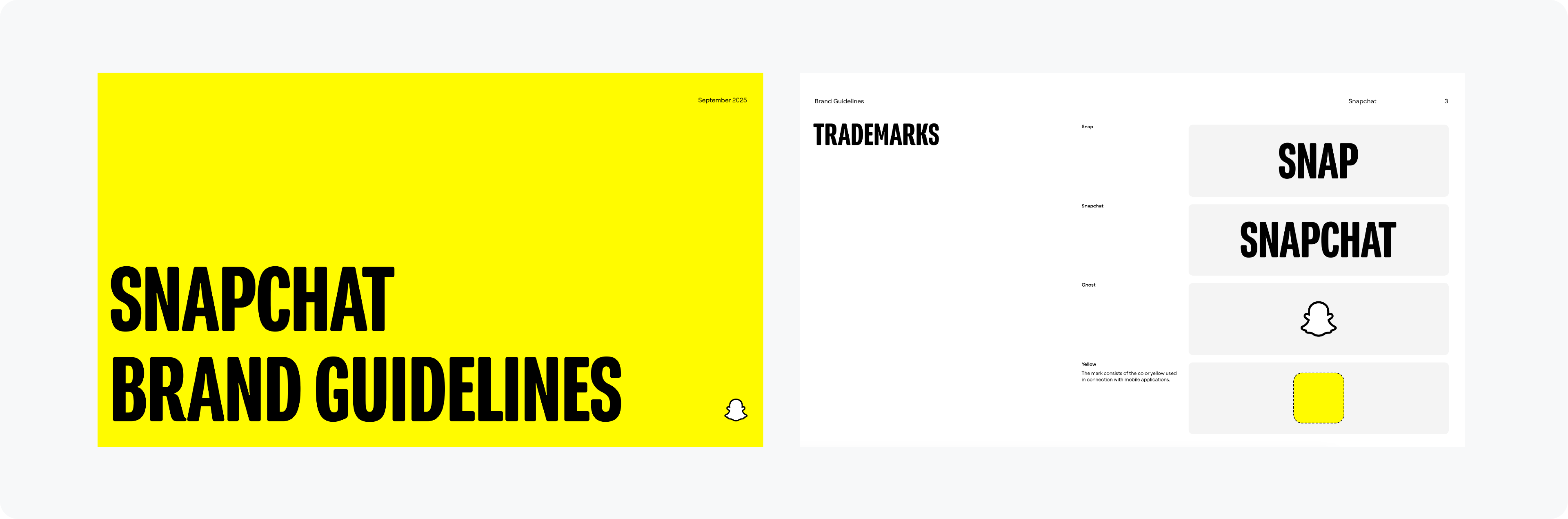
Similar to Bolt, Snapchat's guide is built for partners and is incredibly direct. There's no fluff, just clear rules on the logo suite, color, and typography. It gets straight to the point.
You can also use this brand guidelines example inside this free brand guidelines template kit for Adobe Illustrator.
10. 3MON: Mastering Logo Variations

3MON is a fantastic example of how to handle a brand with many logo lockups. They clearly show the primary badge, symbol alternatives, and exactly how each version should be used, which is crucial for consistency.
11. John Knox Christian School (JKCS): Clean and Focused
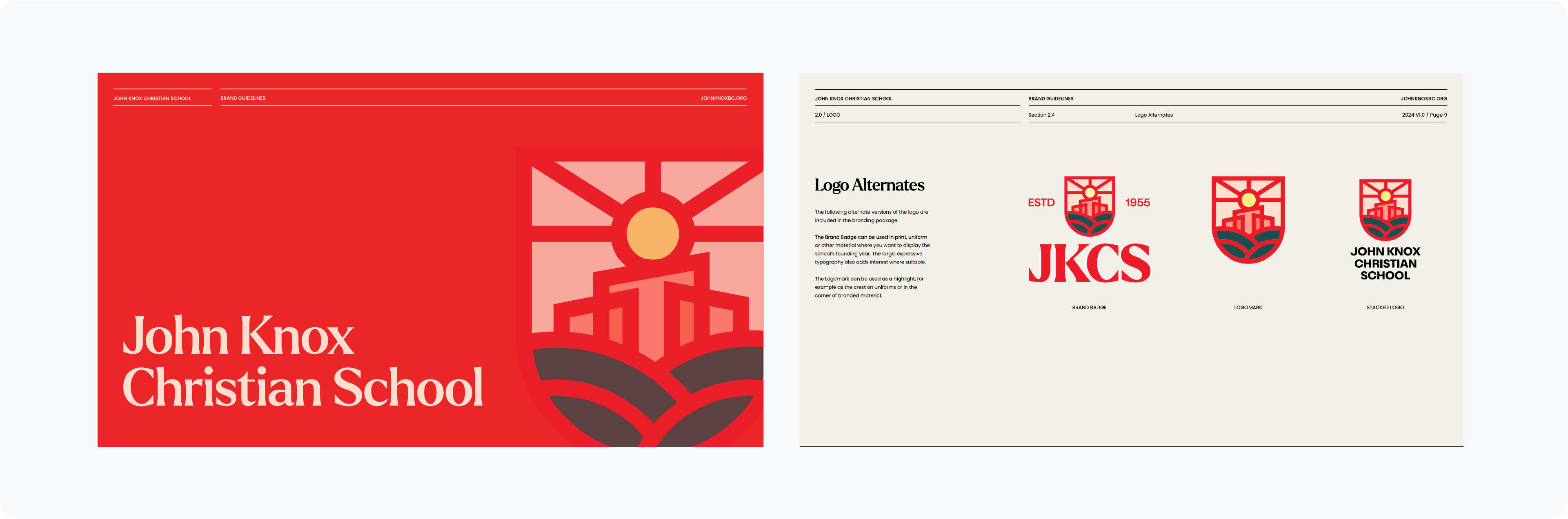
The JKCS brand guide is beautifully clean and minimal. The layout gives the brand elements plenty of room to breathe. This provides a really good, clear view of the brand identity.
Generate Brand Guidelines in Seconds
Related Reading: For non-profit brand guidelines examples, read the non-profit brand guidelines examples guide.
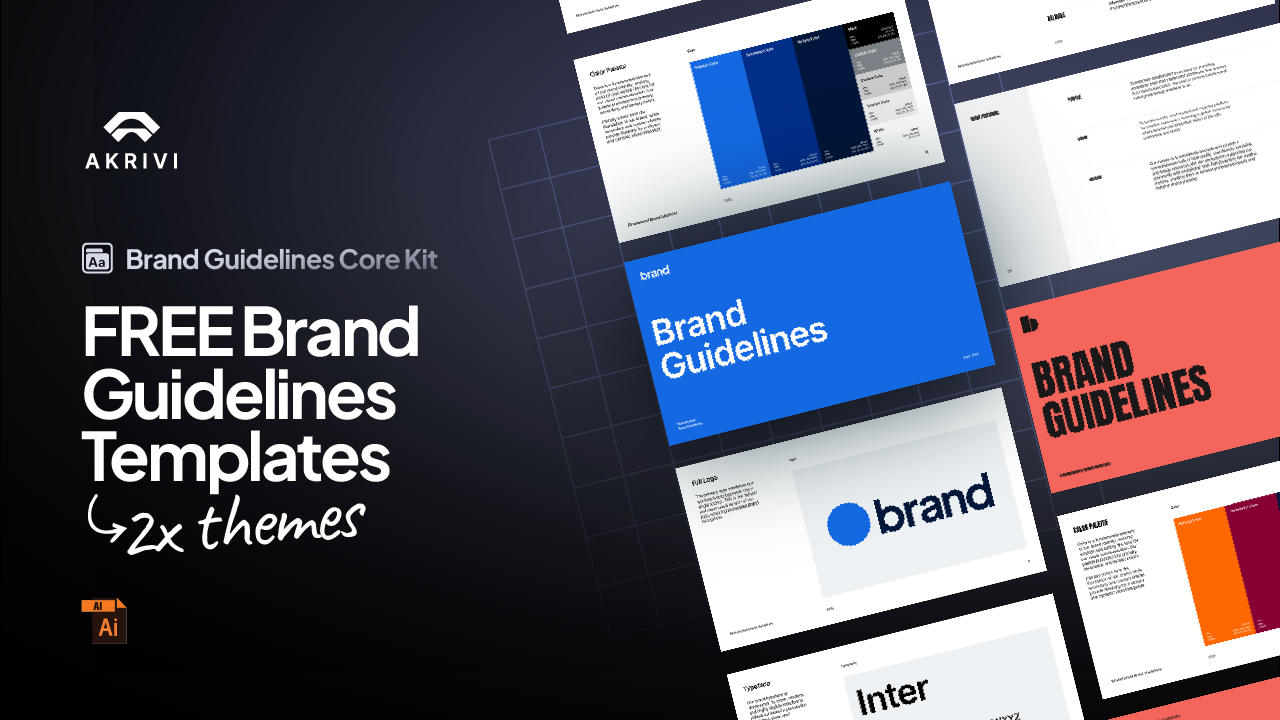
Generate your own brand guidelines with Guideit
Guideit generates a complete brand guidelines document inside Adobe Illustrator in seconds using Automated Templates. Choose from 10 templates across Corporate, Tech, Contemporary, Signature, Urban, Swiss, Corporate 100, Tech 100, and more.
The output is a native AI file you export as a PDF for client delivery. Store it in Google Drive or Dropbox and share a link so the client always has access to the latest version.
Generate for Free with Akrivi Studio
Conclusion
The best brand guidelines documents are clear, consistent, and practical. They give anyone working with the brand exactly what they need to apply it correctly without guessing. Use the examples above as inspiration for your own projects.