Kwaku Amprako is a brand identity designer and founder of Akrivi — pioneering BIDA (Brand Identity Design Automation) to empower designers to create with more speed, precision, and less stress.
for your clients 10x faster
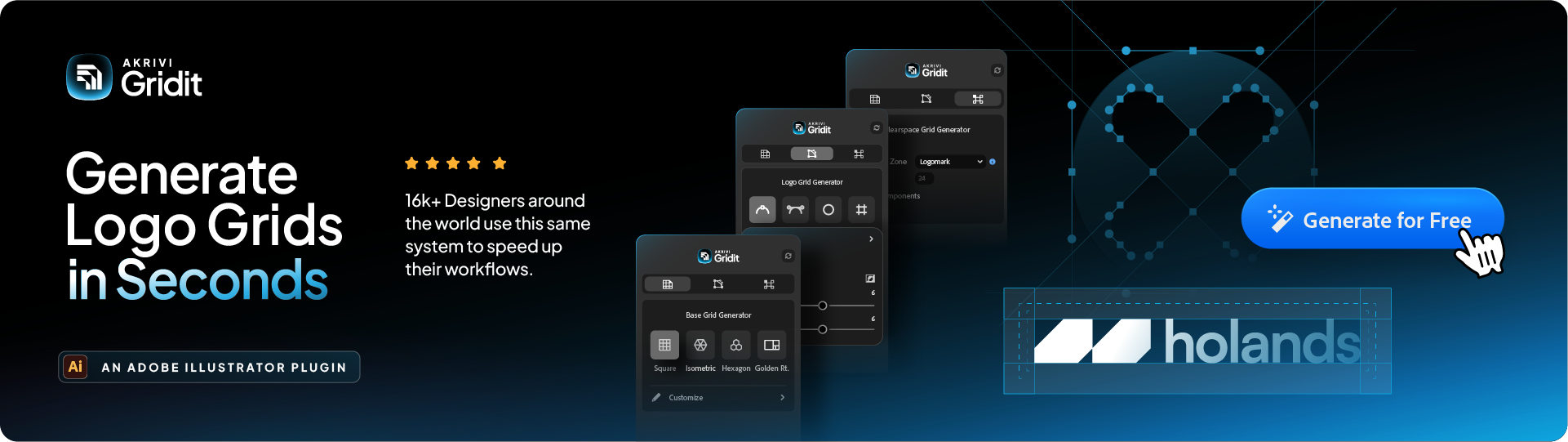
Automate your entire logo & brand identity workflow with Akrivi Studio.
How to Balance Your Logos: Pairing your Logomark & Logotype Using Grids
Learn how to balance your logomark and logotype using a grid system for cleaner, more professional logos.
You’ve designed a strong logomark and a distinctive logotype. Now comes a crucial step, combining them in a way that feels balanced and intentional.
When designers ask how to “balance a logo,” they’re usually referring to the process of pairing a logomark (the symbol) with a logotype (the text) in a clean, visually harmonious way.
In this guide, I’ll show you how to use simple grid systems to create balanced logo lockups that look polished and professional.
What Are Logo Lockups?
A logo lockup is a fixed arrangement of a brand’s visual elements, usually the logomark, logotype, and sometimes a tagline, combined into a single, unified layout.
I go into more detail about what logo lockups are, and the different types in this blog post here.
Using a Grid System for Logo Balance
Now you understand what a logo lockup is, the next step is learning how to balance it, and that’s where a grid system comes in, specifically a Lockup Grid.
This type of grid gives you a clear structure for aligning your logomark and logotype so they feel cohesive and well-proportioned, no matter the layout.
While there are many ways to arrange logo elements, this blog focuses on the two most common lockup types:
- Horizontal Lockup: The logomark is placed beside the logotype
- Vertical Lockup: The logomark is placed above the logotype
We’ll walk through how to balance both using a lockup grid system.
Discover tools that automates your design process.
How to Balance a Horizontal Logo
For horizontal lockups (where your logomark sits beside your logotype), my method focuses on harmonious spacing:
- Place Elements: Position your logomark to the left, and your logotype to its right.

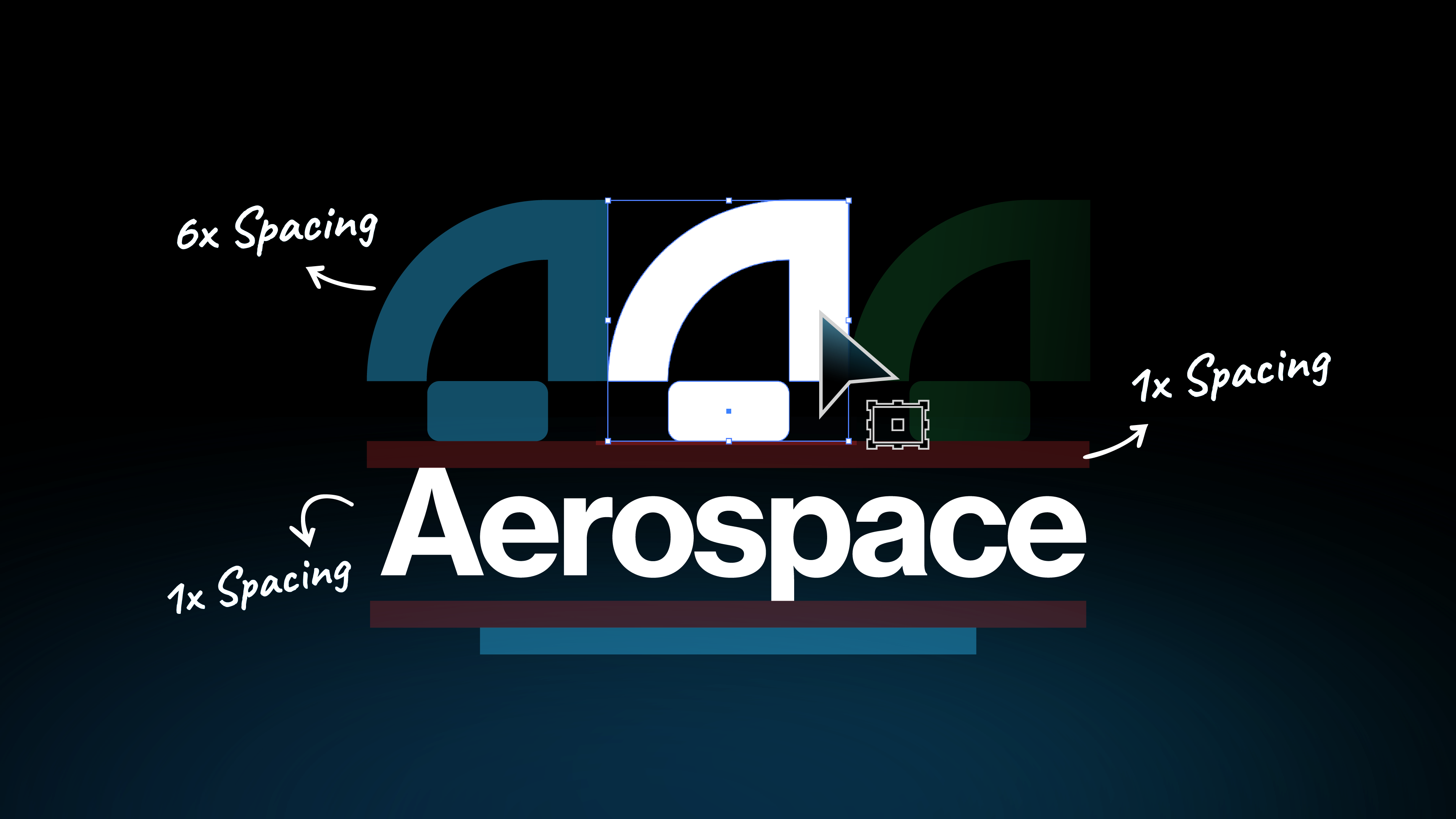
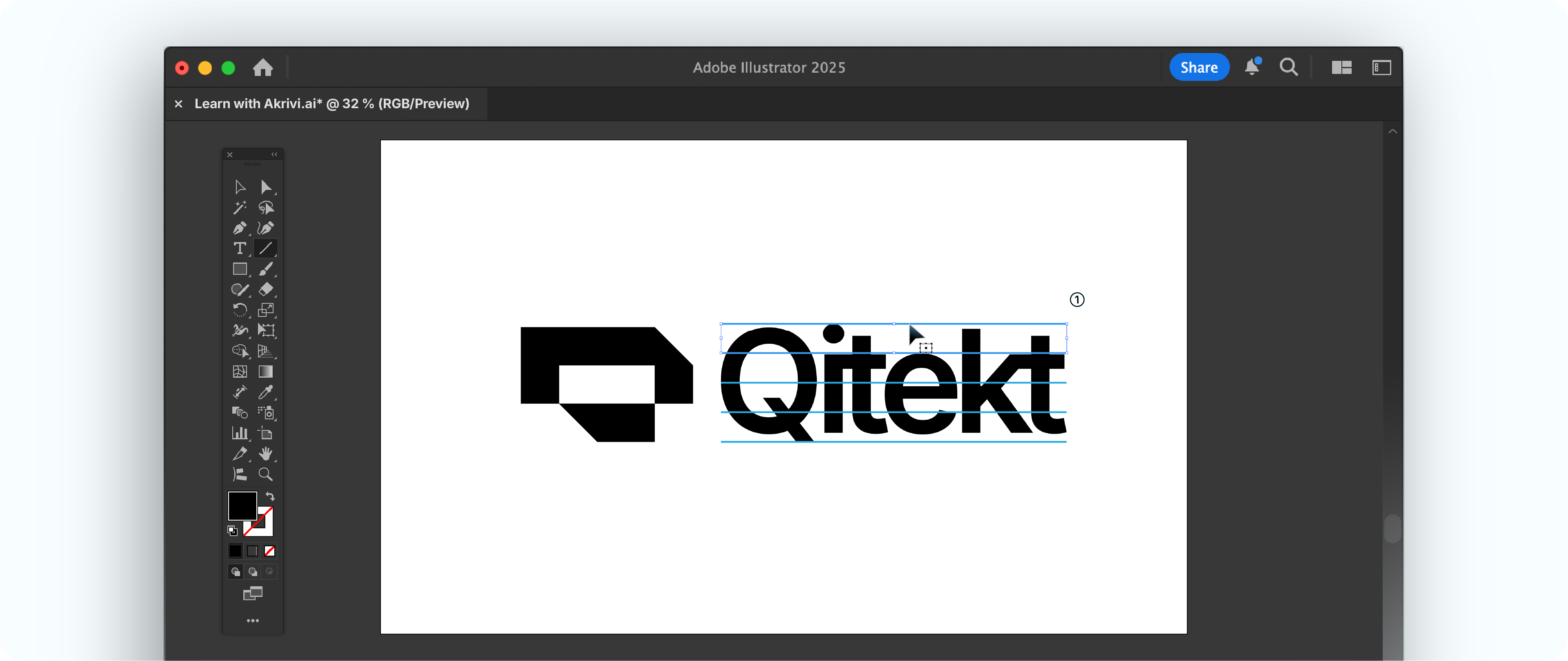
- Divide The Logotype: Use the Line Segment tool (\) to draw a line across the logotype. Drag it to the top making sure it snaps, and another to the bottom using Alt or Option keys to duplicate. Create copies of 3 in between, making them 5. Select all and use the Align Panel (Window > Align), Click Vertical Distribute Space to space them evenly.
- Define Separation Space: Select the top 2 lines and drag holding Alt or Option. In toolbar double click Rotate tool (R) and input 90 in Angle. Use that as clearance between the two marks.

- Apply Spacing: Now extend the lines to precede your logomark. Use them as guide to position the mark perfectly in place.

- Remove Guide: Delete the guides and there you have it! Your logo perfectly balanced.

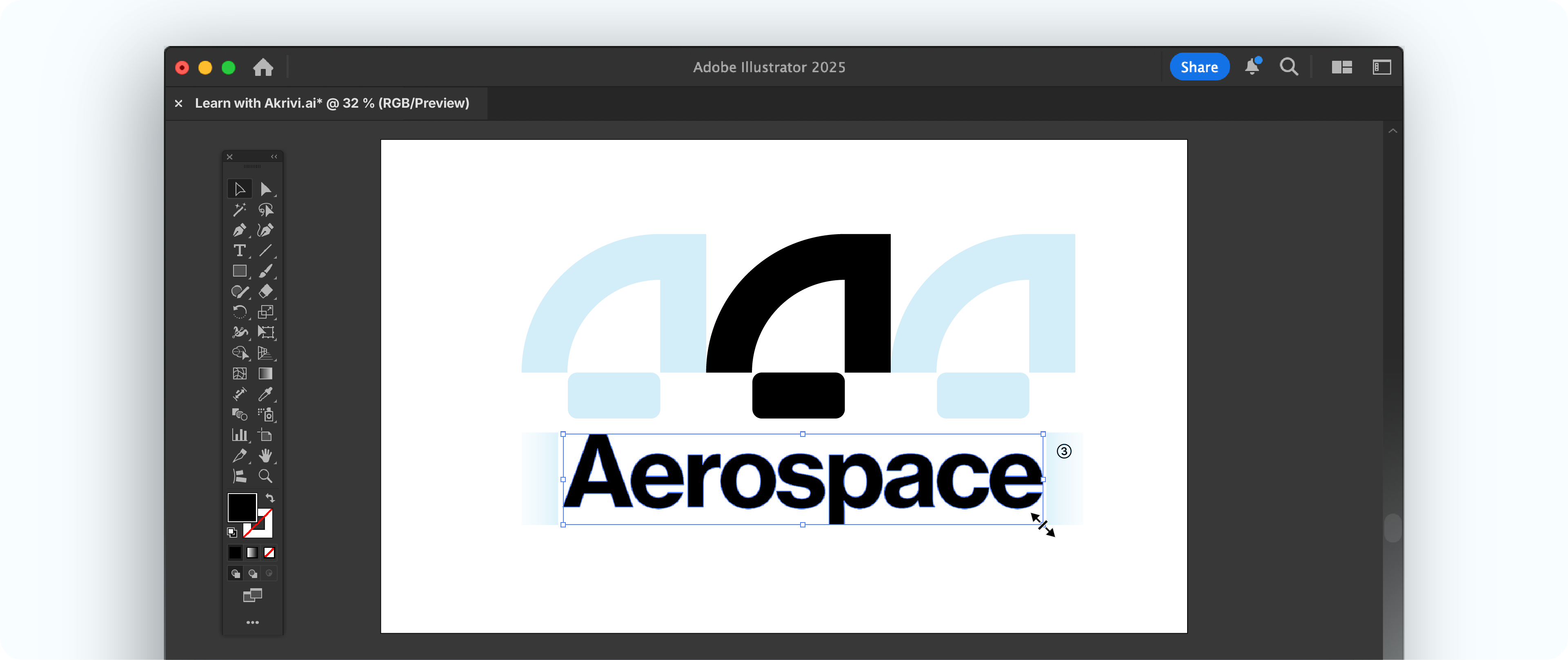
How to Balance a Vertical Logo
For a vertical lockup (where your logomark sits above your logotype), I use this precise approach:
- Place Your Logomark: Start with your completed logomark on your artboard. This will be the central focus.

- Define Wordmark Width: I duplicate the logomark to the right and left, snapping them edge-to-edge with no space. These act as temporary guides.

- Scale Your Logotype: I then scale the logotype (your brand name text) to fit exactly between the outer ends of those duplicated marks. This aligns the text width optically with the mark.
- Create Guide: Use the Line Segment tool (\) to draw a line across your logo mark. Drag it to the top and duplicate one at the bottom. Create 2 more copies in between and use Align (Window > Align) Vertical Distribute Space them evenly. Use 2 of the lines as separation space
- Define Separation Space: Use 2 of the lines as separation space (⅓ of your logotype height) as clearance spacing.
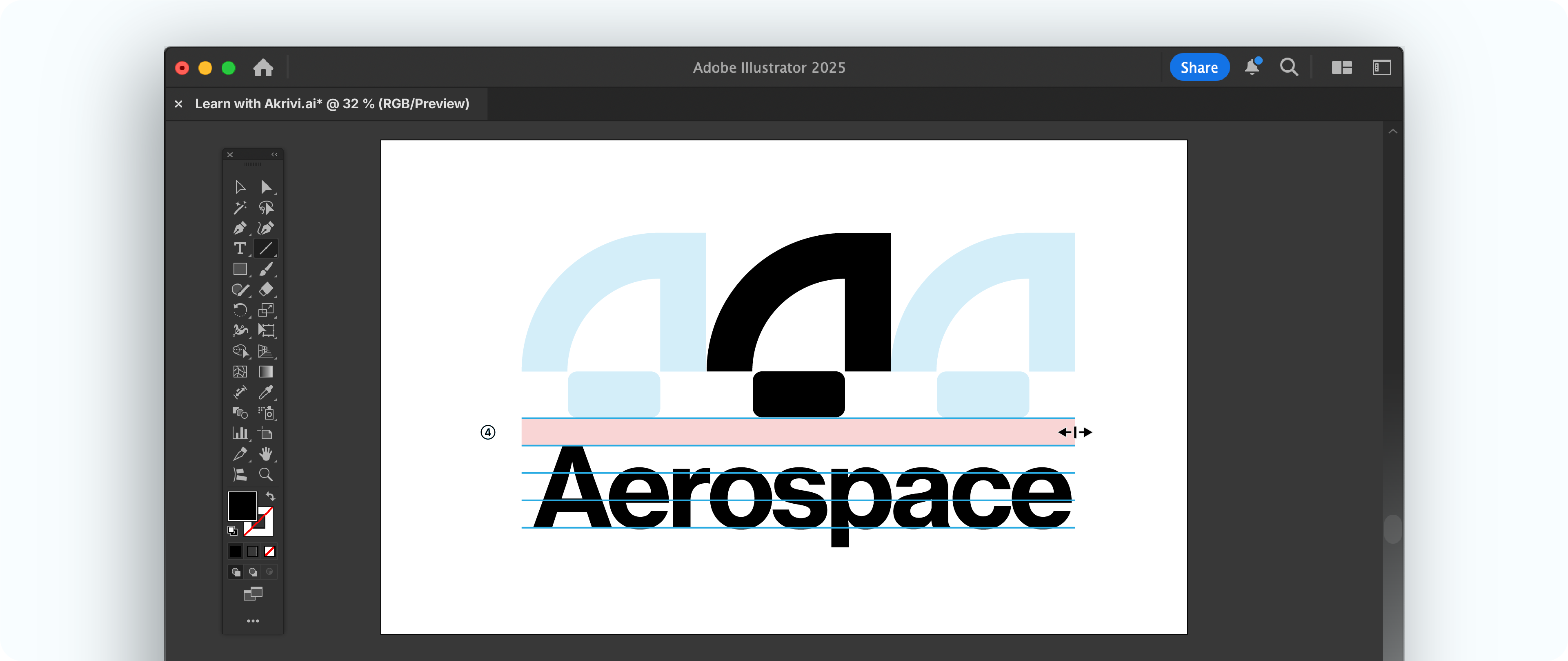
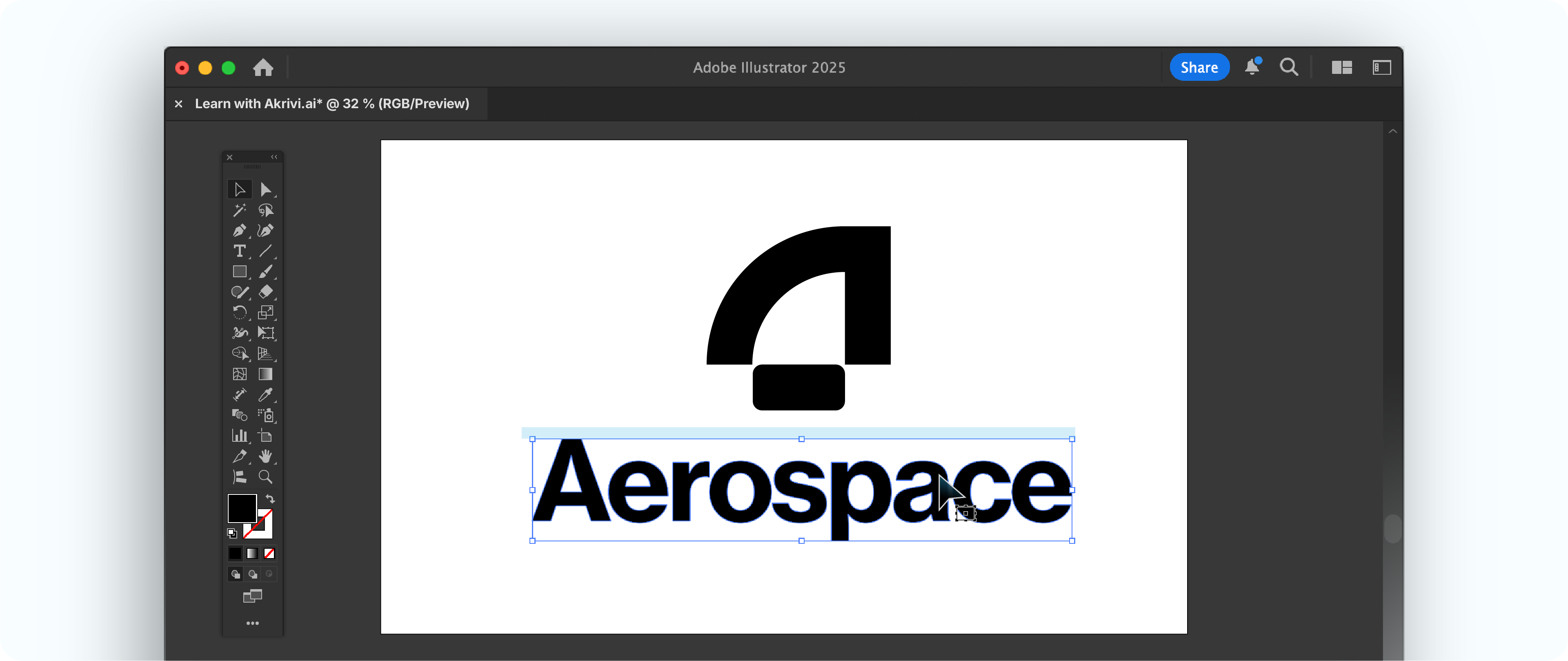
- Adjust Spacing: Delete the duplicated marks. Now, visually adjust the vertical space until it feels harmonious. This creates a strong, stable visual block.
A Step-by-Step Tutorial to Balance Your Logos
Check this video I put together for you, to demonstrate how to do it, EASY PEASY!
The Fastest Way to Do This
While practicing these manual methods sharpens your eye, Adobe Illustrator scripts can automate this process.
They save you immense time and ensure consistent results.
I created a few Adobe Illustrator scripts for creating. Horizontal Lockup Grids and Vertical Lockup Grids.
The scripts instantly apply the precise rules you've learnt in this blog.
Why Logo Balance Matters Before Client Delivery
Balancing your logo correctly is not just a design decision, it directly impacts how you deliver your work.
Before you even think about exporting logo files or creating a logo package, each logo variation needs to be properly aligned and visually balanced.
The techniques covered in this guide ensure your logomark and logotype work together consistently across all variations.
If a logo is even slightly off balance, that issue gets carried across every exported file. This means you’re not fixing one file, you’re re-exporting dozens of logo files across multiple formats, sizes, and variations.
Getting the balance right early ensures your entire logo package is consistent, scalable, and ready for client delivery without unnecessary rework.
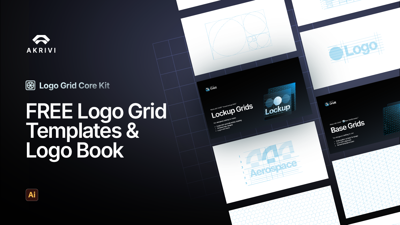
Free Logo Grid Templates
I’ve also created pre-made lockup grids, which can be downloaded here - Logo Grid Core Kit.
Conclusion
Learning how to balance your logo by mastering lockup grids is a crucial skill.
It transforms how your logomark and logotype work together, ensuring they are always consistent, clear, and professional. This mastery brings confidence to your designs and timeless results for your logo projects, which are thing that other Gridit tools offer.