Kwaku Amprako is a logo expert, brand identity designer, speaker, and founder of Akrivi — a platform shaping the future of brand identity design through automation, systems, and precision.


What is Clear Space for Logo Design?
Learn what clear space is, why it matters, and how to define it in your logo designs.
You've spent hours perfecting a logo. But then, you see it on a poster or website. It’s crowded. Other elements are too close, and your logo just disappears. I often see logos battling for attention.
They get lost because nearby elements don't respect the brand's space. A brand's ability to be seen is a key to success, and a logo that isn't clearly visible can't do its job.
This is where clear space for logo design comes in. It’s the invisible shield that ensures your logo always stands out.
I’ll explain what clear space is, why it's so vital, and how designers define this safe zone in logo creation.
What Exactly is Clear Space for Logo Design?
Clear space (also known as an exclusion zone or logo safe zone) is the minimum amount of empty space that must always surround your logo.
Think of it like a person's personal space. No one should cross it unless invited. For your logo, that "invitation" might be a specific brand guideline allowing an overlay or pattern. But generally, it's a no-go zone.

This buffer ensures your logo remains legible and impactful. It keeps it protected from other design elements.
Why Clear Space Matters for Your Brand
A clear space is critical for making your logo strong. It helps your brand achieve its goals.
- Ensures Legibility & Impact: Without clear space, text or graphics can get too close. Your logo becomes hard to read or loses its visual power. Clear space makes your logo immediately stand out. It helps deliver your brand's message clearly.
- Maintains Brand Integrity & Professionalism: A crowded logo looks unprofessional. It signals a lack of care in brand guidelines. Correct clear space shows precision. It reinforces your brand's professionalism and authority.
- Adaptability Across Platforms: Logos appear on many different backgrounds and materials. Without clear space, each new placement is a risk. Defining clear space ensures your logo performs consistently. It works well on a website, merchandise, or print.
Clear space is one of the types of logo grids I teach. Each grid type serves a distinct purpose in logo design.
How Designers Define Clear Space
Designers define clear space using a proportional measurement, often called the "X" unit. This "X" isn't the letter; it's a variable representing a space taken from a prominent part of the logo. This ensures the buffer zone scales perfectly with the logo.
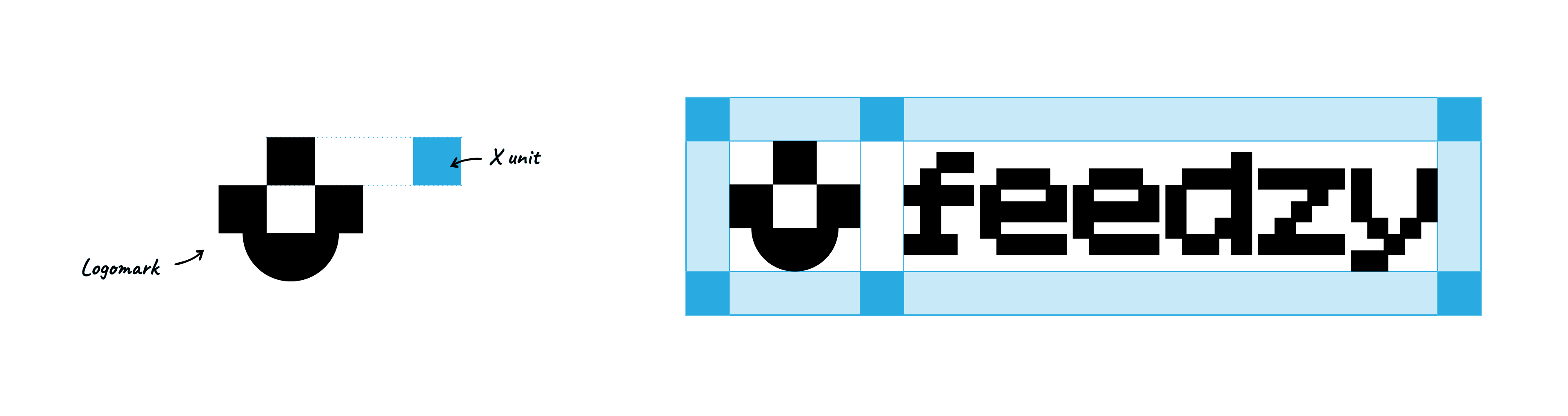
A common method is to make the height or width of a significant letter in the logotype a square, such as an 'O' or 'E', as the 'X' unit. However, many designers get creative with this.
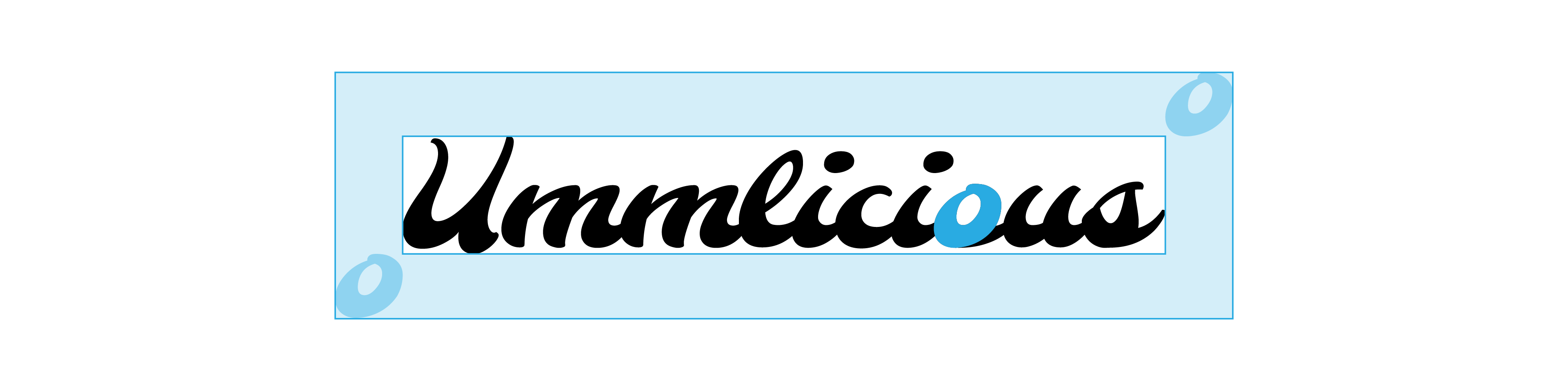
It doesn't matter what element you use, as long as it is consistent and achieves the goal of giving the logo enough room to breathe.
Akrivi’s Tool for Clear Space (Coming Soon!)
Defining clear space manually can be very precise but also time-consuming. Soon, Akrivi will be releasing the Clearspace Grid Generator™, an Adobe Illustrator plugin. This tool will automate the creation of these essential clear space grids. It will make setting your logo's safe zone instant and accurate.
Ready to Build Logos Worth Protecting?
A great logo needs a solid foundation before you can protect it with clear space. To help you build perfectly balanced logos from the start, I've put together a FREE logo grid template.
It's part of our Logo Grid Core Kit and includes an ebook all about mastering logo grids inside Adobe Illustrator.

Conclusion
Understanding what is clear space for logo design is non-negotiable. It acts as your logo's personal bodyguard. It makes your logo stand out, look professional, and work consistently everywhere. This brings confidence to your brand and peace of mind to you.