Kwaku Amprako is a brand identity designer and founder of Akrivi — pioneering BIDA (Brand Identity Design Automation) to empower designers to create with more speed, precision, and less stress.
for your clients 10x faster
Automate your entire logo & brand identity workflow with Akrivi Studio.
Why Use Logo Grids? 3 Essential Reasons Every Designer Should Know
Why Use Logo Grids? Here’s Why They’re Essential for Great Logo Design
Ever wondered if grids in logo design are actually needed, or if they’re just for show?
The truth is, yes, grids matter. After nearly 10 years of designing logos, I can confidently say using grid systems has improved my work in three key ways:
- They keep your shapes consistent
- They make your logos feel balanced
- And they help your designs scale properly across all sizes
Once I started using grids to automate my workflow, my logos looked more polished, more professional, and much easier to present to clients.
Below, you’ll see a side-by-side comparison of my logos before using grids vs. after, the difference is clear.

To understand the basics of logo grids, check out this article where I explain exactly what a logo grid is and why you should use it.
1. Consistency
A grid provides a clear framework that helps maintain consistent proportions and alignments throughout the entire design process.
This level of consistency is key to creating logos that feel polished, professional, and cohesive across different formats.
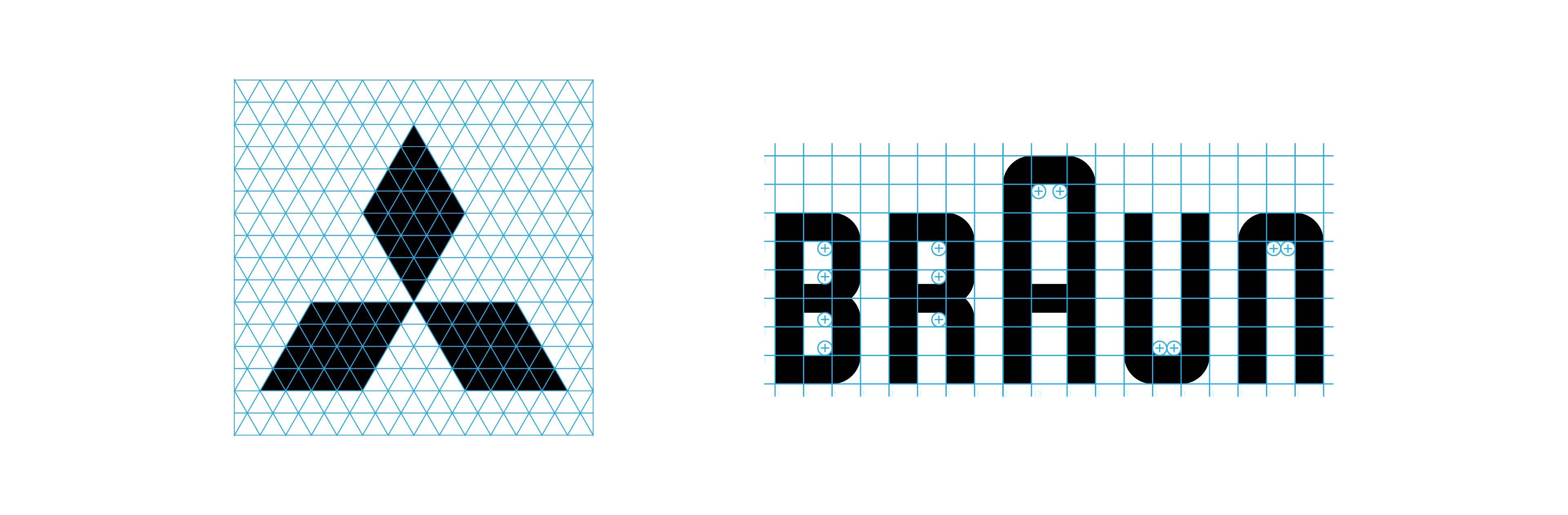
Since logos are built from multiple vector shapes, it’s important that these shapes follow consistent rules, especially when working with geometric logos.
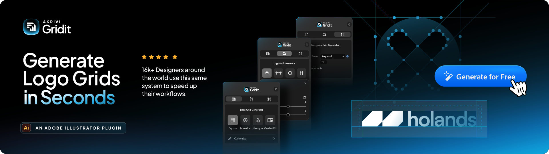
This is where base grids like square, isometric, hex, or golden ratio grids come in.
Base Grid Generator™ a tool within the Gridit plugin, instantly creates any grid you need to start of your logo.
Want to learn more? I've explained base grids in depth here.
2. Balance and Harmony
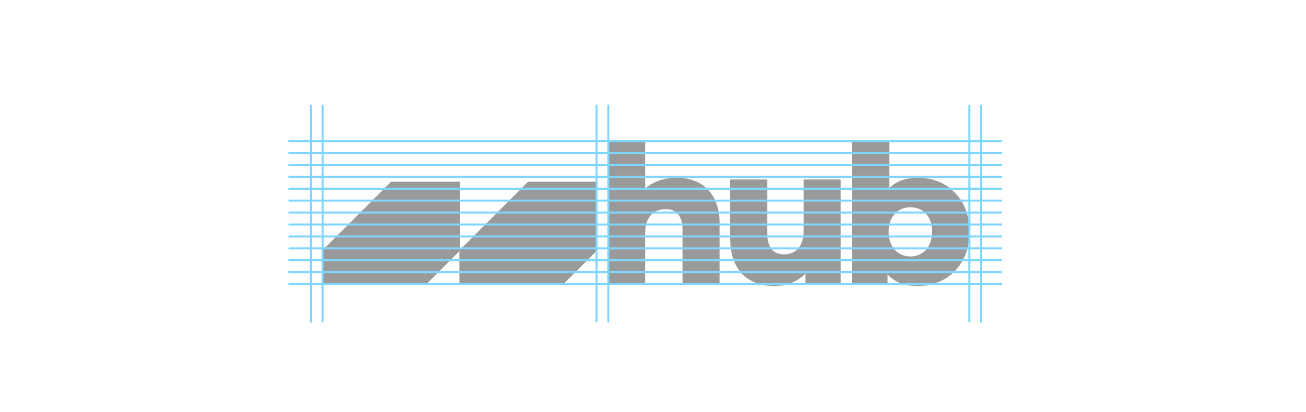
Grids help organize and align elements within your logo, particularly in combination logos, where a logomark (symbol) and logotype (text) need to work together.
These two components are often very different in shape and size, which makes them challenging to balance.
Designers often struggle with this, especially when creating horizontal or vertical lockups.
That’s where the lockup grid becomes incredibly useful. It gives you a clear structure for pairing your logo elements in a way that feels balanced and intentional.
I've written an article explaining how to balance your logos, and pairing your logomark and logotype.
3. Scailability
Your logo has to work everywhere, from a small app icon and favicon, to large posters and billboards.
A solid grid system ensures that your logo stays readable, proportional, and visually clear at any size. This is especially important for responsive branding and systems-based design.
Grids like the base grid, lockup grid, and especially the clearspace grid all contribute to making your logo versatile, legible, and adaptable.
You can learn more about how clearspace grid systems help with scalability for a logo here.

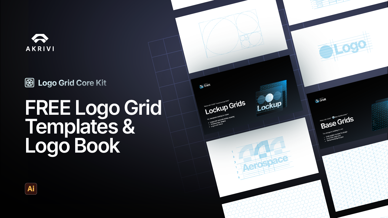
Download Your Free Logo Grid Templates
I've put together a FREE logo grid template for you to use right away.
This logo grid template pack contains all the grids inside Gridit's Base Grid Generator™
Inside, you can find a FREE ebook for Mastering Logo Grids in Adobe Illustrator