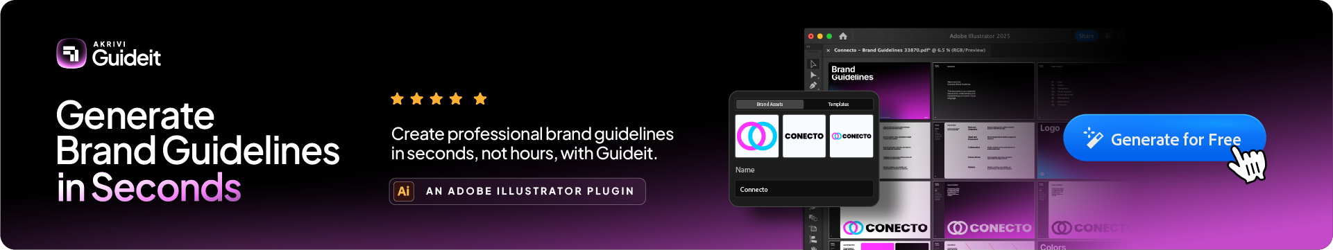
The all-in-one automation suite for brand identity designers
Deliver flawless
Everything you need, in one poweful suite


13 Brand Guidelines Examples Professionals Love (2026)
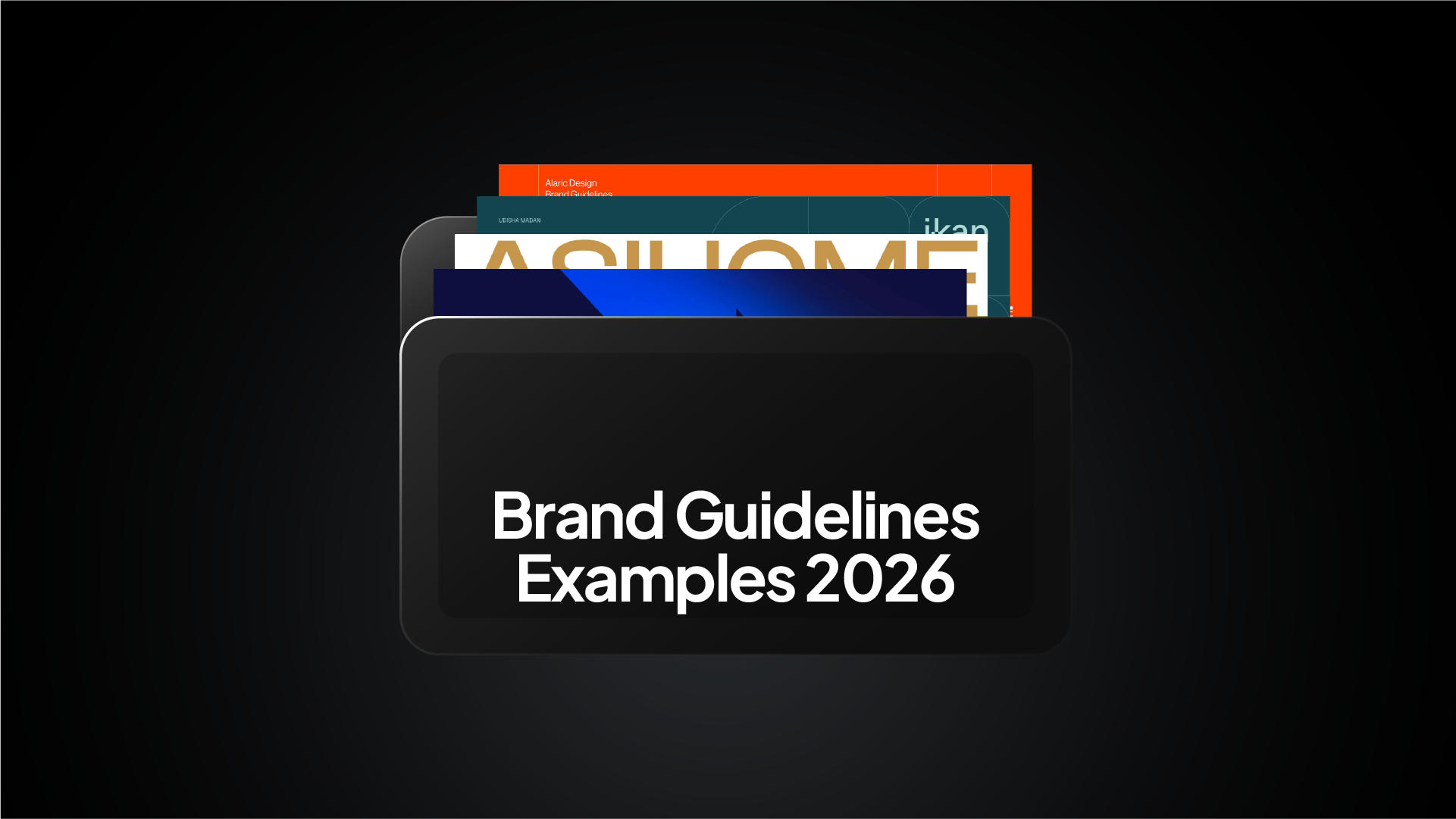
From tech giants to creative studios, here are the brand guidelines that set the standard in 2026.
Whenever I start a new branding project, the first thing I do is look at examples.
It isn't about copying. It is about benchmarking. Seeing how other professional designers organize their visual identity helps you understand what standards you need to hit for your own clients.
Whether you call it a brand book or a style guide, the goal is always the same, which is consistency.
In this post, I have curated 13 specific examples of brand guidelines that you can actually view and study. I will explain exactly why they work and how you can achieve a similar level of polish using Guideit.
1. Bolt (2025)
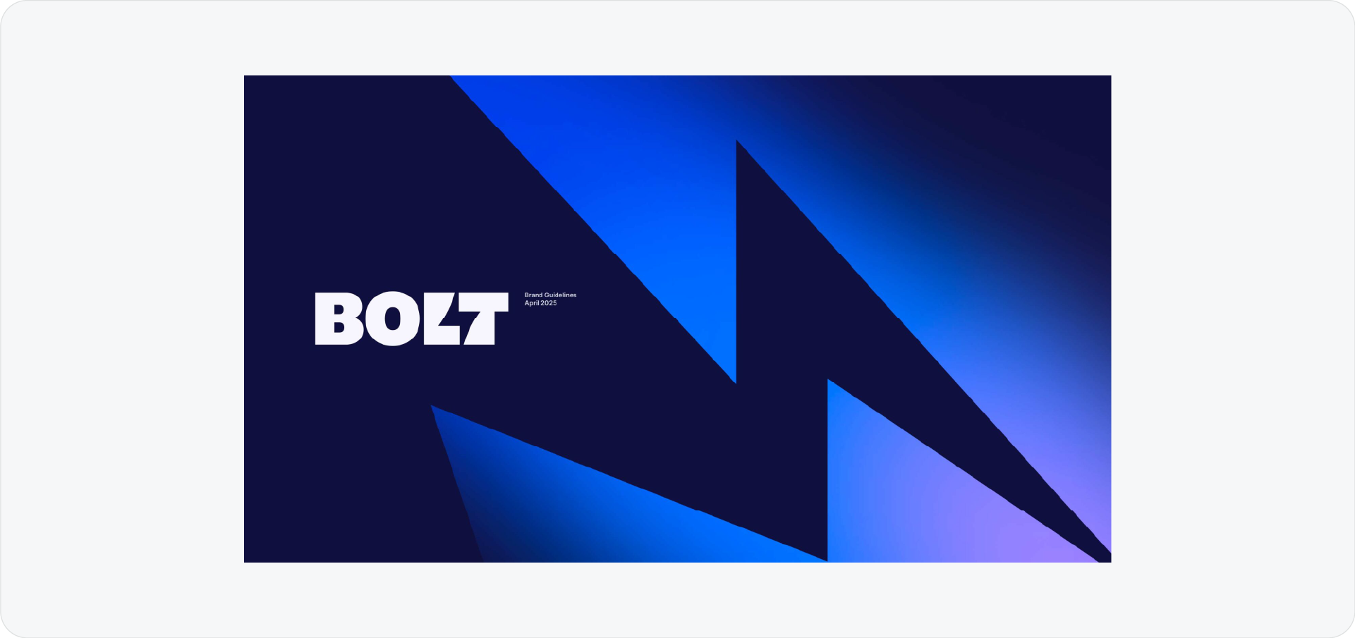
Bolt’s guidelines are a masterclass in modern mobility branding. They manage to keep a very tech-heavy brand feeling human and accessible.
Why I love these brand guidelines:
- Motion is key: Since they are an app, they don't just show static logos; they explain how the brand moves.
- Clear spacing: The layout uses massive amounts of white space, making the rules easy to digest.
2. Discord
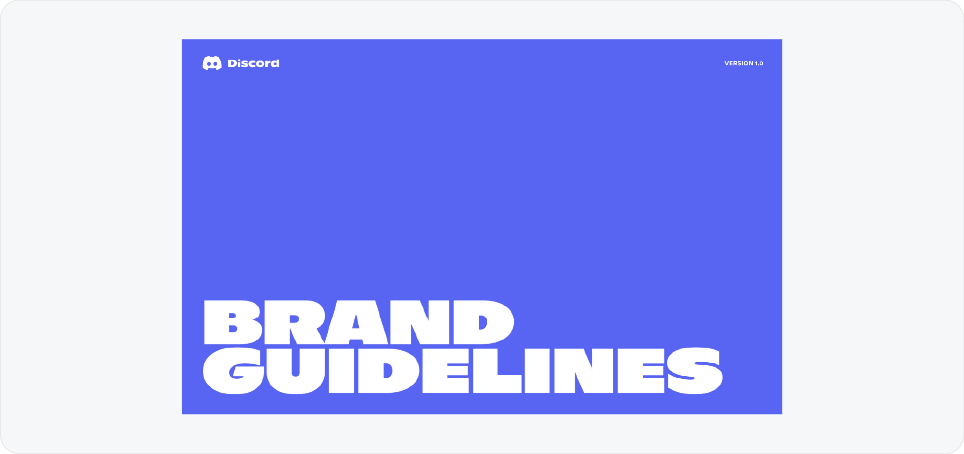
Discord manages a difficult balance. They have a playful, gamer-centric vibe, but they need to be taken seriously as a communication platform.
Why I love these brand guidelines:
- Mascot rules: They explicitly show how to use Clyde (their logo) so he doesn't get distorted or misused.
- Accessibility focus: They prioritize legibility and color contrast, which is crucial for a chat app.
- Tone of voice: The writing style in the guide itself is fun, proving you don't have to be boring to be professional.
3. Burger King
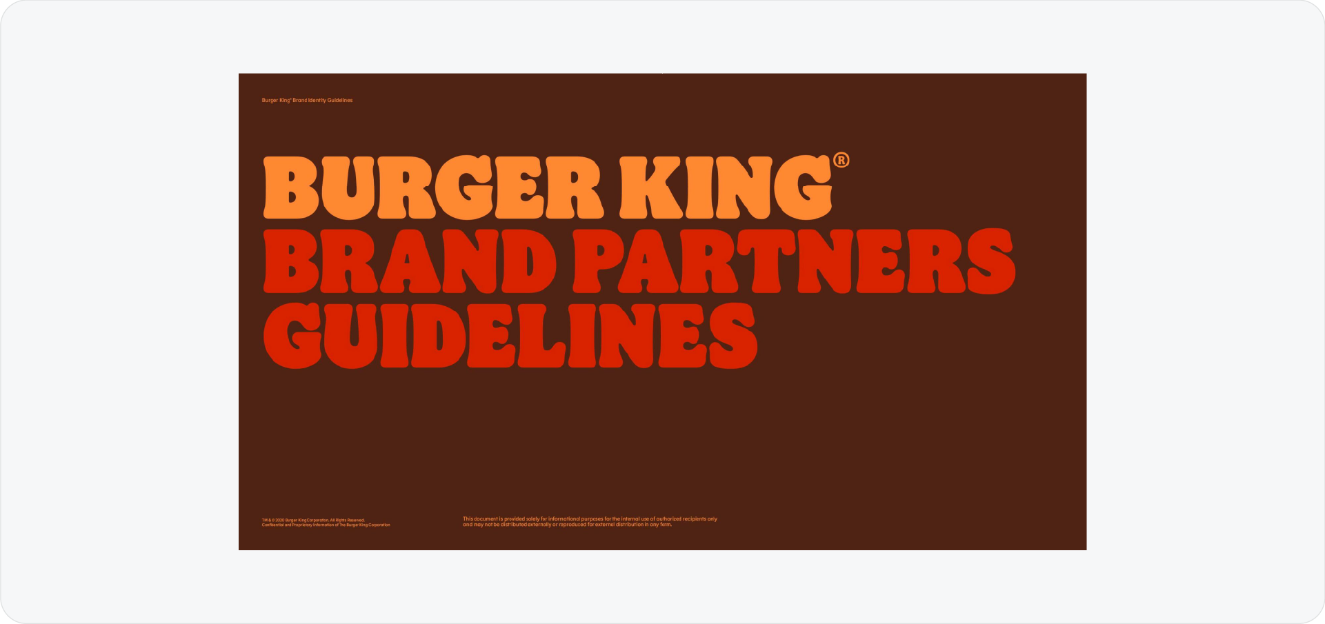
This is one of the most famous rebrands of the decade. It leans heavily into a mouth-watering retro aesthetic that feels incredibly distinct.
Why I love these brand guidelines:
- Juicy typography: The font itself looks like food. It creates an instant emotional connection.
- Warmth: They ditched the artificial blue for natural colors that feel organic and tasty.
- Personality: Every page feels loud and confident. They aren't afraid to take up space.
4. TikTok for Business
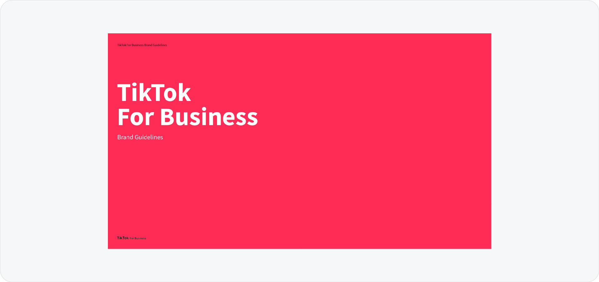
TikTok is known for chaos and creativity, but their B2B guidelines are surprisingly structured. They show how to organize the "noise" of user content into a clean layout advertisers can trust.
Why I love these brand guidelines:
- B2B Polish: They successfully translate a Gen-Z consumer brand into a trustworthy corporate identity.
- Visual hierarchy: They show how to frame user content without letting it clash with the brand UI.
5. BYD
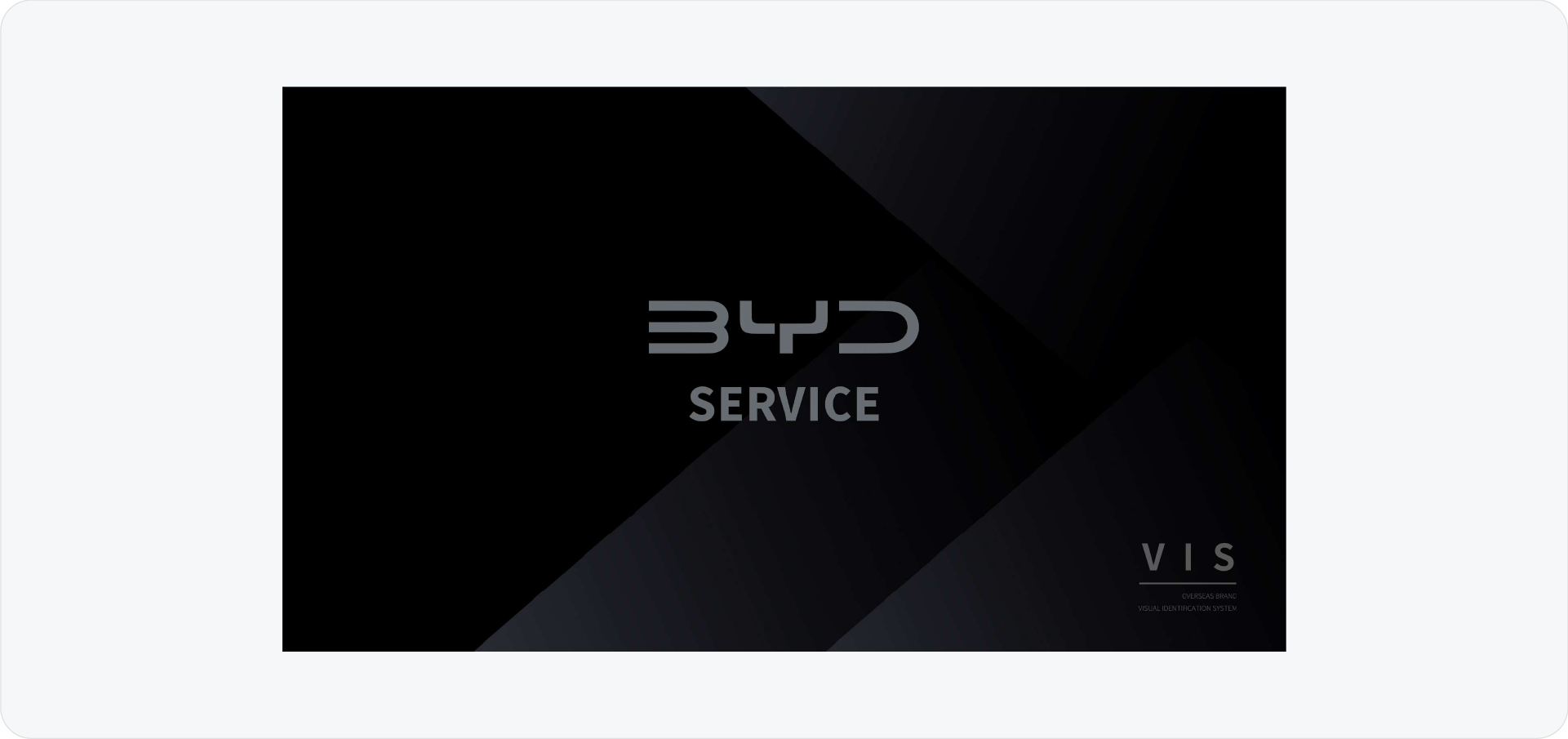
For a more corporate, industrial example, look at BYD. Their guidelines are strict, precise, and focused on engineering.
Why I love these brand guidelines:
- Technical precision: The layout feels engineered, which matches an automotive brand perfectly.
- Prints: There is a heavy preview and rules for merch print, which is not seen often in brand guidelines.
6. Fatboy
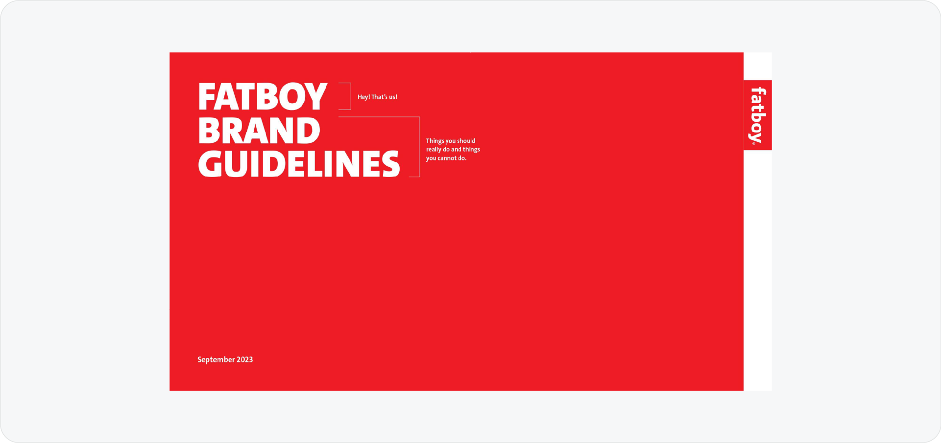
Fatboy sells lifestyle furniture, and their guidelines reflect that fun, relaxed attitude. It proves that a brand book doesn't have to be a boring manual.
Why I love these brand guidelines:
- Show, don't tell: They use large, bold imagery and very little text.
- Lifestyle focus: The photography does the heavy lifting, selling the feeling of the product rather than just the specs.
7. Widelab
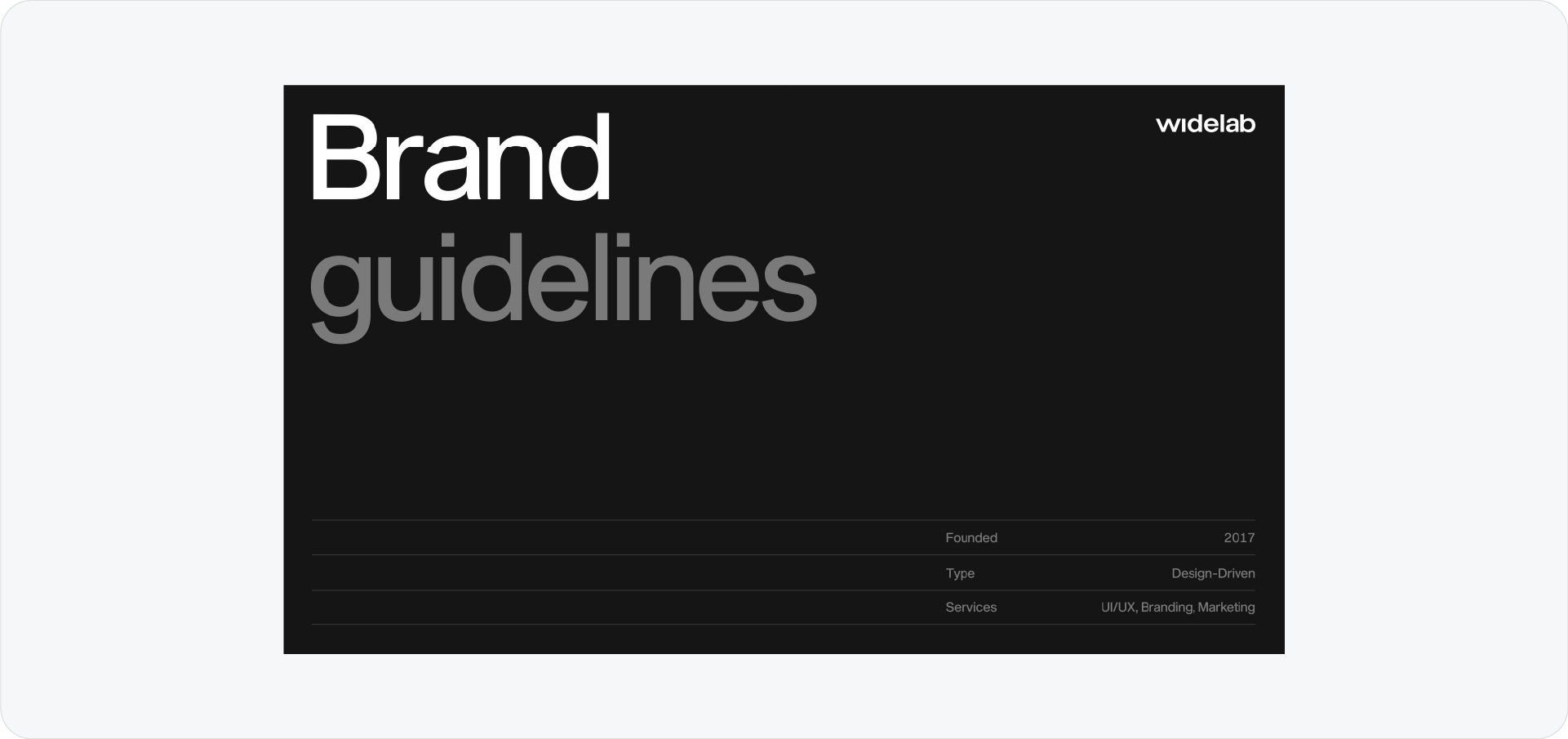
Widelab is a design agency, so their guidelines are incredibly polished. This is the kind of aesthetic you can easily replicate using the Tech template in Guideit.
Why I love these brand guidelines:
- Dark mode aesthetic: They lean into a sleek, dark UI style that feels premium.
- Clean grids: The layout is mathematically balanced, showing off their design capability.
8. Alaric Design
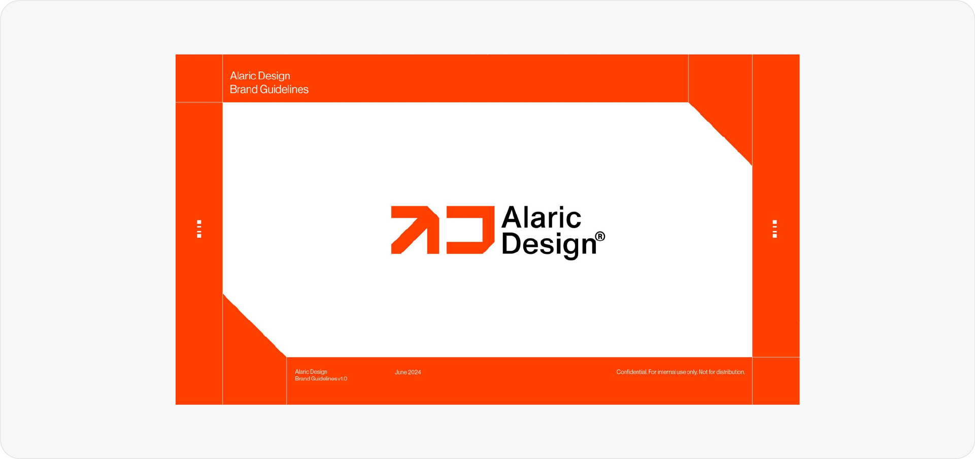
This is a great example of minimalism. Alaric shows that you don't need a 100-page book to be effective.
Why I love these brand guidelines:
- No fluff: It gets straight to the point, logo, color, type.
- Visual clarity: A concise document is often more effective because people actually read it.
9. AsiHome
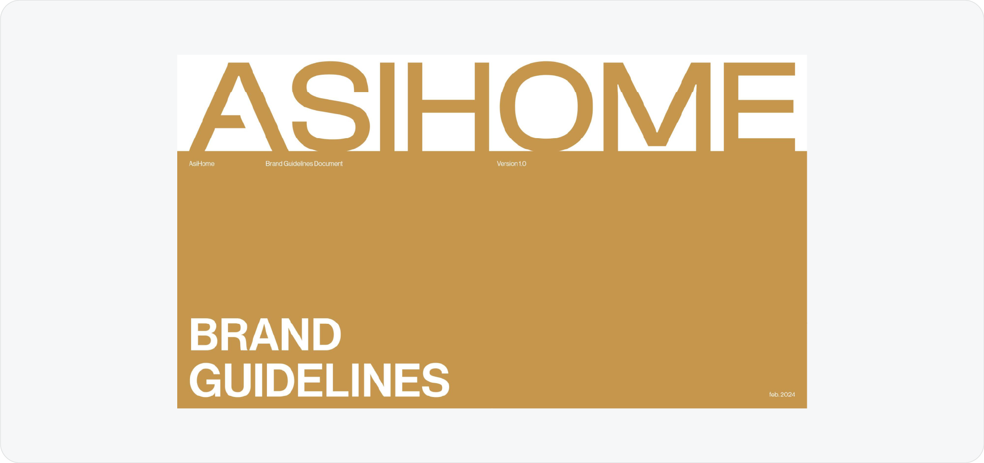
AsiHome demonstrates how to handle a brand that relies heavily on interior photography.
Why I love these brand guidelines:
- Art direction: The imagery section gives clear direction on lighting and composition.
- Atmosphere: They define the mood of the photos, not just the subject matter.
10. Ikan
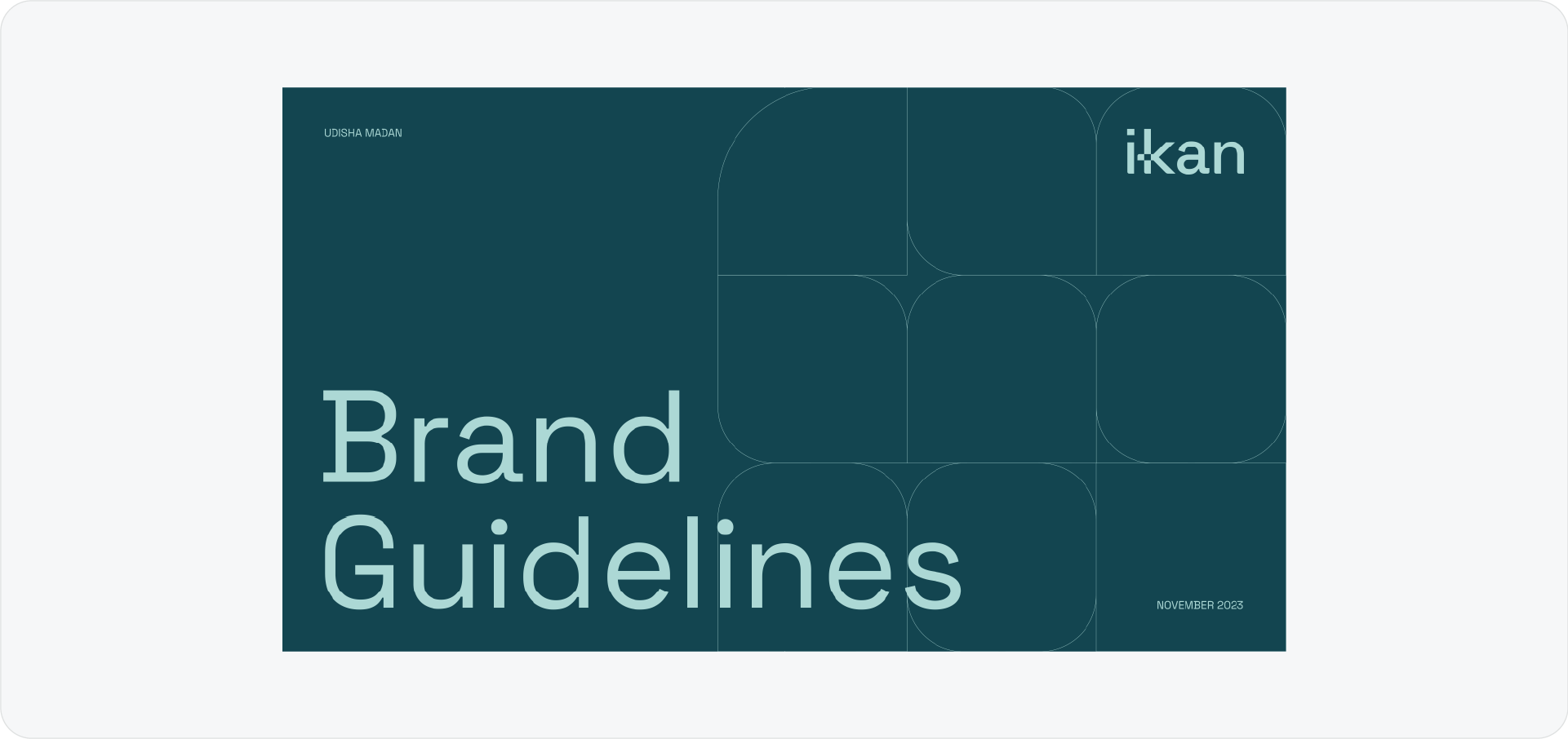
Ikan uses a very structured, corporate layout. It is a good reference for financial or bank-adjacent brands where trust is the main goal.
Why I love these brand guidelines:
- Structure: It feels safe and established.
- Color definition: The color palette section is particularly clear, leaving no room for error.
11. Elron
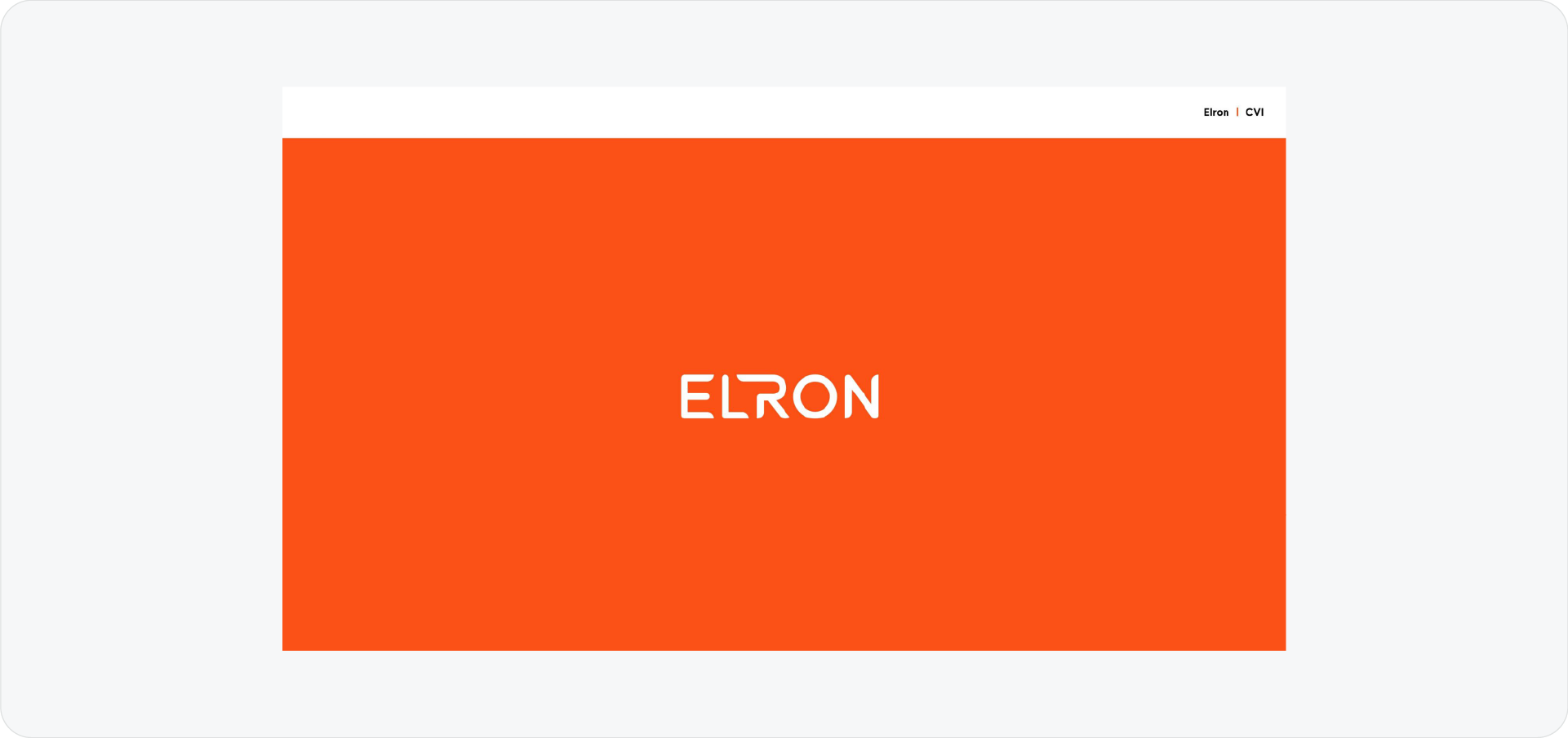
Elron is another strong example of a clean, tech-forward identity. They use a lot of black and high-contrast elements.
Why I love these brand guidelines:
- Logo lockups: They present their logo variations very clearly.
- Consistency: The dark theme runs through every single page, reinforcing the tech vibe.
12. Target Trips
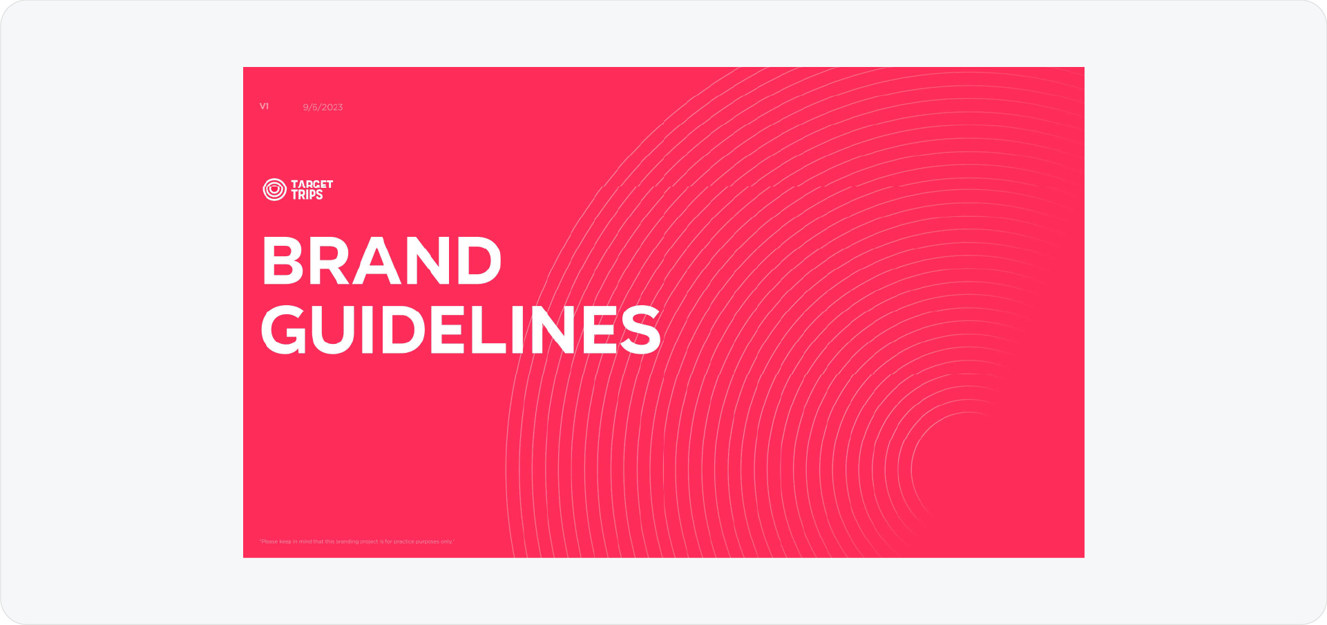
This is a campaign-specific guideline. It shows how a sub-brand connects back to the main parent brand while having its own unique flavor.
Why I love these brand guidelines:
- Flexibility: It shows how to play within the rules without breaking them.
- Extension: It demonstrates how a brand can stretch into new territories (like travel) while staying recognizable.
13. Finland
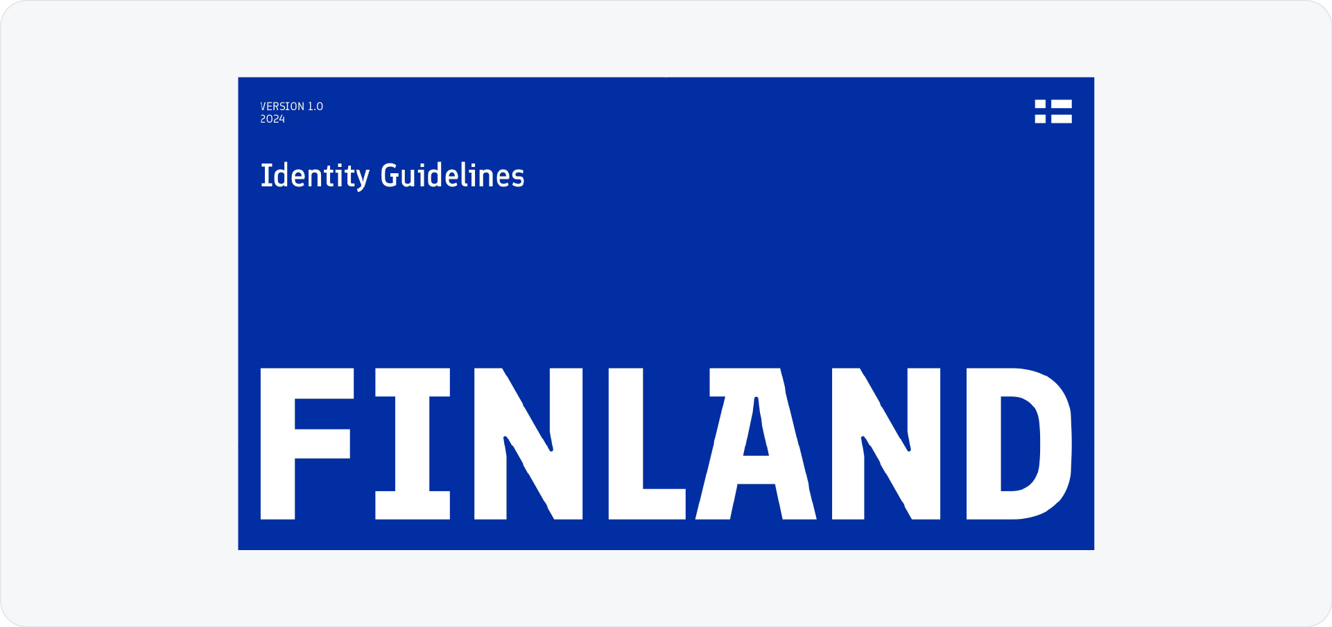
Nation branding is incredibly difficult, but Finland nailed it. This guide is iconic.
Why I love these brand guidelines:
- Comprehensive: It covers everything from typography to physical spacing.
- Distinct identity: It feels distinctly Finnish, simple, functional, and honest.
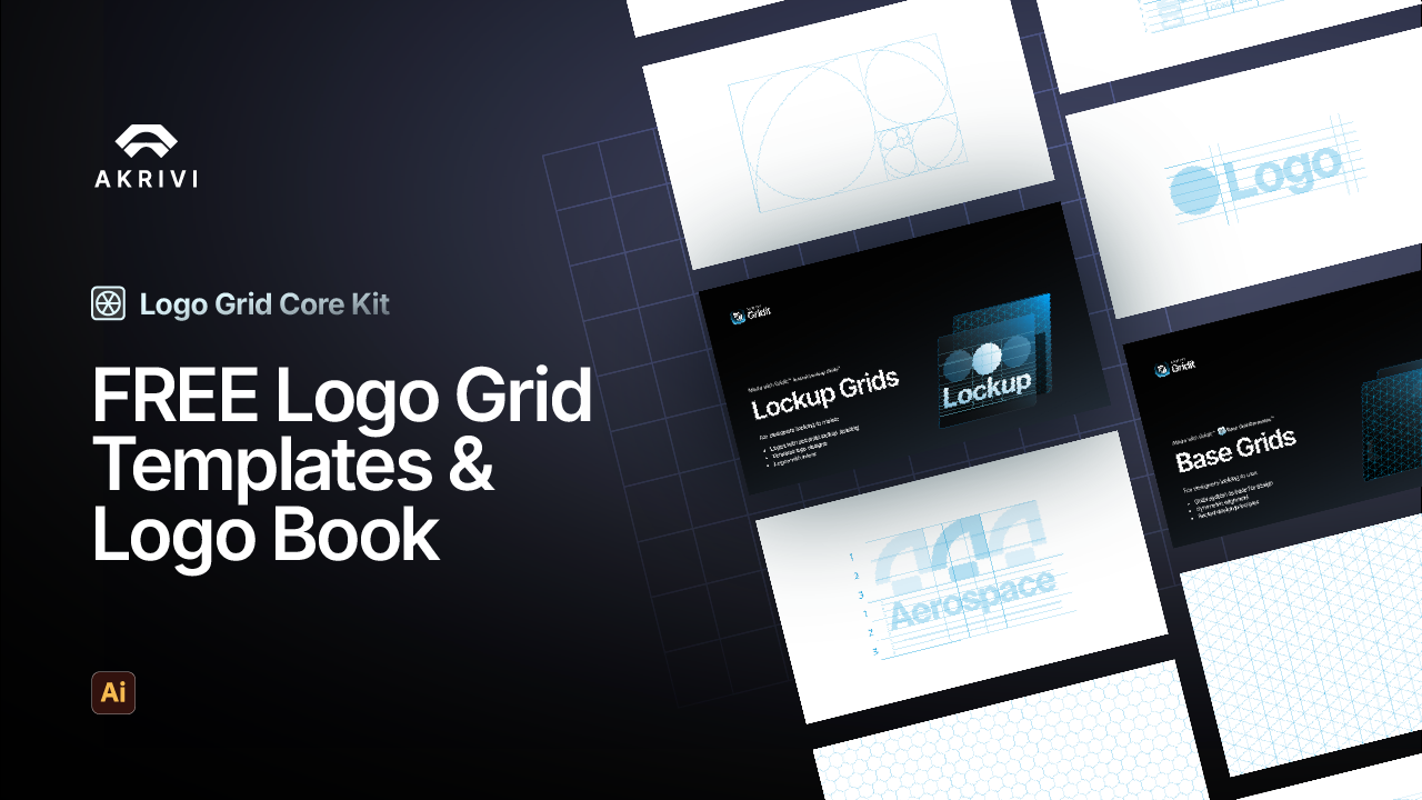
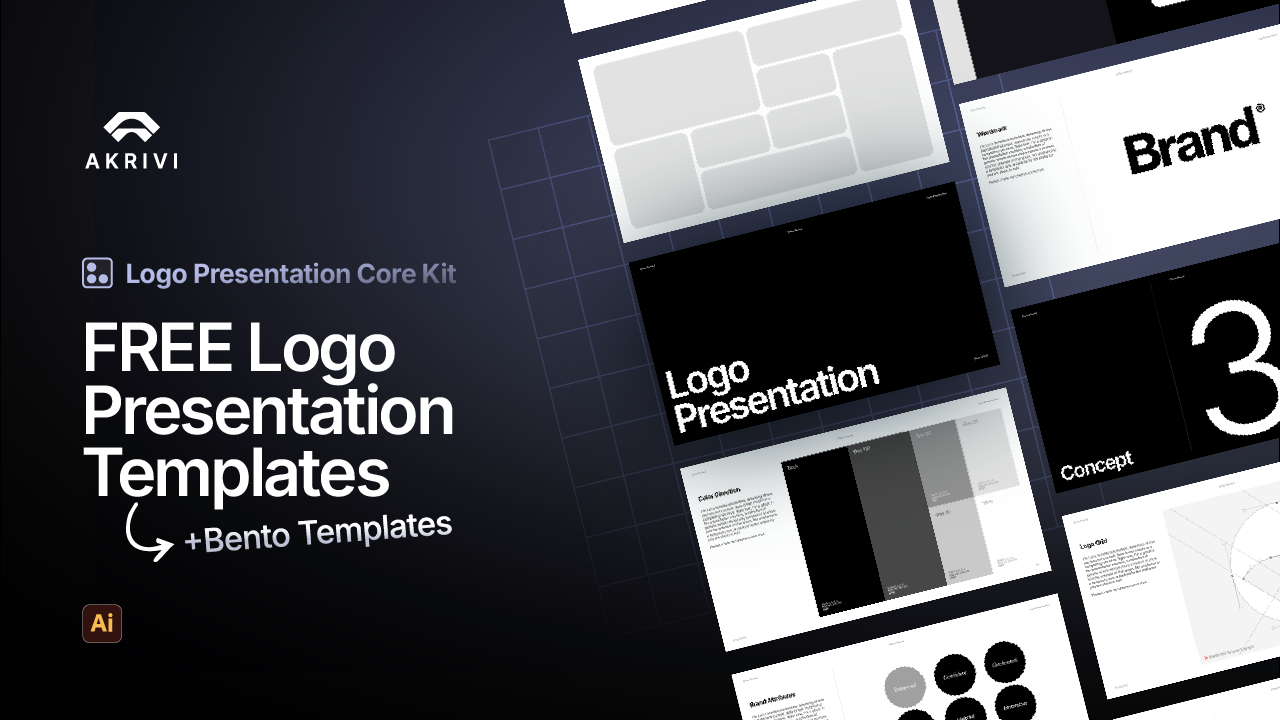
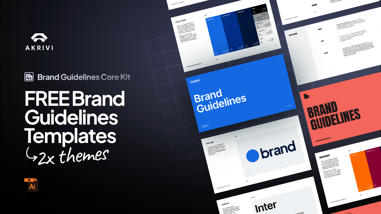
If you want something fast for your project, I have put together some free templates you can download and edit right a way, here.
How to Create Your Own
Looking at these examples is inspiring, but it can also be intimidating. Companies like Burger King and Bolt spend months developing these documents.
But you don't have to.
You can achieve this same level of structure and professionalism using Guideit inside Adobe Illustrator.
Instead of manually laying out pages, you just select a template (like our Corporate or Tech styles), upload your assets, and click generate. It builds a document that rivals these examples in seconds.
Conclusion
The best brand guidelines are the ones that actually get used. Whether you are inspired by the retro energy of Burger King or the clean precision of Widelab, the key is clarity. By using automation tools, you can deliver a world-class brand book to your clients without the agency-level timeline.
Generate for Free with Akrivi Studio